
In the previous blog post, we defined a technology stack and discussed why it’s important to choose the right one for web application development.
Now it’s time to discover the most prevalent technologies that are valued both by startups and large enterprises.
Let’s dive in our top of tech stacks you should draw attention to in 2020.
Undoubtedly, the MEAN stack is the most popular full-stack solution. Being entirely JavaScript-powered, it brings numerous benefits to web developers among which is the usage of a single language throughout your stack. Another strong advantage is that all the underlying technologies are free and open-source. The community around it is vibrant and active. If any issue arises during the development, you can always rely on its support.
MEAN presents a modern approach for developing fast and robust apps. Besides, all the components of MEAN speak JSON which makes the data flow smoothly between the layers.
Using one language (JavaScript) both for client-side and server-side development improves the communication inside the team and helps to understand your product holistically.
Now let’s break down its structure and take a closer look at its components.
MongoDB is a popular NoSQL database. Unlike relational databases, it stores data as JSON-like documents. Developers appreciate this database for these key advantages:
MongoDB copes well with big data. Due to being horizontally scalable, it fits perfectly mobile and social networking sites, e-commerce product catalogs, and any apps that rely heavily on geospatial data.
Express.js is a back-end web app framework that supports and hosts Node.js projects. It assists in organizing your app into an MVC architecture on the server-side. The main task of Express.js is to manage the workflow between the client-side and the data model, ensuring easy transferring of data to end-users.
Being written in JavaScript, it’s cross-platform, free and open-source. Lots of features are available for web and mobile apps.
With Express, it’s easy to build a robust API. Another thing to love Express.js for is its incredibly accurate error handling.
Angular is a front-end framework, developed and maintained by Google. According to the Stack Overflow Developer Survey 2019, it’s in the topmost used web development frameworks.
Angular extends the syntax of HTML, runs JavaScript code in the browser and serves to make your app’s UI dynamic and interactive. It’s mostly favored by the well-tuned performance and templates that are perfect for building the front end of cloud-native apps.
NodeJS is an open-source cross-platform engine for building server-side applications. It’s the true backbone of the MEAN stack. NodeJS serves as an integrated web server for the smooth deployment of MongoDB and the app itself to the cloud.
According to the results of Stack Overflow’s Developer Survey 2019, NodeJS tops the rating of the most favorable frameworks, libraries, and tools.
With NodeJS, you can breath more functionality into your app. Built on top of Google’s V8 JS engine, it’s acknowledged as one of the most efficient and lightweight server-side frameworks. It improves runtime performance and successfully handles data-intensive tasks which leads to faster app development and better scalability. NodeJS comes with the largest repository of libraries – npm.
NodeJS is often preferred for microservice architectures. Therefore, it’s appreciated by enterprises and large-scale projects.
Companies that use the MEAN stack are PayPal, LinkedIn, Netflix, and the New York Times.
In its essence, the MERN stack is the same as MEAN stack but with Angular replaced by React. As well as MEAN, it successfully covers the full development process – from front end to back end.
React
Developed and maintained by Facebook, React is one of the most popular frameworks for building interactive UIs. It’s appreciated by the reusability of components, high performance, and smooth learning curve.
In this version of MEAN, Angular is replaced with Vue.js as a frontend framework.
Vue.js
Vue.js is rapidly gaining popularity during recent years. It embodies the best features of React and Angular. Its key advantages are a non-steep learning curve, excellent performance, neat programming style and a rich ecosystem of tools.
The LAMP stack is an industry-standard. It’s recognized for its performance, flexibility, and open-source nature. LAMP is often chosen for improving operational efficiency and reducing IT infrastructure costs.
Let’s take a look at its structural components.
Linux is an operating system and a first layer of the stack. All subsequent layers run on top of it.
Apache is an open-source and free HTTP server that transfers the content between the server and client machines upon request. To be precise, it fetches the content from the server, turns it to static HTML files and returns it to the browser.
To be precise, it’s not a physical server but a software that operates on the server. It establishes a connection between a server and browsers of users (Google Chrome, Safari, Firefox, etc).
Since Apache is a cross-platform software, it works on Unix and Windows servers.
Due to its module-based structure, it can be customized to enable security, caching, password authentication, etc.
MySQL is a relational database management system (RDBMS). It stores information that can be requested to build a website.
PHP is a programming language. Instead, you can use a similar web programming language, e.g., Perl or Python.
All these layers are open-source and free products. However, since the stack can run smoothly on any operating system, you can choose different modifications and variations of the same stack:
Ruby on Rails is a web framework written over Ruby – a dynamic programming language with an elegant syntax. With Ruby on Rails, you can build a complete web application by combining HTML, CSS, JavaScript, and Ruby.
Ruby on Rails has a lot of supporters since it makes writing and debugging code faster and easier. The greatest thing is that Ruby developers can reap benefits from open source tools that speed up development.
Signature stacks
Now that we considered standard solution stacks, let’s discover which bundles of technologies stand behind popular web apps. The following combinations of technologies can be categorized as “signature stacks”.
Uber Tech Stack
Reddit Tech Stack
Pinterest Tech Stack
Facebook Tech Stack
Airbnb Tech Stack
This time we covered the time-tested tech stacks that are used widely across modern applications. The right tech stack directly affects the success of your project. Hopefully, today you’ve got the step closer to finding your perfect match.
If your app needs analytical and reporting features, you can always rely on WebDataRocks. Integrating with any front-end technology of your technology stack is as simple as ABC – check out available tutorials to make sure how seamless the entire process is.

We continue our blog series on discovering awesome data visualization types. This tutorial suits everyone who wants to understand their geographic data better.
Today we’ll focus on using one of the most popular visualization techniques for geospatial data – a choropleth map. And not only you’ll learn how to use this chart to represent the geodata but also how to efficiently combine it with a pivot table on a dashboard.
Here’s what you’ll get as a result:
See the Pen WebDataRocks Pivot Table with Google Charts Map by WebDataRocks (@webdatarocks) on CodePen.
But first things first: what is a choropleth map?
Choropleth map is a data visualization technique that allows representing the data using different colors or shades of one color for different regions. Most often, it’s used to visualize how the variable varies across a certain geographic area. You can use this technique to communicate the correlation between the variable and a geographic location.
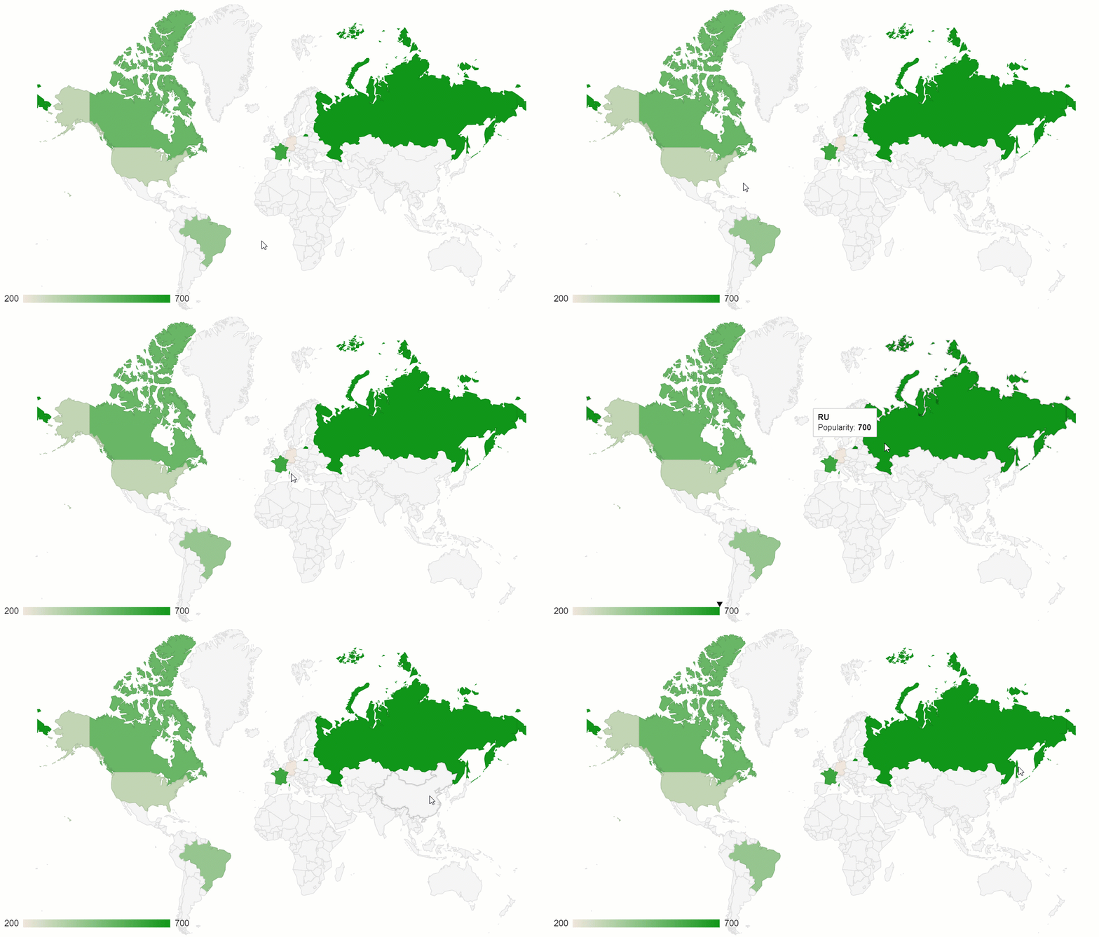
One of the best implementations of this data visualization method is a geo chart by Google Charts. Plus, it can be perfectly combined with another data visualization type – a pivot table.
Now let’s figure out how to create a dashboard in five simple steps.
The first step is to include the pivot table on the page. For this, we should follow the straightforward steps from the Quickstart guide.
Choose the data format you prefer and load the file into the pivot table by specifying its URL or the name of the function that returns it.
Here’s how you can specify the data source in the report object:
filename: "URL-to-your-CSV-or-JSON-file"
or
data: getData()
Now it’s time to select the fields to be displayed on the grid. Let’s put the “Country” hierarchy to the rows, “Category” to the columns and aggregate this data by “Revenue” – a calculated value built using “Price” and “Quantity” measures:
"slice": {
    "rows": [{
        "uniqueName": "Country",
        "sort": "asc"
    }],
    "columns": [{
        "uniqueName": "Category",
        "sort": "asc"
    }, {
        "uniqueName": "Measures"
    }],
    "measures": [{
        "uniqueName": "Revenue",
        "formula": "sum(\"Price\") * sum(\"Quantity\") ",
        "individual": true,
        "caption": "Revenue"
    }]
}
Add the Google Charts loader to the <head> section of your web page:
<script src="https://www.gstatic.com/charts/loader.js"></script>
To have access to the data preprocessing methods of WebDataRocks, include its connector for Google Charts:
<script src="https://cdn.webdatarocks.com/latest/webdatarocks.googlecharts.js"></script>
Create a <div> container to hold the chart:
<div id="googlechart-container"></div>
Now that we’ve set up the web reporting tool and charts, let’s synchronize them.
For this, we need a reportcomplete event. It’s triggered once the report has completed loading into the pivot tool.
Here’s how we can attach an event handler to it:
reportcomplete: function() {
    pivot.off("reportcomplete");
}
Additionally, we need two flag variables to track when both charts loader and the report are ready to be used:
var pivotTableReportComplete = false;
var googleChartsLoaded = false;
For loading the charts, we need to specify the mapsApiKey parameter:
google.charts.load('current', {
    'packages': ['geochart'],
    'mapsApiKey': 'AIzaSyD-9tSrke72PouQMnMX-a7eZSW0jkFMBWY'
});
We also need to set the callback function for the google.charts module to track if it’s finished loading:
google.charts.setOnLoadCallback(onGoogleChartsLoaded);
Once we’ve configured everything, let’s move on to a more creative part of the tutorial – drawing charts.
Create the functions that are responsible for handling the drawing logic:
function createGoogleChart() {
    if (googleChartsLoaded) {
        pivot.googlecharts.getData({
                type: "bar"
            },
            drawChart,
            drawChart
        );
    }
}
function onGoogleChartsLoaded() {
    googleChartsLoaded = true;
    if (pivotTableReportComplete) {
        createGoogleChart();
    }
}
function drawChart(data) {
    var data = google.visualization.arrayToDataTable(_data.data);
    var options = {
        colorAxis: {
            colors: ['#449544', '#4ca64c', '#7fbf7f', '#b2d8b2']
        },
        backgroundColor: '#b3e5fc',
        datalessRegionColor: '#ffffff',
        defaultColor: '#f5f5f5',
    };
    var chart = new google.visualization.GeoChart(document.getElementById('googlechart-container'));
    chart.draw(data, options);
Since for mapping data, we’ll use a single-hue progression, in the colorsproperty, we should specify the palette – all the shades of the chosen color, from the lightest to the darkest. The darkest hue represents the largest values of the data, the lightest – the smallest values.
So, after we’ve defined all the needed functions, here’s how our event handler for reportcomplete looks like:
reportcomplete: function() {
    pivot.off("reportcomplete");
    pivotTableReportComplete = true;
    createGoogleChart();
}
Hooray! Now your dashboard is rendered on the web page and we can use it for deriving insights from the geographic data.
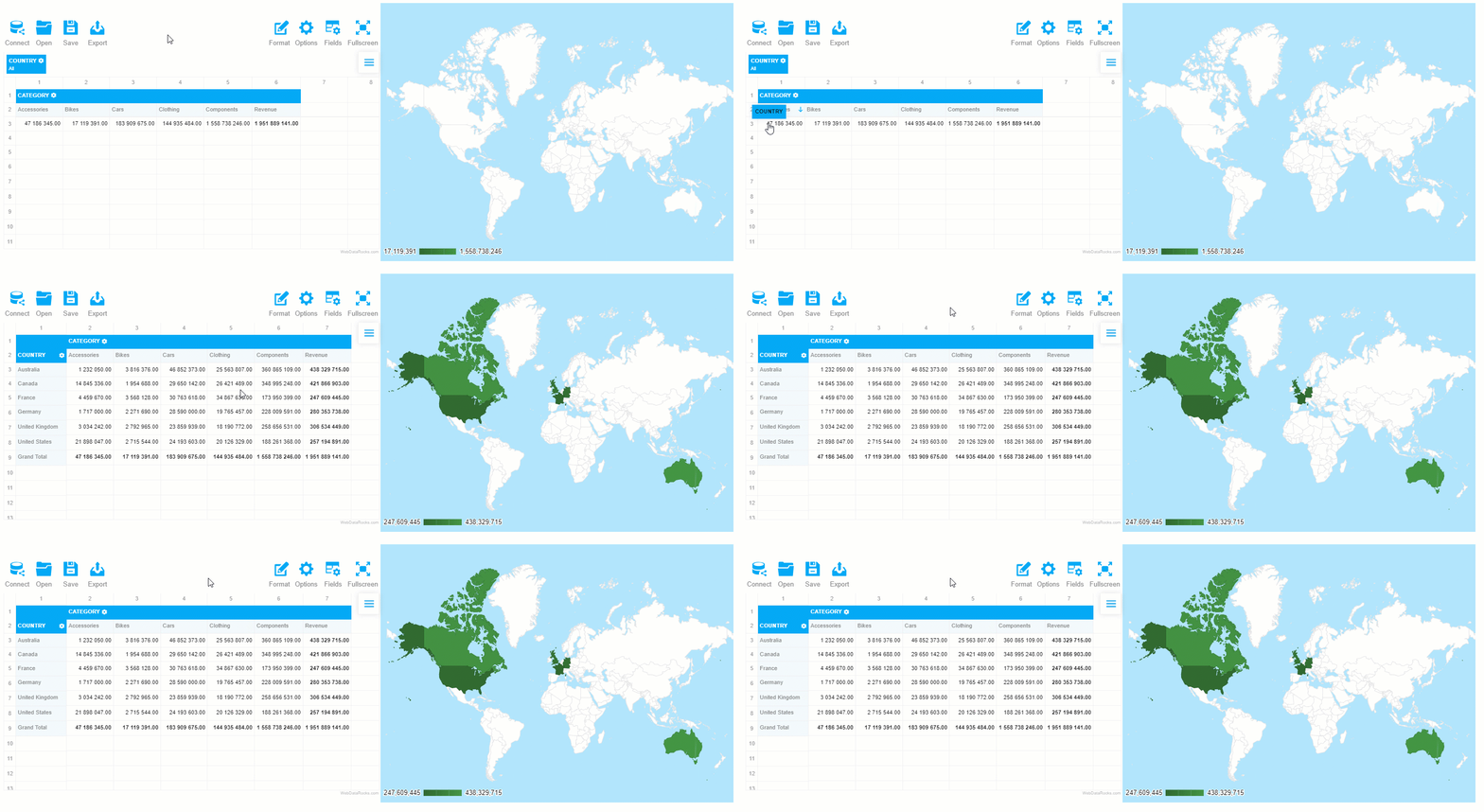
The greatest thing about such a data visualization approach is that the elements on the dashboards are connected – the chart reacts to the changes applied to the report. Try filtering the data or moving the hierarchies between rows and columns to see the synchronization in action.
Eager to discover more features of WebDataRocks Pivot? Check out our tutorials on integration and the UI guide.
Want to customize the charts further? The editable examples from the Google Charts documentation will help you to find out how to do it.

Let’s outline the essential aspects every developer needs to know about a technology stack and how its selection can affect the entire process of software development. Further, we’ll stress the top things you should pay attention to when choosing the tech stack for your project.
We do hope that this article will help you get a full picture of the tech stack’s purpose and understand how to make a smart choice of the one that fits your project at best.
Let’s start!
Even if you are already well-familiar with the concept, let’s recap its definition.
A tech stack (also known as a solutions stack) is a bundle of tools, namely programming languages, libraries, frameworks, and databases that come together for the development of a particular web, mobile, or hybrid application.
Such a name is given to this concept not without a reason – each subsequent layer of the stack builds on top of the features of one underneath it. All of them are brought together around one common goal – to assist in building, testing and running your application.
Though this concept can be found in many areas, the term itself emerged in the software development community. It meant to simplify communication between developers and help to indicate the application’s strong and weak points.
Every tech stack is different, yet, they all share a common structure. It’s comprised of two major components – front end and back end. The front end is responsible for the client-side part of your app while the back end is in charge of its server-side functionality.
A back end is the backbone of your application. It refers to everything that is not visible to users but ensures the proper functioning of the app. Behind the scenes, it takes care of things like security, content management and the structure of your app.
Structurally, the back end consists of the following components:
Let’s break down the purposes of all the back end’s building blocks. A back-end developer has to work with programming languages that databases understand to ensure the communication between web services, database systems and the application itself. A framework simplifies and speeds up development. A database is used for storing your application’s data. In addition to a database, a caching system is required to be set up to reduce the load on your database (e.g., Memcached, Redis, etc). A web server handles requests that come from the client-side, i.e., your app’s users.
And now let’s look at the front-end more closely.
A front end is responsible for a visual part of an application. It defines what your users see and how they can interact with your app. The core purpose of front-end web development is to create a seamless user experience and maximize its quality by making the interface accessible to any user.
As a rule, a front end is a part of the project where the development starts since it’s the most important thing to show to your customers in the first stages.
What are the cornerstones of the client-side?
This is a classical trio of tools for implementing designs on the web. HTML defines the structure and layout of the application’s content. CSS tells the browser how this content has to be styled with colors, fonts, etc. JavaScript is a scripting language that is responsible for making web pages interactive (i.e. defining the rules of how, when and where the content should be modified, hidden or removed). Often, front-end development becomes heavily JavaScript-oriented, especially if a web application is highly interactive.
A modern front-end developer needs to be familiar with the principles of responsive design, test-driven development, front-end frameworks and libraries (React, AngularJS, Angular, Vue, Ember, Bootstrap, Foundation), and basics of server-side rendering. Also, knowledge of the principles of working with SASS and LESS adds a competitive advantage since these pre-processors for CSS provide more flexibility and modularity when it comes to your app’s styling. Front-end developers should know how to use graphic design tools that allow building the application’s prototypes, experiment with the user interface and deliver the final variant. The most popular software is Balsamiq Mockups, Illustrator, Figma, Photoshop, Sketch. Try at least several of them to find your perfect match.
The technology stack is a foundation of your application. The underlying technologies make a significant impact on how your app is functioning and how it will perform in the future. It also can affect the scalability of your app. That’s why developers should take the task of selection responsibly and with exceptional care.
Once you’ve chosen the tech stack, try to understand its strengths and weaknesses. This will help you to know how to benefit from the former and alleviate the latter.
If you struggle to make the right choice on the tech stack, there are some general guidelines for you to follow.

Vue.js is a progressive JavaScript framework that enables web developers to create UIs in an elegant and efficient manner. Lately, it started to attract more and more attention from wider circles of the web development community.
And not without a reason – among the most prominent features of Vue are a smooth learning curve, concise programming style and high performance due to the automatic tracking of the component’s dependencies during its rendering. Besides, its core concepts are well-documented.
As the Vue.js community grows in size, so does its ecosystem of development tools. Let’s explore its best representatives in more detail.
Vue CLI is a standard utility for rapid Vue.JS development. It provides your Vue app with access to the build tools and ensures they work smoothly together, allowing you to fully concentrate on bringing your ideas with code rather than on configuring the app.
The flexible plugin system of Vue CLI supports Babel, TypeScript, ESLint, PostCSS, PWA, Jest, Mocha, Cypress, and Nightwatch. Plus, thanks to this system, developers can share their plugins with the community.
To my mind, the greatest thing is that you can make use of various configuration and customization options to meet your project’s specific needs.
Another thing you’ll love is a mighty GUI of Vue CLI that makes creating, configuring and managing projects a lot easier. Besides, Vue CLI has out-of-the-box support of unit & end-to-end testing.
Storybook is an open-source environment for developing, managing and testing UI components. Seamless configuring components through a flexible API is what makes it a must-have tool for building UIs efficiently.
With Storybook, you can create awesome components and demonstrate them in an isolated environment. Since it runs outside your app, you don’t need to worry about your app’s dependencies and specific requirements.
If you want to implement extra features for Storybook, you can try addons functionality.
Vuetify is a component framework that offers a broad range of stunning UI components. All the components adhere to the principles of Material Design. You can use this framework for building mobile, server-side rendered, single page, and progressive web apps as well as for regular HTML pages.
To get familiar with everything Vuetify has to offer, browse the components, pick those you like the most and get hands-on experience with them in your app. Try one of the pre-made layouts, design your own theme or style your components with colors, spacings, typography and more.
Another aspect I’d like to highlight is its rich ecosystem which includes a theme generator, vuetify-loader, Cognito module, and other tools. Moreover, the components are well-documented and accompanied with nice examples.
To my mind, this framework can meet the needs of any project. Plus, you can select only specific components to be used within your app. This approach allows you to control the size of your app by making it more lightweight.
VuePress is a static site generator tool. It offers blogging features and a plugin system. You can build custom themes and use ready-to-use community themes.
Let me break down the essence of its work. After you write the site’s content using Markdown syntax, VuePress transforms it into static HTML files. As soon as these files are loaded, your site runs as a single page application (SPA) backed by Vue, Vue Router and Webpack.
The main advantage of this approach is that you can include Vue code or components within Markdown files. That’s why the development comes out as flexible and you can create a website like a regular Vue app.
VueX is a state management system for Vue apps. You can use it as a centralized store for the application’s components and define rules that ensure that states are mutated merely in a predictable manner.
Let’s take a closer look at the structural components of VueX:
Also, it’s worth to mention modules as an inevitable part of VueX. Modules may come in handy when your application starts to scale. It’s a good practice to organize your code in modules to separate the store into individual pieces and hence simplify its maintenance. Each module has its own state, mutations, actions, and getters.
Other cool built-in features you may like are hot-reloading mutations, modules, actions, and getters during development.
To my mind, VueX perfectly copes with shared state management. But if your application is as simple as single page application, then you most likely don’t need Vuex. You should use it if you are building a medium- or large-scale single page application and facing the problem of handling the state outside of your Vue components.
Nuxt is another progressive Vue-based framework for building modern web applications. Under the hood of Nuxt, there are Vue official libraries (vue, vue-router, and vuex), and web dev tools (as webpack, PostCSS, and Babel) being used.
With Nuxt, you can build all kinds of Vue applications – from static landing pages to sophisticated enterprise-ready ones. It has a modular ecosystem that enables you to easily connect REST and GraphQL endpoints.
Other built-in features include server-side rendering, automatic code-splitting, ES2015+ transpilation, powerful routing system with async data and a lot more.
To my mind, the best thing about Nuxt is that it lets you enhance the development experience by providing the functionality for making the app structured and optimized.
To get a better idea of how Nuxt.js can be used, dive into examples and explore its API.
If you want to contribute to its development, you are welcome to do it on its GitHub.
Gridsome is a modern framework for building fast and secure websites that can be deployed to any static web host or CDN (Netflify, Amazon S3, etc). Though it’s relatively new (released in 2018), there are already a lot of adopters and followers among Vue developers. Its creators were inspired by Gatsby.js (a site generator for React). This inspiration resulted in building a similar framework but for Vue.js.
Let me explain how it works. Gridsome generates SEO-friendly HTML files based on the data source you provide within your app. The data source can be any – Markdown, CSV, Yaml, JSON, WordPress, Drupal (any other CMS), MongoDB, Airtable, etc. After loading the content, it’s turned into a single GraphQL Data Layer that serves for centralized data management. Now you can use extract this data and use it for building and deploying your Vue application.
The use of a universal GraphQL layer for all the data sources connected to the app is what makes Gridsome so unique. Due to it, data management is greatly simplified since the GraphQL layer acts as centralized storage and can be used by any page or component.
Another aspect I’d like to mention is a plugin ecosystem of Gridsome. You can take advantage of diverse plugins developed by the community of developers or even create your custom one.
Other out-of-the-box features are automatic code-splitting, static file generation, dynamic and file-based routing, hot-reloading, etc. I recommend taking the time exploring all other features of the framework.
Besides, not only it’s free but also open-source. Any contribution to the project is more than welcome since it’s a young project created and maintained by two Vue enthusiasts.
If you are searching for ways to improve your VueJS coding skills and deepen knowledge in its specific concepts, we recommend you to explore GitConnected – there you can find plenty of tutorials on how to build apps with VueJS.

The best way to succeed in the field of data science or data analytics is to complete structured courses designed by industry experts.
And here is why.
The primary value of such courses is that you learn the subject in a logically organized way.
But courses shouldn’t stand alone. When coupled with real-life projects, they help you to get a deeper knowledge of how everything works.
Another advantage of such courses is that you can learn everything at your own pace and from anywhere in the world. Modern courses allow you to be truly flexible. There is no room for “no-time” excuses – you are free to make a learning schedule that suits you the best. No less important is interaction with the community of peers who are in the same boat as you are. By getting into thematic discussions on forums, you can move forward noticeably faster.
To simplify your way to developing an intuition behind algorithmic techniques, statistical and mathematical concepts, and master programming skills, we’ve picked for you the best-in-class free data analytics and data science online courses that deliver the most current knowledge and cover cutting edge models and techniques. During the completion, you’ll be given a chance to gain hands-on experience with coding assignments and solve real-world business problems.
Let’s dive in!
Another way to start data science and analytics journeys is with tracks on DataQuest.io. There are a lot of awesome career paths available:
DataCamp also has to offer comprehensive career tracks in data science and analytics. Check them out:
During all these missions, you’ll face exciting challenges as well as get the intuition behind the basic concepts, apply statistical and ML models to real-world scenarios, and master programming in Python or R.
Since many courses simply bombard you with the theory, we’ve selected only those that contain practical coding exercises and help to build a solid foundation of maths and statistics behind data science and analytics. All of them are created by professional data scientists who are eager to share their knowledge and simply teach you complex concepts.
We do hope you’ll find the best fit for you, get enough soft and hard skills and create a stunning portfolio to kickstart your career.

We hope you’ve had enough time to get acquainted with WebDataRocks Pivot Table and make sure its functionality is the best fit for your analytical app.
Here at WebDataRocks, we strive to provide you with the quintessential features for data visualization and analytical reporting:
All these features work together to help you compose interactive reports and understand your data better.
What if you need more data to load?
You may have noticed that WebDataRocks perfectly works with data sets that do not exceed 1 MB. This quality satisfies most of the pivot’s users.
But what if your business starts rapidly scaling?
That particular moment can be hard to predict but it’s important to be prepared for any sudden changes in advance. Especially if your data also starts growing in size and the need to find scalable solutions for data analysis arises.
That’s exactly the case for which we’ve decided to prepare you. To handle either rapid or expected growth of your business successfully, we suggest migrating from WebDataRocks to Flexmonster – a more sophisticated and flexible reporting tool.
If you are ready to discover more exciting features of Flexmonster Pivot which your project will certainly reap the benefits of, move ahead!
Surely, CSV and JSON are the most common data sources when it comes to storing the data. And WebDataRocks perfectly copes with its processing.
But if you prefer to load the data directly from the database, you can try connecting to relational or NoSQL databases from Flexmonster Pivot.
Or if your data comes from an OLAP cube, you can connect to Pentaho Mondrian or Microsoft Analysis Services and start pivoting your data in minutes.
Lastly, if you prefer Elasticsearch to any other data storages, that’s not a problem at all likewise. You can easily connect to the index from the pivot table just as fast.
As you can see, Flexmonster provides a lot more data source options to which you can connect.
What else deserves special attention is the special algorithm under the hood of Flexmonster which ensures the data from the cube or index is loaded piece-by-piece, meaning the component loads only the data that is specified by the current slice.
This approach guarantees that all the data calculations are performed on the server-side and less data is loaded into the browser thereby improving the overall performance of your app.
The developers can experience more flexibility in terms of integration with the most popular tech stacks. Among the solutions stacks in which Flexmonster proved to work smoothly are LAMP and MEAN.
As for front-end frameworks, libraries, module loaders, bundlers, and languages, you can integrate the reporting tool with AngularJS, Angular, React, webpack, RequireJS, TypeScript, ASP.NET, PhoneGap, and a lot more.
Check out the full list of client-side technologies for which Flexmonster provides ready-to-use wrappers and integration instructions.
You may especially like more sophisticated filtering options of Flexmonster Pivot.
As in WebDataRocks, you can easily manage how and when filters are applied to your data but using more versatile queries.
Take advantage of filters by date – we are sure that your end-users may find these extremely powerful for their reports.

What is distinctive about Flexmonster is its UI design inspired by the principles of Material Design. It makes the component totally suitable for any app, no matter where it’s published – on Android, iOS or web.
As well as in WebDataRocks, you can customize the Toolbar, apply predefined themes, localize UI labels, customize cells, and configure exporting options of Flexmonster.
However, you can feel even more freedom of personalization and change the component in line with the needs of your project. For example, you can completely change the context menu to add custom scenarios for the right-click action, enable search in the Field List, and a lot more. There are also more date and time formatting options available.
If you want to dive into other visual customization options, refer to the Customizing appearance section.
This is the feature exclusive to Flexmonster. In addition to integrations with charting libraries, you can benefit from Pivot Charts that are always at hand.
To understand patterns hiding in your data visually, simply send summarized numbers to Pivot Charts in a few clicks:
You can even try the split view to look at both charts and the grid at the same time.
The JavaScript API of Flexmonster offers many more API calls. For example, you can partially update data in the runtime, define custom sorting for hierarchy members, and more.
If you choose Flexmonster, you’ll also get new minor features and updates every two weeks. Besides, the Flexmonster Support team is always ready to help you to manage a case of any difficulty on the Forum.
Feeling you need more data to analyze? Then you should give Flexmonster a try. Learn more in our documentation.
You have 30 days to test its functionality without any commitment and decide whether to move to a new solution or not. Oh, besides, it’s really easy. We’ve prepared a special guide for you to make the transitioning completely seamless.
You may also be interested in:

Today we’re going to talk about analytics. To be more precise – HR analytics.
We’ll clarify why it is so important for small-, medium- and large-sized businesses and how you can implement a custom solution for HR data analysis simply using charts and a pivot table without investing a lot of developer resources?
You might be wondering: why does your company need to focus on it at all? – Fortunately, we have all the answers for you here.
First of all, it helps to evaluate the performance of the company’s departments and answer crucial questions regarding the work of employees.
Though often being underestimated, HR analytics also gives the power to transform how the HR department performs by testing the effectiveness of the implemented strategies.
In other words, provided that you use analytics to the fullest extent, you can improve employee performance, get a bird’s eye view of your business and make data-driven decisions relying on extracted insights rather than simple intuition.
Before the start, we suppose you’ve already managed to outline your business goals. The goals may vary from company to company but the foremost ones may include:
Then, you need to identify metrics to track.
We took care of it and have prepared a kind of memo for you.
It’s fundamental metrics we’re going to analyze in this tutorial and corresponding types of visualization. (!But bear in mind that you can always calculate your own metrics with the help of tools we’ll mention below).
And finally, demographics-related metrics:
Now, check all your data that you’ve already collected from various sources and start building your HR analytics solution.
We suggest the most popular way to communicate all the data through an interactive dashboard. You can easily implement this approach by combining WebDataRocks Pivot with Highcharts.
Both libraries work together like a charm and soon you’ll make sure of it. Let’s go-ahead to the dashboard’s creating!
We’ll be adding all scripts into the <head> section of the web page to ensure they are run before the rest of the page is loaded.
To access Highcharts, include these scripts:
<script src="https://code.highcharts.com/highcharts.js"></script>
<script src="https://code.highcharts.com/highcharts-more.js"></script>
Let’s also add the export module to allow end-users to download charts as PDF, JPG, PNG, or SVG images:
<script src="http://code.highcharts.com/modules/exporting.js"></script>
If you want to enable exporting without an internet connection, you can add this script instead:
<script src="http://code.highcharts.com/modules/offline-exporting.js"></script>
Add containers where the charts will be rendered:
<div id="piechart-container"></div>
...
<div id="barchart-container"></div>
Create as many containers as there will be charts on the dashboard.
It’s time to configure a reporting tool in your project.
Include WebDataRocks scripts and styles:
<link href="https://cdn.webdatarocks.com/latest/webdatarocks.min.css" rel="stylesheet">
<script src="https://cdn.webdatarocks.com/latest/webdatarocks.toolbar.min.js"></script>
<script src="https://cdn.webdatarocks.com/latest/webdatarocks.js"></script>
To apply the dark theme, add the corresponding styles:
<link rel="stylesheet" type="text/css" href="https://cdn.webdatarocks.com/latest/theme/dark/webdatarocks.min.css" />
Create the container for the pivot table:
<div id="pivot-container"></div>
var pivot = new WebDataRocks({
    container: "#pivot-container",
    toolbar: true,
    report: {
        dataSource: {
            data: getData()
        }
    }
});
To load data into the component, define and set a function that returns the JSON data:
function getData() {
    return [
        {
            "id": 1,
            "Full Name": "Sallyanne Tryhorn",
            "Job Title": "Software Consultant",
            "Country": "Sweden",
            "Gender": "F",
            "Employee Engagement": 0.8,
            "Part-time": "No",
            "Revenue per employee": 889,
            "Hours Spent for Project": 66,
            "University": "Kalmar University College",
            "Currency": "SEK",
            "Department": "Business Development",
            "LinkedIn Skill": "Brand Management",
            "Month Salary": 1229,
            "Overtime Hours": 12,
            "Employment start date": "9/26/2015",
            "Age Group": "<21"
        }
    ]
}
Don’t forget to specify data types for JSON!
Now that your pivot contains the data, it's time to analyze it.
To provide your end-users with a meaningful report, set a slice that describes which hierarchies have to be placed to the rows, columns, and measures.
As well as a report, this object has a JSON structure:
"slice": {
    "rows": [{
        "uniqueName": "Department"
    }],
    "columns": [{
        "uniqueName": "Measures"
    }],
    "measures": [{
        "uniqueName": "Total Overtime Hours",
        "formula": "sum(\"Overtime Hours\") ",
        "caption": "Total Overtime Hours"
    }],
    "sorting": {
        "column": {
            "type": "desc",
            "tuple": [],
            "measure": "Total Overtime Hours"
        }
    }
}
This slice helps to get an understanding of the overtime hours by departments.
Try exploring the data interactively - drag and drop the hierarchies on the grid and save the resulting report.
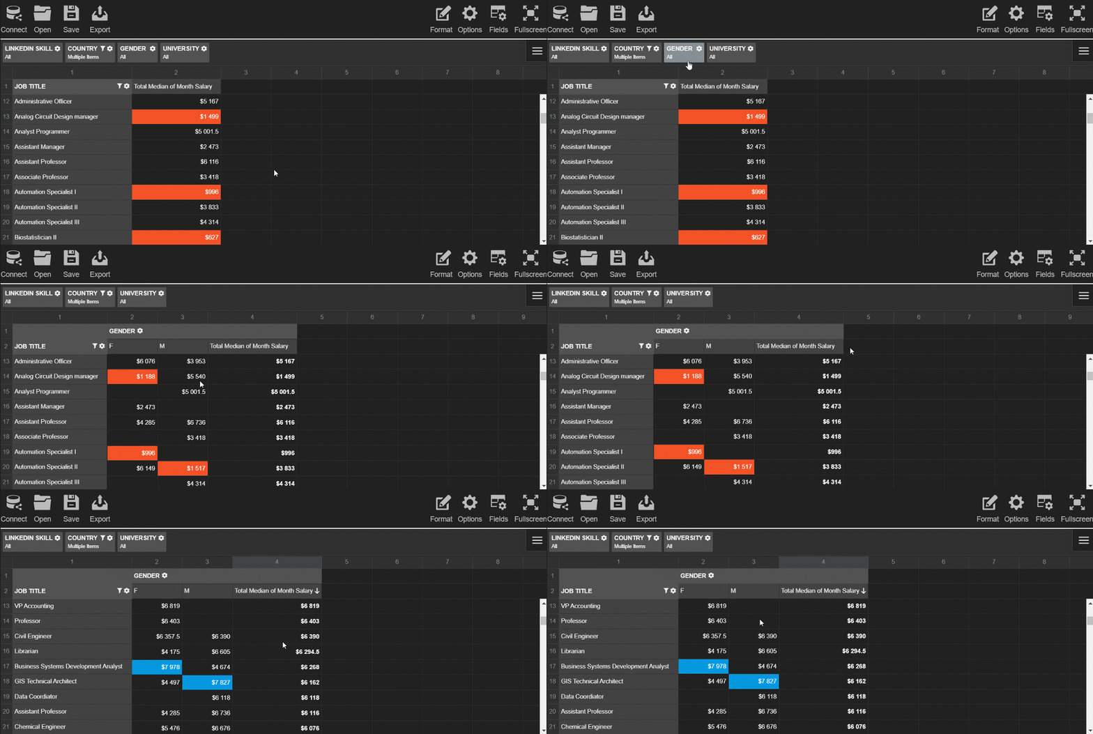
Before creating the charts and filling them with the data, we need to process the data to the appropriate formats.
Each chart requires a different data structure. To save your time, add the WebDataRocks connector for Highcharts to get access to the ready-to-use methods that handle data processing:
<script src="https://cdn.webdatarocks.com/latest/webdatarocks.highcharts.js"></script>
Next, we need to write code that performs the following scenario for each chart type:
To know whether the pivot table is ready to provide the data, we should use an event handler for reportcomplete.
Here's a simple example of the handler you can attach to the event:
reportcomplete: function() {
    pivot.off("reportcomplete");
    createPieChart();
    createBarChart();
}
To keep the blog post concise, I prefer not to include all the code here - you can find all the details of charts creating in the CodePen demo. You can also see there how to apply a dark theme for Highcharts.
See how the dashboard looks like as a result:

This dashboard is completely ready to be an efficient instrument for HR analytics. Your end-users can interact both with a pivot table and charts, change reports on the fly and look at the data from multiple angles.
Coupled together, the pivot table and charts complement each other and make your data speak.
Hopefully, the presented approach will help you to get insights from the data, showcase your data story to the colleagues and improve the business performance in the long run.
People often ask: how data analytics and data science differ from each other? For many, it may be hard to differentiate these two disciplines. And today we’ll try shedding the light upon their principal distinctions.
To my mind, it’s not quite right to oppose these disciplines with each other. Instead, it’s more beneficial to consider them as parts of a single whole.
Data science is an umbrella term that embraces data mining, data analytics, machine learning, and other disciplines. Its primary goal is to extract insights from massive collections of raw unstructured, semi-structured and structured data sets.
A significant difference between Data Science and Data Analytics lies in their goals and tactics. For example, a data scientist is more concerned with finding the right questions to ask while a data analyst intends to obtain the right answers based on the existing questions to the data.
Also, these disciplines are different in scopes. While data science produces broader insights on the subject and identifies inherent trends in the data, data analytics aims at focusing on more concrete / narrower goals.
Hard skills
A skilled data scientist has to know how to collect data sets from diverse sources, preprocess it by cleaning and transforming disordered data, extract required features and implement machine learning techniques to gain insights into the data.
Equally important is to know how to perform predictive analytics, sentiment analysis and integrate analytics with enterprise-scale systems.
Tools and languages
Along with ML techniques, a data scientist has to know Python, R, Scala, or/and SAS/STAT well, have a strong background in maths, probability, and statistics.
Since the data that data scientists work with is most often stored in relational databases, SQL expertise is a critical skill that can’t be underestimated. You need to know how to write basic and complex, nested queries to get the precise data you need.
Understanding how to work with unstructured data is especially valuable – in most cases, you’ll work with messy data. The ability to work with NoSQL databases (MongoDB, etc) is also highly appreciated.
Soft skills
A qualified data scientist should possess not only exceptional technical skills but also outstanding communication, problem-solving, and prioritization skills. Another key skill is a clear understanding of the data from a business point of view.
Given the above, data scientists are proficient data analysts with solid programming skills.
To be a good data scientist, you must be an excellent data analyst. But the opposite is not always true.
A data analyst has to be skilled at descriptive statistics, visualizing data, and reporting insights gained from the data.
Like data scientists, data analysts have to be proficient at statistics, working with databases, and looking at the data from multiple angles.
Hard skills
Must-have skills for data analysts are:
Soft skills
A skilled data analyst has to expertly communicate their findings to a wide audience of decision-makers by using various data visualization and reporting methods. Data analysts have to constantly cooperate with other team members, be good at problem solving and research.
No less important is to be attentive to the smallest details and be able to present complex concepts in a simple language.
To summarize, data science and data analytics have a lot in common, yet, they have differences that can be nonobvious at first sight. Today we’ve covered the major aspects that differentiate these two powerful disciplines and outlined must-have skills for data scientists and data analysts.

React is a front-end library created and maintained by Facebook.
The central idea behind React is that everything can be built with reusable components which have own lifecycle.
Among companies that choose React as a front-end technology, you can find Netflix, Dropbox, Coursera, IMDb, Khan Academy, New York Times and a lot of other notable organizations.
If you asked us what are the main features that make React great for the development of user interfaces, we’d outline these:
Another advantage of React is its rich ecosystem that’s backed by the strong community of developers across the globe. Thanks to them, all possible tools are available to you: IDEs, extensions for code editors, plugins for web browser, boilerplates, libraries, etc. And these are what we’re going to dedicate this blog post to.
Regardless of your level of expertise, you can greatly benefit from tools that speed up web development. To simplify your searching, we’ve picked the most useful tools that will help you to build a successful project.
Let’s take a closer look at them.
CodeSandBox is on the top of our list. And not by chance – it’s one of the most progressive online IDEs we know. The companies that use CodeSandBox are GitLab, Atlassian, Shopify.
With the available toolkit, you can create any type of web project that uses React, Angular, Vue, Vanilla JS, Preact, Reason, Svelte, CxJS, Unibit, Dojo as client templates and Next.js, Nuxt.js, Gatsby, Ember, Apollo, Nest, Node.js as server templates. If you don’t want to be limited to provided templates, you can create your custom ones.
The finished sandboxes can be deployed to Zeit or Netlify.
The IDE smoothly integrates with GitHub: you can import your repository as a sandbox which will stay in sync with the original repo.
You can even create commits and open pull requests from a forked sandbox. It’s also possible to create a new GitHub repository based on the existing sandbox.
Another cool feature is that React DevTools are integrated directly inside CodeSandBox.
The feature we’d like to highlight is the capability to embed the project anywhere, even on Medium. This is what makes it perfect for sharing projects.
Lastly, the IDE is almost entirely open-source – you can contribute to its development.
You shouldn’t miss this stand-alone IDE as well. Rekit Studio offers a lot of features which make building scalable web applications with React, Redux, and React Router easier: code generation, dependency diagraming, building, unit tests, navigating code in a meaningful manner. It also facilitates refactoring, which is especially important for large-scale apps.
With the project explorer, you can quickly navigate between project elements.
To understand your code better, you can always review your project visually – Rekit generates diagrams that display dependencies between features, modules, and actions. This functionality increases the visibility of your work and simplifies refactoring.
Read about it in more details on freeCodeCamp.
Whether you prefer using a design- or code-first approach for building projects, you are going to like React Studio.
It provides the functionality that makes easier to control all the top-level aspects of your application’s design, assemble the components into an application and keep your code clean. As soon as you’re satisfied with your project, you can publish it right to the web. All these features bolster rapid development.
It should be noted that the IDE is especially suitable for designers. Completely from scratch, they can create a web application via the drag-and-drop gesture and test it even before the real-world data is available.
Other features for designers include built-in drawing tools for Illustrator, Photoshop, and Sketch.
Discover more about new features of React Studio on Hackernoon.
React boilerplate is a real find for developers who want to enhance their performance. It automates everything – creating of components, routers, containers, selectors right from the CLI.
The built React applications are offline-first, meaning that they remain accessible to the users even without a network connection.
When editing code, you can see changes to the CSS and JS in an instant, without the need to update the page.
Other features for development involve state management, support of the most up-to-date JavaScript features, composable CSS.
You are free to contribute to this evolving project on GitHub.
Create React App is an official start-kit for React created by Facebook. It considerably reduces time spent on configuring projects. With one simple command, you can create a project with its live development server, compiled React, JSX, ES6, CSS files. For testing, ESLint is used.
Keeping the library up-to-date is effortless as well – once a new version of Create React App is rolled out, you can update it with a single command.
React DevTools for Chrome is a handy extension for making the development process more manageable. As well as ‘Create React App’, it’s created and maintained by Facebook.
With the Component tab, you can thoroughly inspect the components, edit their properties and states.
With the Profiler feature, you can track performance information.
By the way, you can select one of the 18 predefined themes to change its Look & Feel. Or even create your custom styling.
React DevTools for Firefox is another add-on that offers alike functionality for inspecting a React tree right in Firefox.
All the listed React developer tools are meant to make your development process more efficient and fast. We truly hope they will.
If you are getting started with React, you’ll find useful this amazing overview.
If you prefer a visual approach, check out the React for designers guide.

Employees often spend hours trying to compose meaningful reports with inconvenient tools, creating a big drain on efficiency in the team.
To prevent this from happening, you can provide them with ready-to-use data dashboard libraries equipped with interactive features and intelligible visualizations.
As a developer, you can build such a dashboard right in your app with the help JavaScript libraries.
The advantage of this approach is that it makes development flexible – you can control all the aspects of a dashboard (both visual and functional) and customize it whenever required.
Firstly, understand your problem and objectives.
Since the core purpose of any dashboard library is to communicate actionable information at a glance, you need to figure out the far-reaching goals of analysis and define metrics or KPIs to measure in a specific department.
Secondly, define the dashboard’s structure. The data dashboard can consist of many elements of varying complexity: charts, tables, maps, graphs, networks, diagrams, word clouds, timelines, widgets, etc.
Key characteristics of a full-featured dashboard library are the ease of customization and displaying trends in data.
Keeping this in mind, we’ve decided to provide you with an overview of popular JavaScript data visualization libraries which charts can be used as a dashboard’s components. We’ll also focus on “a pivot table + charts” combination and show how to build a dashboard with WebDataRocks Pivot and any of the listed charting libraries.
But firstly, a few words about WebDataRocks.

WebDataRocks is a lightweight JavaScript pivot table component that runs on any browser and integrates with any front-end and back-end technology. Its functionality is aimed primarily at creating tabular reports in a fast-paced and efficient manner.
The coolest thing is that you can integrate this component as a part of an embedded business intelligence solution.
Its core features are:
And a lot more!
All these reporting features are at hand via the UI and make WebDataRocks Pivot so essential for data analysis.
The pivot table has a smooth learning curve. To explore more features, please refer to our UI Guide. If you prefer the code-first approach, you are welcome to dive deeper into the API reference.
Integrations
Available tutorials on integrations will walk you through using a pivot in React, Angular, AngularJS, and jQuery projects.
Another shiny feature is that you can use a pivot control with any charting library of your choice.
We are excited to present our top of charting libraries that you can use with WebDataRocks. ?

With over 8K stars on GitHub, the Highcharts library holds the leading positions among free and commercial charting solutions on the market. It’s widely used across diverse industries: from computer software and IT to higher education and financial services. It’s also favored by such top companies as Facebook, Microsoft, StackOverflow, MasterCard, and others.
You can run it either on top of jQuery or on top of its framework.
It’s easy to get started – simply install packages via CDN, npm, Bower or locally.
Data
You can load data from a CSV file, HTML tables or Google Sheets. You can even visualize the real-time data from a server.
Chart types
The Highcharts library provides a whole family of charts: Highstock, Highmaps, Highcharts Gantt.
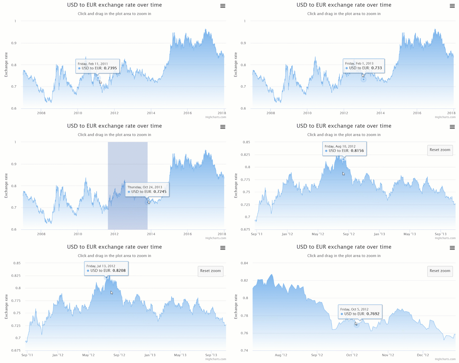
Among the basic charts there are gauges, area, areaspline, bar, column, error bar, box plot, funnel, heat maps, line, pie, polar range, waterfall, scatter, spline charts, treemaps, and more.
Integration options
Supports TypeScript, React, Django integrations.
Documentation
The documentation is divided into topics that contain logically linked tutorials. You can quickly get used to all primary concepts and move to create more sophisticated charts.
A particular point of interest is the Use cases section. Here you can check real examples of industry-specific usage.
Customization
There are a lot of aspects you can configure through options:
It’s also possible to extend Highcharts functionality by writing custom plugins.
General impression
Highcharts stand out from the rest thanks to a wide variety of responsive charts for all purposes and the ease of usage – the code is incredibly developer-friendly.
If you want to communicate your data effectively, this library is a perfect choice.
Dashboards with Highcharts and WebDataRocks:

FusionCharts is one of the most widely used charting libraries written in JavaScript.
It offers three types of installation: via CDN, npm or locally.
Chart types
Once you start working with FusionCharts, a broad spectrum of charts is at your disposal: maps, columns, bar, line, area, pie, donut, stacked, bubble, scatter charts, heat maps, Gantt, Pareto, box and whisker, bullet charts, gauges, and more.
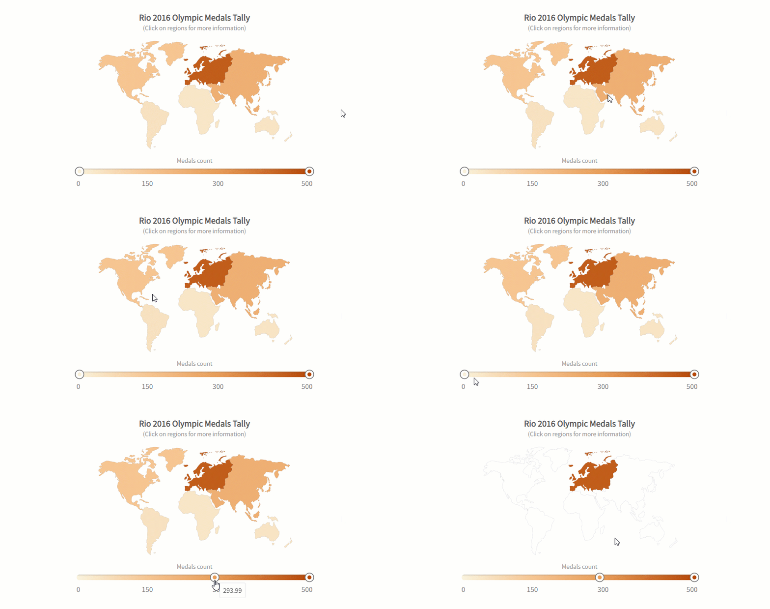
All charts are categorized by purposes and accompanied by the code you can play with.
Most of the charts are available in 3D versions. There are also their real-time charts which means you can stream real-time data through charts. Another benefit is that there are a lot of charts for time-series analysis.
Integration options
It integrates easily with such front-end technologies as React, Angular, jQuery, Vue, Ember, AngularJS, and React Native. Plus, it works well with apps that are written in Java, PHP, Ruby on Rails, Django, ASP.NET.
If you want to integrate FusionCharts with Highcharts – it’s not a problem as well.
Customization options
Personalize charts by changing colors, titles, labels, add tooltips, animations, and exporting options, apply themes. Using API events, you can build custom scenarios around the component.
You can even add a special extension to make charts more accessible to any end-user and great looking on any screen and device.
Documentation
The documentation is user-friendly – it walks you through the basics to advanced custom charts creating. What is more, you can take a look at how to build each chart using various frameworks.
If you want to develop your storytelling skills and learn how to communicate information, we strongly recommend delving into the Data stories section where you can find many industry-oriented demos.
General impression
Regardless of your level of expertise, it takes a brief time to figure out how charts work and configure them. This is all thanks to a rich gallery of examples.
Dashboards with FusionCharts and WebDataRocks:

Google Charts is one of the most popular services for creating web-based data visualization. It’s created and maintained by Google.
You can install it by simply including JS scripts and loaders to your web page.
Data
The simplest way to use Google Charts is by setting JSON data in the chart’s configuration. Under the hood, it will be represented by DataTable and DataView classes.
Other options include connecting data from your database, importing data from Salesforce, Google Fusion Tables, or Google Sheets. As an advanced option, you can implement your data source protocol to fill the charts with data from custom data sources.
Also, you can embed charts right in spreadsheets.
Chart types
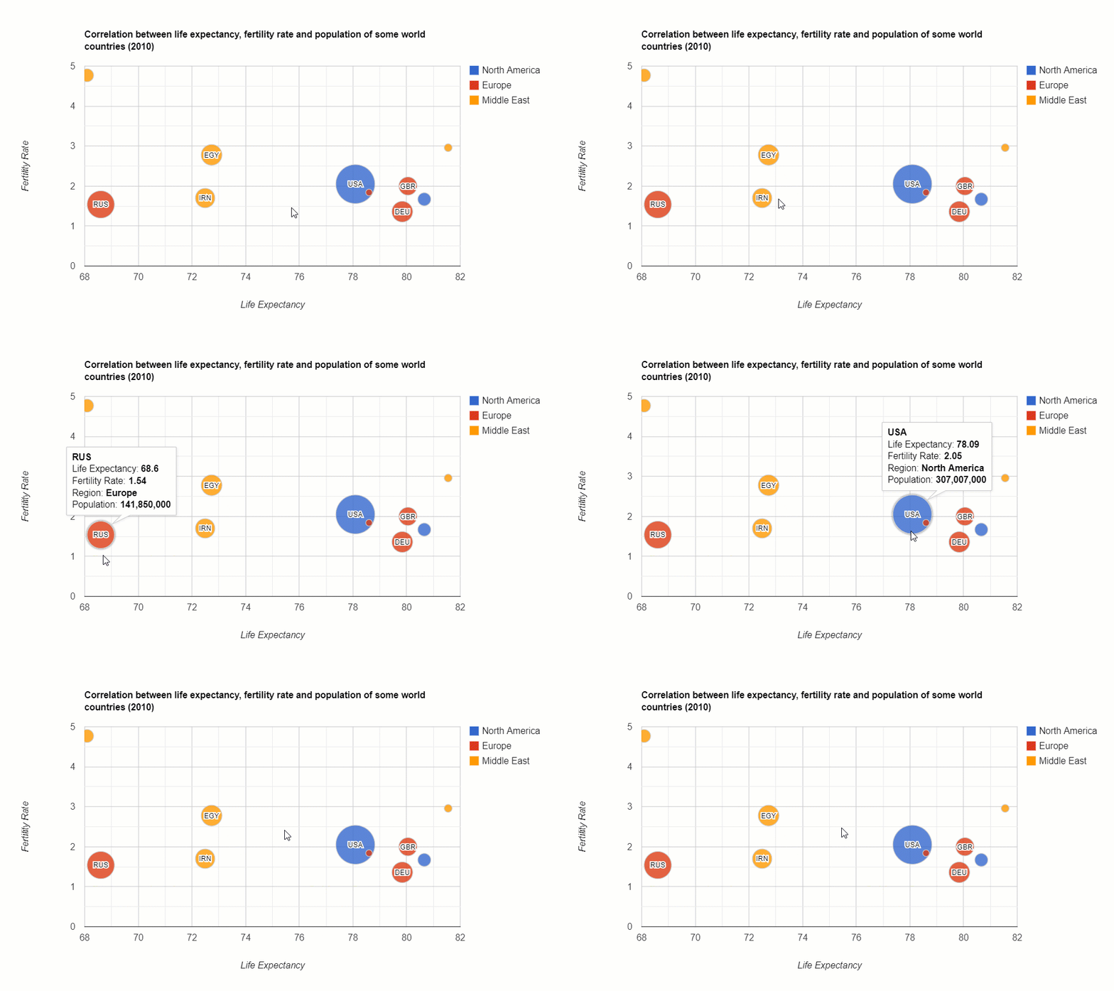
It offers pre-built visualizations that serve for diverse purposes: bar, column, combo, area line, geo, pie, donut, bubble, scatter charts, histograms, gauges, timelines, candlestick charts, word trees, and a lot more.
Integration options
There are no official integration guides with frameworks but you can find wrappers for Angular, React, Vue, and TypeScript definitions contributed by passionate developers.
Customization
You can customize the look and feel of every chart effortlessly by setting their options in the chart’s draw() method.
Change axes, formatters, lines, crosshairs, points, overlays, tooltips, animations, add toolbars – it’s all possible.
If you want to run certain scenarios upon the user’s actions or describe complex interactions between charts and widgets placed on the same web page, you can do it with events.
Chosen charts are available in material design which makes charts look modern in any app.
Documentation
The library’s functionality is well-documented and exemplary. The structure of the documentation is intuitive and consists of many tutorials. It guides you through all the important aspects of visualizing data: from installing the library to creating advanced web dashboards.
General impression
Charts are easy-to-use for both beginners and skilled developers.
See how to build a dashboard with WebDataRocks Pivot and Google Charts:

AmCharts is a charting library that can brighten up any project with truly eye-catching visualizations. Among customers, there are Amazon, eBay, Microsoft, CISCO, Apple, PayPal and a lot of other outstanding companies.
The library runs on any platform and browser and can be used with mobile platforms.
You can include it via CDN, npm or install it right on your server.
Note your browser must support SVG technology (which is true for all modern browsers).
To make it work perfectly on mobile devices, you can activate touch-specific UX features.
Chart types
A collection of charts contains pie, line, column, pyramid, polar, dumbbell, bubble, stacked column, Gantt charts, histograms and many more. It also comes with plenty of charts for visualizing time-series data. You can also visualize geographical data with maps.
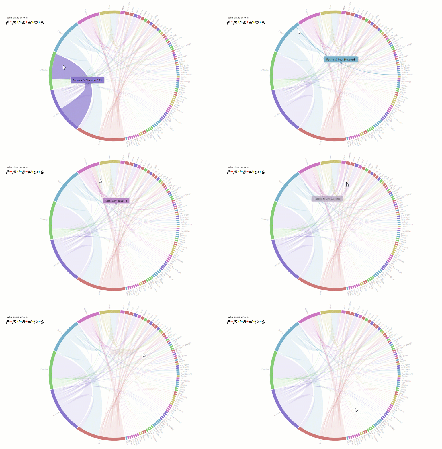
With minimum lines of code and using an object-based approach, you can build any chart.
Integration options
You can use it with vanilla JavaScript, React, Angular2+ projects. It also integrates with Ember, RequireJS, Cordova / PhoneGap, webpack. You can use it as a plugin for WordPress.
The latest version is written in TypeScript, therefore, there are no problems in integrating with this language.
Customization
You can tailor colors, gradients, patterns, themes, zoom and localize charts. Besides, it’s possible to enable responsive settings of charts to make them look accurate on any device’s screen. The adapters can be used to override the default functionality.
Also, charts support right-to-left (RTL) languages such as Arabic, Aramaic, Hebrew, Farsi, and others.
To complement the existing functionality with new features, you can load extra plugins (e.g., Regression trend lines, Slice Grouper)
Documentation
We’d like to note that the product is well-documented and the documentation is nicely organized by logical sections. What is more, each demo contains the source code that helps to understand how to use charts with frameworks. You can simply copy-paste and create a chart.
General impression
All in all, this library is definitely worth your attention. Feel free to use it in your data visualization projects.
Check out how to create a dashboard with amCharts and WebDataRocks Pivot:

AnyChart is a JavaScript library that provides a collection of beautiful charts that run on any device and browser, including IE 6 and can be integrated with any app.
A lot of companies, startups, governmental and educational organizations all around the world choose AnyChart. Among the largest ones, there are Microsoft, Ford, Samsung, At&T, Nokia, Bosch, Oracle, McDonald’s, Citi, and others.
Chart types
There is a family of products that serve different purposes. You can use AnyStock to visualize financial data, AnyMap to display data in maps, AnyGantt to track performance inside the organization.
Other kinds of charts and maps you can try are area, bar, bar mekko, box, pie, Pareto, line, error, bubble, cherry, bullet, column charts, gauges, maps, candlestick and bullet charts, and many more. All of them are noteworthy.
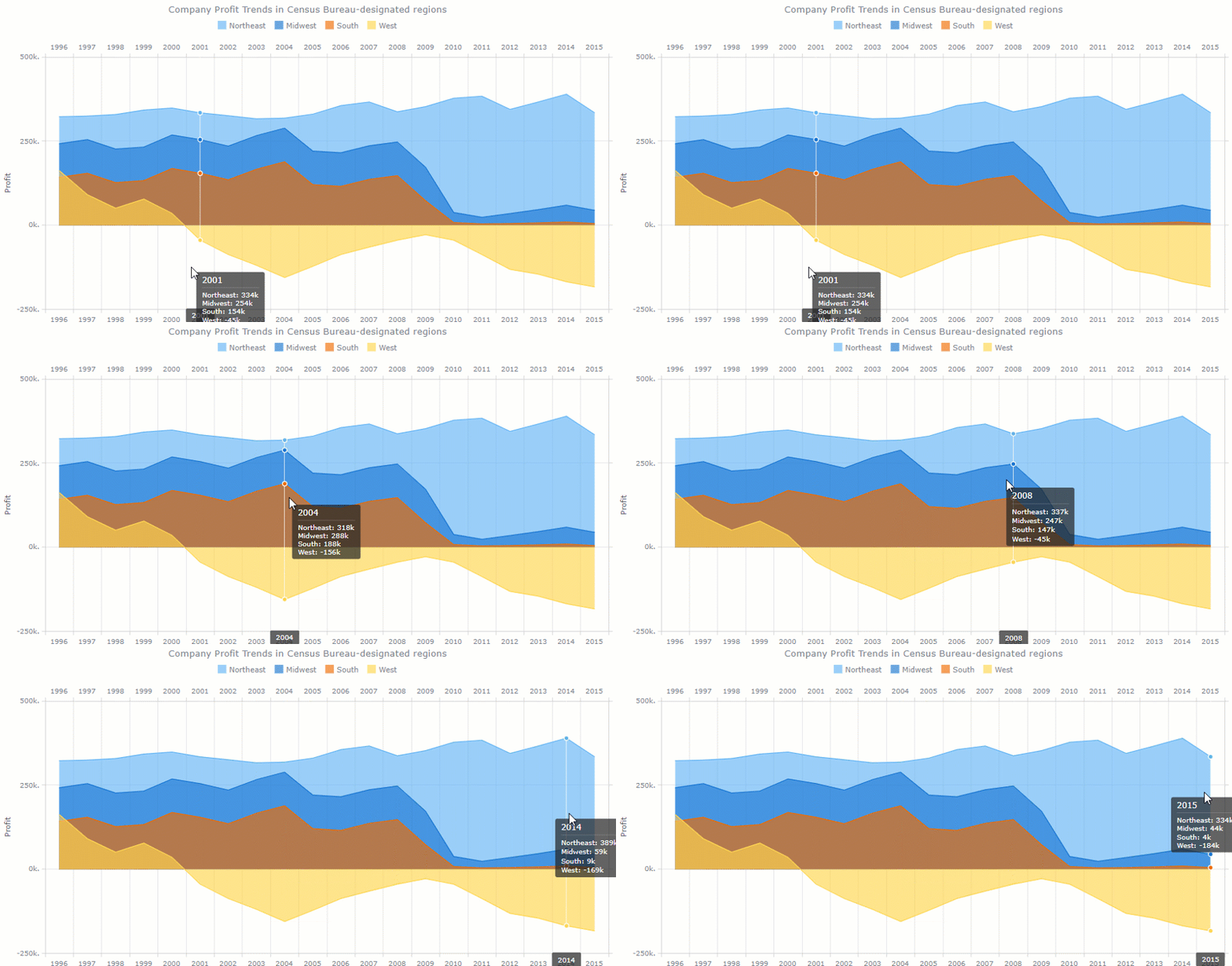
Besides, the list of charts is constantly updated.
Integration options
Works well with scripting languages (PHP, ASP, ColdFusion, Perl).
Integrations with Elasticsearch and Backbone are planned.
Customization
You can customize everything manually or by using scripts.
Documentation
The documentation allows walking through all general concepts of using charts effortlessly. It’s divided into sections: the General User’s Guide is a great place to start with, the API Reference with all properties and methods, the Playground – a sandbox for running charts, and Chartopedia for discovering all kinds of charts.
General impression
This lightweight charting library offers brisk visualizations that deserve to be a part of your data visualization project.
Dashboards with WebDataRocks and AnyChart:

ChartJS is a free and open-source JavaScript charting library.
Getting started is easy: you can install it via CDN, Bower, jsDelivr, or npm and create your first chart.
Data
To fill the chart with information, you should make sure that your data fits the structure required for a certain type of visualization. In most cases, it’s an array of numbers or objects.
Chart types
There are eight kinds of charts you can add to your project: bar, line, pie, radar, area, bubble, scatter and a polar area.

All charts are rendered in canvas elements that are supported in all modern browsers.
Customization
You can configure fonts, colors, texts, tooltips, scales, chart’s size, gradients, as well as add scriptable properties and transitions.
What is especially cool is the ability to configure animations. There are a lot of easing functions that modify the motion of charts.
Also, try using plugins – they represent an extra way to change the charts.
Integration options
You can use ChartJS with plain JS and various bundlers. There are also React, Meteor, Vue, Ember, Angular wrappers available.
We recommend trying extensions for ChartJS that extend the capabilities of the original charting library. The extensions are contributed by developers – you can support this trend and suggest your ideas of making charts better.
Documentation
The most important information is at your fingertips in the documentation which is short yet comprehensive.
General impression
ChartJS is lightweight and simple. The visualizations it has to offer are enough for basic data exploration. But if you need more diverse charts (e.g., for statistical analysis or visualizing geospatial data), it’s better to stick to other solutions presented on this article’s list.
See how to create a data dashboard with WebDataRocks Pivot and ChartJS:
In this blog post, we’ve covered top JavaScript data visualization libraries and showed how these can be combined. We encourage you to take some time exploring the data in interactive dashboards. Hopefully, these will help to improve your data analysis and bring value to your business.
We believe customizing should be easy. Hence, we’ve prepared plenty of tutorials to make your pivot table component look and work uniquely:
Searching for ways to improve your programming skills? Try GitConnected – here you can find a rich collection of the most up-to-date coding tutorials.