Importance of analytics
Employees often spend hours trying to compose meaningful reports with inconvenient tools, creating a big drain on efficiency in the team.
To prevent this from happening, you can provide them with ready-to-use data dashboard libraries equipped with interactive features and intelligible visualizations.
As a developer, you can build such a dashboard right in your app with the help JavaScript libraries.
The advantage of this approach is that it makes development flexible – you can control all the aspects of a dashboard (both visual and functional) and customize it whenever required.
Where to start
Firstly, understand your problem and objectives.
Since the core purpose of any dashboard library is to communicate actionable information at a glance, you need to figure out the far-reaching goals of analysis and define metrics or KPIs to measure in a specific department.
Secondly, define the dashboard’s structure. The data dashboard can consist of many elements of varying complexity: charts, tables, maps, graphs, networks, diagrams, word clouds, timelines, widgets, etc.
Key characteristics of a full-featured dashboard library are the ease of customization and displaying trends in data.
Keeping this in mind, we’ve decided to provide you with an overview of popular JavaScript data visualization libraries which charts can be used as a dashboard’s components. We’ll also focus on “a pivot table + charts” combination and show how to build a dashboard with WebDataRocks Pivot and any of the listed charting libraries.
But firstly, a few words about WebDataRocks.
What is WebDataRocks

WebDataRocks is a lightweight JavaScript pivot table component that runs on any browser and integrates with any front-end and back-end technology. Its functionality is aimed primarily at creating tabular reports in a fast-paced and efficient manner.
The coolest thing is that you can integrate this component as a part of an embedded business intelligence solution.
Its core features are:
- Aggregation functions.
- Slicing & dicing data via the drag-and-drop.
- Calculated values feature for tracking custom metrics.
- Filtering based on members and values.
- Report filters that can be applied to the entire report.
- Highlighting cells via conditional formatting.
- Number formatting.
- Built-in exporting of reports to PDF, HTML, Excel.
- The drill-through feature that helps to know which records stand behind the aggregated values.
And a lot more!
All these reporting features are at hand via the UI and make WebDataRocks Pivot so essential for data analysis.
The pivot table has a smooth learning curve. To explore more features, please refer to our UI Guide. If you prefer the code-first approach, you are welcome to dive deeper into the API reference.
Integrations
Available tutorials on integrations will walk you through using a pivot in React, Angular, AngularJS, and jQuery projects.
Another shiny feature is that you can use a pivot control with any charting library of your choice.
Charts
We are excited to present our top of charting libraries that you can use with WebDataRocks. ?

With over 8K stars on GitHub, the Highcharts library holds the leading positions among free and commercial charting solutions on the market. It’s widely used across diverse industries: from computer software and IT to higher education and financial services. It’s also favored by such top companies as Facebook, Microsoft, StackOverflow, MasterCard, and others.
You can run it either on top of jQuery or on top of its framework.
It’s easy to get started – simply install packages via CDN, npm, Bower or locally.
Data
You can load data from a CSV file, HTML tables or Google Sheets. You can even visualize the real-time data from a server.
Chart types
The Highcharts library provides a whole family of charts: Highstock, Highmaps, Highcharts Gantt.
Among the basic charts there are gauges, area, areaspline, bar, column, error bar, box plot, funnel, heat maps, line, pie, polar range, waterfall, scatter, spline charts, treemaps, and more.
Integration options
Supports TypeScript, React, Django integrations.
Documentation
The documentation is divided into topics that contain logically linked tutorials. You can quickly get used to all primary concepts and move to create more sophisticated charts.
A particular point of interest is the Use cases section. Here you can check real examples of industry-specific usage.
Customization
There are a lot of aspects you can configure through options:
- Customize the design of charts by changing colors, gradients, axes, titles, predefined styles and even create your theme.
- Add the drill-down, zooming features, tooltips, bubble legends, scrollbars.
- Make charts responsive.
It’s also possible to extend Highcharts functionality by writing custom plugins.
General impression
Highcharts stand out from the rest thanks to a wide variety of responsive charts for all purposes and the ease of usage – the code is incredibly developer-friendly.
If you want to communicate your data effectively, this library is a perfect choice.
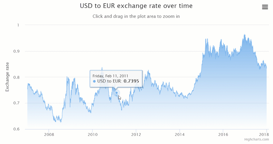
Dashboards with Highcharts and WebDataRocks:

FusionCharts is one of the most widely used charting libraries written in JavaScript.
It offers three types of installation: via CDN, npm or locally.
Chart types
Once you start working with FusionCharts, a broad spectrum of charts is at your disposal: maps, columns, bar, line, area, pie, donut, stacked, bubble, scatter charts, heat maps, Gantt, Pareto, box and whisker, bullet charts, gauges, and more.
All charts are categorized by purposes and accompanied by the code you can play with.
Most of the charts are available in 3D versions. There are also their real-time charts which means you can stream real-time data through charts. Another benefit is that there are a lot of charts for time-series analysis.
Integration options
It integrates easily with such front-end technologies as React, Angular, jQuery, Vue, Ember, AngularJS, and React Native. Plus, it works well with apps that are written in Java, PHP, Ruby on Rails, Django, ASP.NET.
If you want to integrate FusionCharts with Highcharts – it’s not a problem as well.
Customization options
Personalize charts by changing colors, titles, labels, add tooltips, animations, and exporting options, apply themes. Using API events, you can build custom scenarios around the component.
You can even add a special extension to make charts more accessible to any end-user and great looking on any screen and device.
Documentation
The documentation is user-friendly – it walks you through the basics to advanced custom charts creating. What is more, you can take a look at how to build each chart using various frameworks.
If you want to develop your storytelling skills and learn how to communicate information, we strongly recommend delving into the Data stories section where you can find many industry-oriented demos.
General impression
Regardless of your level of expertise, it takes a brief time to figure out how charts work and configure them. This is all thanks to a rich gallery of examples.
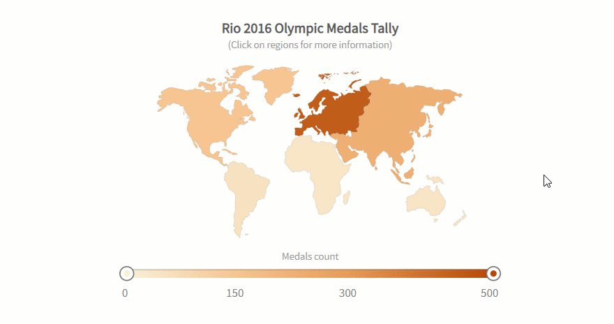
Dashboards with FusionCharts and WebDataRocks:
- Sales analysis with the pivot table and charts
- Dashboard with the pivot table and charts: dark theme
- 3D bar chart and the pivot table

Google Charts is one of the most popular services for creating web-based data visualization. It’s created and maintained by Google.
You can install it by simply including JS scripts and loaders to your web page.
Data
The simplest way to use Google Charts is by setting JSON data in the chart’s configuration. Under the hood, it will be represented by DataTable and DataView classes.
Other options include connecting data from your database, importing data from Salesforce, Google Fusion Tables, or Google Sheets. As an advanced option, you can implement your data source protocol to fill the charts with data from custom data sources.
Also, you can embed charts right in spreadsheets.
Chart types
It offers pre-built visualizations that serve for diverse purposes: bar, column, combo, area line, geo, pie, donut, bubble, scatter charts, histograms, gauges, timelines, candlestick charts, word trees, and a lot more.
Integration options
There are no official integration guides with frameworks but you can find wrappers for Angular, React, Vue, and TypeScript definitions contributed by passionate developers.
Customization
You can customize the look and feel of every chart effortlessly by setting their options in the chart’s draw() method.
Change axes, formatters, lines, crosshairs, points, overlays, tooltips, animations, add toolbars – it’s all possible.
If you want to run certain scenarios upon the user’s actions or describe complex interactions between charts and widgets placed on the same web page, you can do it with events.
Chosen charts are available in material design which makes charts look modern in any app.
Documentation
The library’s functionality is well-documented and exemplary. The structure of the documentation is intuitive and consists of many tutorials. It guides you through all the important aspects of visualizing data: from installing the library to creating advanced web dashboards.
General impression
Charts are easy-to-use for both beginners and skilled developers.
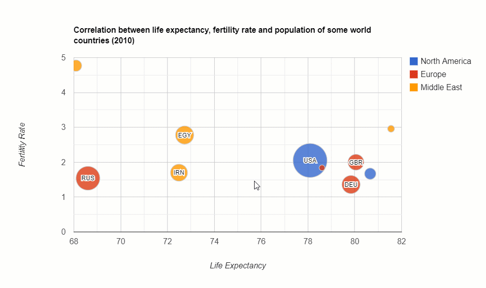
See how to build a dashboard with WebDataRocks Pivot and Google Charts:
- Sales analytics
- WebDataRocks Pivot Table with Google Charts Map
- Marketing analytics with WebDataRocks and Google Charts
- WebDataRocks with Google Charts: Bubble Chart

AmCharts is a charting library that can brighten up any project with truly eye-catching visualizations. Among customers, there are Amazon, eBay, Microsoft, CISCO, Apple, PayPal and a lot of other outstanding companies.
The library runs on any platform and browser and can be used with mobile platforms.
You can include it via CDN, npm or install it right on your server.
Note your browser must support SVG technology (which is true for all modern browsers).
To make it work perfectly on mobile devices, you can activate touch-specific UX features.
Chart types
A collection of charts contains pie, line, column, pyramid, polar, dumbbell, bubble, stacked column, Gantt charts, histograms and many more. It also comes with plenty of charts for visualizing time-series data. You can also visualize geographical data with maps.
With minimum lines of code and using an object-based approach, you can build any chart.
Integration options
You can use it with vanilla JavaScript, React, Angular2+ projects. It also integrates with Ember, RequireJS, Cordova / PhoneGap, webpack. You can use it as a plugin for WordPress.
The latest version is written in TypeScript, therefore, there are no problems in integrating with this language.
Customization
You can tailor colors, gradients, patterns, themes, zoom and localize charts. Besides, it’s possible to enable responsive settings of charts to make them look accurate on any device’s screen. The adapters can be used to override the default functionality.
Also, charts support right-to-left (RTL) languages such as Arabic, Aramaic, Hebrew, Farsi, and others.
To complement the existing functionality with new features, you can load extra plugins (e.g., Regression trend lines, Slice Grouper)
Documentation
We’d like to note that the product is well-documented and the documentation is nicely organized by logical sections. What is more, each demo contains the source code that helps to understand how to use charts with frameworks. You can simply copy-paste and create a chart.
General impression
All in all, this library is definitely worth your attention. Feel free to use it in your data visualization projects.
Check out how to create a dashboard with amCharts and WebDataRocks Pivot:

AnyChart is a JavaScript library that provides a collection of beautiful charts that run on any device and browser, including IE 6 and can be integrated with any app.
A lot of companies, startups, governmental and educational organizations all around the world choose AnyChart. Among the largest ones, there are Microsoft, Ford, Samsung, At&T, Nokia, Bosch, Oracle, McDonald’s, Citi, and others.
Chart types
There is a family of products that serve different purposes. You can use AnyStock to visualize financial data, AnyMap to display data in maps, AnyGantt to track performance inside the organization.
Other kinds of charts and maps you can try are area, bar, bar mekko, box, pie, Pareto, line, error, bubble, cherry, bullet, column charts, gauges, maps, candlestick and bullet charts, and many more. All of them are noteworthy.
Besides, the list of charts is constantly updated.
Integration options
Works well with scripting languages (PHP, ASP, ColdFusion, Perl).
Integrations with Elasticsearch and Backbone are planned.
Customization
You can customize everything manually or by using scripts.
Documentation
The documentation allows walking through all general concepts of using charts effortlessly. It’s divided into sections: the General User’s Guide is a great place to start with, the API Reference with all properties and methods, the Playground – a sandbox for running charts, and Chartopedia for discovering all kinds of charts.
General impression
This lightweight charting library offers brisk visualizations that deserve to be a part of your data visualization project.
Dashboards with WebDataRocks and AnyChart:

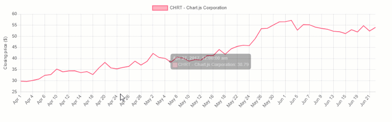
ChartJS is a free and open-source JavaScript charting library.
Getting started is easy: you can install it via CDN, Bower, jsDelivr, or npm and create your first chart.
Data
To fill the chart with information, you should make sure that your data fits the structure required for a certain type of visualization. In most cases, it’s an array of numbers or objects.
Chart types
There are eight kinds of charts you can add to your project: bar, line, pie, radar, area, bubble, scatter and a polar area.
All charts are rendered in canvas elements that are supported in all modern browsers.
Customization
You can configure fonts, colors, texts, tooltips, scales, chart’s size, gradients, as well as add scriptable properties and transitions.
What is especially cool is the ability to configure animations. There are a lot of easing functions that modify the motion of charts.
Also, try using plugins – they represent an extra way to change the charts.
Integration options
You can use ChartJS with plain JS and various bundlers. There are also React, Meteor, Vue, Ember, Angular wrappers available.
We recommend trying extensions for ChartJS that extend the capabilities of the original charting library. The extensions are contributed by developers – you can support this trend and suggest your ideas of making charts better.
Documentation
The most important information is at your fingertips in the documentation which is short yet comprehensive.
General impression
ChartJS is lightweight and simple. The visualizations it has to offer are enough for basic data exploration. But if you need more diverse charts (e.g., for statistical analysis or visualizing geospatial data), it’s better to stick to other solutions presented on this article’s list.
See how to create a data dashboard with WebDataRocks Pivot and ChartJS:
Putting it all together
In this blog post, we’ve covered top JavaScript data visualization libraries and showed how these can be combined. We encourage you to take some time exploring the data in interactive dashboards. Hopefully, these will help to improve your data analysis and bring value to your business.
Extra: pivot table personalization
We believe customizing should be easy. Hence, we’ve prepared plenty of tutorials to make your pivot table component look and work uniquely:
- How to change the theme of the pivot table
- How to use conditional formatting in the pivot table
- How to customize the Toolbar of the pivot table
- How to create a custom theme for the pivot table
- How to localize the pivot table
How to become a better developer
Searching for ways to improve your programming skills? Try GitConnected – here you can find a rich collection of the most up-to-date coding tutorials.