
Correlation is a powerful statistical concept that refers to a linear relationship between variables. It lies in the center of regression analysis techniques.
And when it comes to visualizing relationships between variables, you cannot avoid using charts. They are a great assistance in assessing the quality of predictive regression models.
Charts that show correlation are used at the first step toward detection of cause-effect relationships (but one should remember that correlation doesn’t always imply causation).
In this article, we’ll to cover the purpose and the structure of two basic charts – a scatter plot and bubble chart.
A classical chart for any statistician when it comes to correlation and distribution analysis. It’s perfect for searching distribution trends in data.
Structure
The variable on the y-axis is a dependent variable while the x-axis variable – independent.
Purpose
Use it to check whether there is any relationship between two variables. The presence of a certain kind of relationship simply means that changes in the independent variable lead to changes in values of the dependent variable.
With this chart, you can also notice anomalies or clusters in data.
Recommendations
Example
Check the relationship between the spent amount of hours studied and final grades results

If data points are scattered in a random pattern or form a curve, that means that there is no correlation. However, it’s possible that there is a non-linear relationship between variables.
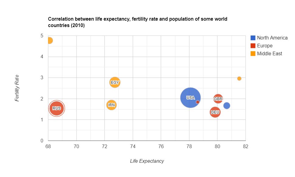
A bubble chart is simply a variation of a scatter chart.
Purpose
Use it to identify the relationship between data points.
The bubble chart is essential for visualizing the 3- or 4-dimensional data on the plane.
Structure
The x-axis corresponds to an independent variable, the y-axis – to a dependent. The third and fourth variables can be represented by the size of a data point and its color. The size should be proportional to the value of the dependent variable and the color should correspond to a certain category.
Recommendations
Examples

Today we’ve discussed the charts which are widely used in predictive analytics.
We aim to share with you the most important information related to data visualization.
To deepen your knowledge about charts, check out other parts of the data visualization project:
If you want to visualize aggregated data in charts, you can integrate WebDataRocks Pivot Table with Google Charts or Highcharts: