Creating multilevel hierarchies in CSV
When working with CSV data, you can define multilevel hierarchies directly in the file.
To create a multilevel hierarchy
Step 1. Choose fields that will be the levels of the hierarchy.
Step 2. For each level, specify the full path to its parent fields using colons.
Example
Here is an example of a Country > City > District hierarchy:
Country, Country:City, Country:City:District, Invoice Date
France, Nice, Port, 8/17/2025
Germany, Munich, Schwabing, 1/5/2025
France, Nice, Port, 9/26/2025
Italy, Naples, Posillipo, 4/8/2025
USA, Los Angeles, Downtown, 5/25/2025
This demo is also available on our CodePen.
See also
By default, WebDataRocks can auto-detect basic data types such as strings, numbers, and dates, but you can use all available data types to enrich your visualization. To set types explicitly, use the metadata object in JSON or data type prefixes in CSV.
After setting field data types, see the guides about connecting to the JSON or connecting to the CSV data.
Available data types
The following data types are available in WebDataRocks:
Number
This field type is used to store numbers.
Available aggregations: all.
See how to set this type for a field in your data source:
JSON
Set the type property of the field’s metadata object to "number":
"Price": {
  "type": "number"
}
Read how to specify number values in JSON data.
CSV
Add the - data type prefix to the field name.
Here is an example of CSV data with the Quantity number (-) field:
-Quantity, Product
3, Cars
4, Bikes
2, Components
2, Bikes
Read how to specify number values in CSV data.
String
This field type is used to store strings.
Available aggregations: Count, Distinct Count.
See how to set this type for a field in your data source:
JSON
Set the type property of the field’s metadata object to "string":
"Product": {
  "type": "string"
}
Read how to specify string values in JSON data.
CSV
Add the + data type prefix to the field name.
Here is an example of CSV data with the Product string (+) field:
Quantity, +Product
3, Cars
4, Bikes
2, Components
2, Bikes
Read how to specify string values in CSV data.
Date
WebDataRocks offers a wide range of date types. Review the options in this section to select the most suitable one.
Read how to specify date values in JSON or CSV data.
Year, Month, Day subfields
The date is divided into 3 string subfields: Year, Month, Day.
This is the default format for all date fields unless a different type is specified in the metadata object or prefixes.
Available aggregations: Count, Distinct Count.
See how to set this type for a field in your data source:
JSON
Set the type property of the field’s metadata object to "date":
"Date": {
  "type": "date"
}
CSV
Add the d+ data type prefix to the field name:
d+Invoice Date, Quantity, Country
2018-05-15, 3, France
2018-05-16, 4, Italy
2018-05-17, 2, Spain
2018-05-12, 2, Japan
Year > Month > Day multilevel hierarchy
The date is represented as a multilevel hierarchy with the following levels: Year > Month > Day.
Available aggregations: Count, Distinct Count.
See how to set this type for a field in your data source:
JSON
Set the type property of the field’s metadata object to "year/month/day":
"Date": {
  "type": "year/month/day"
}
CSV
Add the D+ data type prefix to the field name:
D+Invoice Date, Quantity, Country
2018-05-15, 3, France
2018-05-16, 4, Italy
2018-05-17, 2, Spain
2018-05-12, 2, Japan
Year > Quarter > Month > Day multilevel hierarchy
The date is represented as a multilevel hierarchy with the following levels: Year > Quarter > Month > Day.
Available aggregations: Count, Distinct Count.
See how to set this type for a field in your data source:
JSON
Set the type property of the field’s metadata object to "year/quarter/month/day":
"Date": {
  "type": "year/quarter/month/day"
}
CSV
Add the D4+ data type prefix to the field name:
D4+Invoice Date, Quantity, Country
2018-05-15, 3, France
2018-05-16, 4, Italy
2018-05-17, 2, Spain
2018-05-12, 2, Japan
“dd/MM/yyyy” format
The date is displayed as a string in the "dd/MM/yyyy" format.
Available aggregations: Min, Max, Count, Distinct Count.
The format can be changed using the datePattern option.
See how to set this type for a field in your data source:
JSON
Set the type property of the field’s metadata object to "date string":
"Date": {
  "type": "date string"
}
CSV
Add the ds+ data type prefix to the field name:
ds+Invoice Date, Quantity, Country
2018-05-15, 3, France
2018-05-16, 4, Italy
2018-05-17, 2, Spain
2018-05-12, 2, Japan
“dd/MM/yyyy HH:mm:ss” format
The date is displayed as a string in the "dd/MM/yyyy HH:mm:ss" format.
Available aggregations: Min, Max, Count, Distinct Count.
The format can be changed using the dateTimePattern option.
See how to set this type for a field in your data source:
JSON
Set the type property of the field’s metadata object to "datetime":
"Date": {
  "type": "datetime"
}
CSV
Add the dt+ data type prefix to the field name:
dt+Invoice Date, Price, Country
2018-05-15T18:30:00, 329, France
2018-05-16T06:20:00, 139, Italy
2018-05-17T13:45:00, 429, Spain
2018-05-12T04:50:00, 559, Japan
Time
This field type is used to store time intervals, such as duration.
Available aggregations: Min, Max, Count, Distinct Count.
See how to set this type for a field in your data source:
JSON
Set the type property of the field’s metadata object to "time":
"Duration": {
  "type": "time"
}
Read how to specify time values in JSON data.
CSV
Add the t+ data type prefix to the field name.
Here is an example of CSV data with the Duration time (t+) field:
t+Duration, Movie, ReleaseYears
7020, Blade Runner, 1980-1990
5220, The Lion King, 1990-2000
7560, Jurassic Park, 1990-2000
9120, The Dark Knight, 2000-2010
Read how to specify time values in CSV data.
Month
Fields of this type store months. Natural sorting is applied to the field members: from January to December.
Available aggregations: Count, Distinct Count.
See how to set this type for a field in your data source:
JSON
Set the type property of the field’s metadata object to "month":
"Month": {
  "type": "month"
}
Read how to specify month values in JSON data.
CSV
Add the m+ data type prefix to the field name.
Here is an example of CSV data with the Month month (m+) field:
m+Month, Price, Country
Apr, 329, France
Feb, 139, Italy
Jan, 429, Spain
Dec, 559, Japan
Read how to specify month values in CSV data.
Weekday
Fields of this type store the days of the week. Natural sorting is applied to the field members: from Sunday to Monday.
Available aggregations: Count, Distinct Count.
See how to set this type for a field in your data source:
JSON
Set the type property of the field’s metadata object to "weekday":
"Week Day": {
  "type": "weekday"
}
Read how to specify weekday values in JSON data.
CSV
Add the w+ data type prefix to the field name.
Here is an example of CSV data with the Week Day weekday (w+) field:
w+Week Day, Quantity, Country
Tuesday, 3, France
Wednesday, 4, Italy
Thursday, 2, Spain
Saturday, 2, Japan
Read how to specify weekday values in CSV data.
Level (only for JSON)
This field type means that a field is a level of a multilevel hierarchy. Level fields are stored as strings.
To mark the field as a hierarchy level, set the type property of the field’s metadata object to "level".
Available aggregations: none (fields of this type cannot be used as measures).
Hidden (only for JSON)
This field type is used to hide fields from the report.
To mark the field as hidden, set the type property of the field’s metadata object to "hidden".
Available aggregations: none.
Note. Another way to hide fields from the report is to exclude them from the metadata object.
Automatic type detection
If you omit the field’s type in the JSON metadata object or CSV prefixes, the component detects the data type based on the field’s first value. The following data types can be auto-detected:
See the example of automatic type detection in JSON.
The results of the automatic detection may be unexpected when:
- The first field value is
null. In this case, the field type cannot be detected automatically. - The first field value is formatted differently from other values. For example, the first value is a number while the others are strings.
- Field values are not formatted correctly. For example, a number was specified in hexadecimal form instead of decimal.
- Field values may be confused with values of other types. For example, time values are processed as numbers if the
"time"type is not explicitly specified.
See also
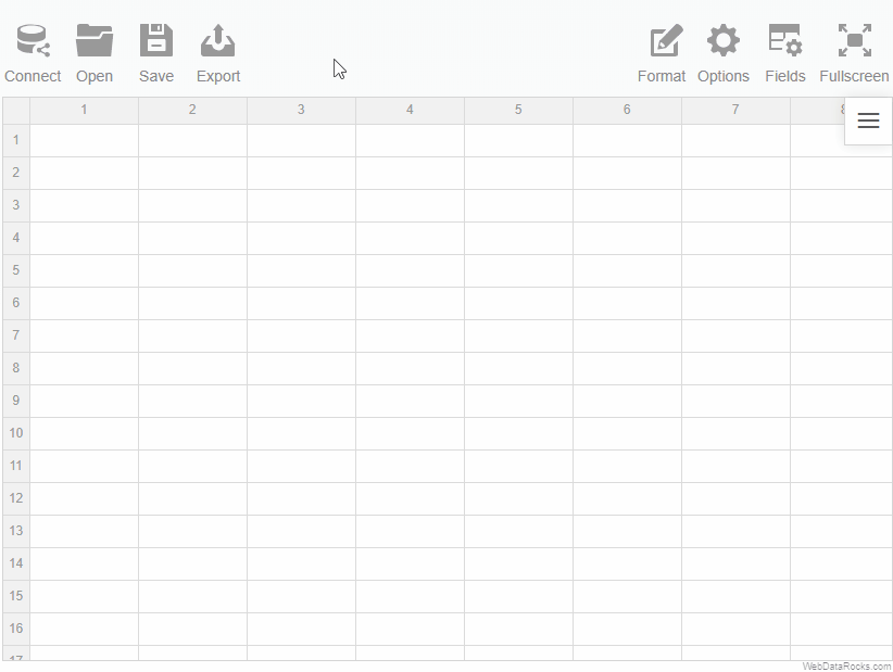
You can hide the spreadsheet headers with column and row numbers, which are displayed by default on the grid.
To hide column and row numbers
Set the grid.showHeaders property to false in the Options Object.
There are several ways to apply this setting, depending on whether the pivot table is configured during report initialization or at runtime:
On initialization
This approach is useful when you want spreadsheet headers to be hidden by default:
const report = {
  options: {
    grid: {
      showHeaders: false
    }
  }
};
At runtime
You can toggle the visibility of spreadsheet headers at runtime by using the setOptions() API call:
this.$refs.pivot.webdatarocks.setOptions({ grid: { showHeaders: false }});
this.$refs.pivot.webdatarocks.refresh();
Example
This tutorial explains how to connect WebDataRocks to any third-party charting library (for example, Chart.js, ApexCharts, ECharts, or D3.js).
WebDataRocks can be integrated with charting libraries using the getData() API call, which returns data displayed on the grid. Then, you need to preprocess the data to a format required by your charting library and pass it to the chart.
In this tutorial, we will integrate with Chart.js, but the steps are similar for other libraries.
Note that if you are integrating with amCharts, Highcharts, FusionCharts, or Google Charts, use our ready-to-use connectors that will automatically process the data. Check out the list of available tutorials.
Step 1. Add WebDataRocks to your project
Step 1.1. Complete the integration guide. Your code of the component with WebDatarocks should look similar to the following:
<script setup>
  import { Pivot } from "@webdatarocks/vue-webdatarocks";
  import "@webdatarocks/webdatarocks/webdatarocks.css";
</script>

<template>
  <div>
    <Pivot
     toolbar
    />
  </div>
</template>
Step 1.2. Create a report for WebDataRocks — connect to the data source and define which fields should be displayed in rows, columns, and measures:
<script setup>
  import { Pivot } from "@webdatarocks/vue-webdatarocks";
  import "@webdatarocks/webdatarocks/webdatarocks.css";

  const report = {
    dataSource: {
      filename: "https://cdn.webdatarocks.com/data/data.csv",
    },
    slice: {
      rows: [
        {
          uniqueName: "Country",
        },
      ],
      columns: [
        {
          uniqueName: "Measures",
        },
      ],
      measures: [
        {
          uniqueName: "Price",
          aggregation: "sum",
        },
      ],
    },
  };
</script>

<template>
  <div>
    <Pivot
     toolbar
     v-bind:report="report"
    />
  </div>
</template>
The fields you’ve specified in the report will be shown on the chart.
Step 2. Get a reference to the WebDataRocks instance
Some of WebDataRocks methods and events are needed to create a chart. Using a reference to the WebDataRocks instance, we can access WebDataRocks API.
Get the reference as follows:
<script setup>
  // ...
  import { ref } from "vue";

  const pivotRef = ref(null);

  // ...
</script>

<template>
  <div>
    <Pivot
     ref="pivotRef"
     toolbar
     v-bind:report="report"
    />
</template>
Now it’s possible to interact with the component through pivotRef.value.webdatarocks.
Step 3. Add a charting library
Note that this tutorial integrates WebDataRocks with Chart.js. The following steps may vary depending on your charting library.
Step 3.1. Install the npm package with your charting library. For example:
npm install vue-chartjs
Step 3.2. Import the charting library into your component:
import { PolarArea } from "vue-chartjs";
import {
  Chart as ChartJS,
  RadialLinearScale,
  ArcElement,
  Tooltip,
  Legend,
} from "chart.js";

ChartJS.register(RadialLinearScale, ArcElement, Tooltip, Legend);
Step 3.3. Add a container for your chart in the template of the component:
<PolarArea/>
Step 3.4. Create a reference to store the chart data:
const chartData = ref({
  labels: [],
  datasets: [
    {
      data: [],
    },
  ],
});
We will pass the data from the component to chartData in step 4.3.
Step 3.5. Pass the chart data to the chart container:
<PolarArea v-bind:data="chartData" />
Step 4. Integrate WebDataRocks with the charting library
In this step, we will use the getData() API call. This method was added especially for integration with third-part charting libraries; using it, you can request data from WebDataRocks and pass it to a charting library.
Step 4.1. If we call the getData() method before WebDataRocks is fully loaded, it will return an empty result. To know when WebDataRocks is ready to provide data for the chart, handle the reportcomplete event:
<script setup>
// ...

function reportComplete () {
  // Unsubscribing from reportcomplete
  // We need it only to track the initialization of WebDataRocks
  pivotRef.value.webdatarocks.off("reportcomplete");
  createChart();
}
</script>

<template>
  <div>
    <Pivot
     ref="pivotRef"
     toolbar
     v-bind:report="report"
     v-bind:reportcomplete="reportComplete"
    />
    <PolarArea v-bind:data="chartData" />
  </div>
</template>
Step 4.2. Implement the createChart() function using the getData() API call:
function createChart() {
  if (pivotRef.value) {
    pivotRef.value.webdatarocks.getData(
      {},
      // Function called when data for the chart is ready
      drawChart,
      // Function called on report changes (filtering, sorting, etc.)
      drawChart
    );
  };
};
Step 4.3. Implement the drawChart() function specified in the previous step. This function will initialize the chart, set all the configurations specific to this chart type, and fill it with the data provided by WebDataRocks:
function drawChart(rawData) {
  const { labels, values } = prepareData(rawData); // This function will be implemented in step 5

  // Configuring the chart and filling it with data
  chartData.value = {
    labels: labels,
    datasets: [
      {
        data: values,
        backgroundColor: [
          "rgba(255, 99, 132, 0.5)",
          "rgba(54, 162, 235, 0.5)",
          "rgba(255, 206, 86, 0.5)",
          "rgba(75, 192, 192, 0.5)",
          "rgba(153, 102, 255, 0.5)",
          "rgba(255, 159, 64, 0.5)",
        ],
      },
    ],
  };
};
Step 5. Prepare the data
getData() API call returns an object (e.g., rawData) that contains the data from the grid and its metadata. The metadata includes a number of fields in rows and columns in the slice, an array of format objects, etc. Read more about the getData() response.
Here is an example of the rawData.data array returned by getData(). This data is based on the slice that was defined in the step 1.2:
data: [
  { v0: 6221870 }, // Grand total
  { r0: "Australia", v0: 1372281 },
  { r0: "France", v0: 1117794 },
  { r0: "Germany", v0: 1070453 },
  { r0: "Canada", v0: 1034112 },
  { r0: "United States", v0: 847331 },
  { r0: "United Kingdom", v0: 779899 }
]
This raw data now must be transformed to match the data format required by your charting library, in our case — Chart.js. Let’s create a function that will preprocess the data, for example, prepareData().
We are passing data to the data.labels and data.datasets properties, where data.labels contains field members and data.datasets contains values. Read more in the Chart.js documentation.
The prepareData() function for Chart.js will look similar to the following:
const prepareData = (rawData) => {
  const labels = rawData.data.filter((rec) => rec.r0 && rec.v0).map((rec) => rec.r0);
  const values = rawData.data.filter((rec) => rec.r0 && rec.v0).map((rec) => rec.v0);

  return { labels, values };
};
prepareData() must return an object with the data that can be used by your charting library. The example shows the returned object for Chart.js:
{
  labels: ["Australia", "France", "Germany", "Canada", "United States", "United Kingdom"],
  values: [1372281, 1117794, 1070453, 1034112, 847331, 779899]
}
Step 6. Run the project
Run your project with the following command:
npm run dev
Open http://localhost:5173/ in the browser to see how the pivot table looks in combination with Chart.js.
Try filtering the data, changing measures, and adjusting aggregation functions — the chart will be updated at once.
Check out the full code
After completing this tutorial, the full code of the integration should look as follows:
<script setup>
  import { Pivot } from "@webdatarocks/vue-webdatarocks";
  import "@webdatarocks/webdatarocks/webdatarocks.css";
  import { ref } from "vue";

  import { PolarArea } from "vue-chartjs";
  import {
    Chart as ChartJS,
    RadialLinearScale,
    ArcElement,
    Tooltip,
    Legend,
  } from "chart.js";

  ChartJS.register(RadialLinearScale, ArcElement, Tooltip, Legend);

  const pivotRef = ref(null);

  const chartData = ref({
    labels: [],
    datasets: [
      {
        data: [],
      },
    ],
  });

  const report = {
      dataSource: {
        filename: "https://cdn.webdatarocks.com/data/data.csv",
      },
      slice: {
        rows: [
          {
            uniqueName: "Country",
          },
        ],
        columns: [
          {
            uniqueName: "Measures",
          },
        ],
        measures: [
          {
            uniqueName: "Price",
            aggregation: "sum",
          },
        ],
      },
    };

  function reportComplete () {
    // Unsubscribing from reportcomplete
    // We need it only to track the initialization of WebDataRocks
    pivotRef.value.webdatarocks.off("reportcomplete");
    createChart();
  };

  function createChart() {
    if (pivotRef.value) {
      pivotRef.value.webdatarocks.getData(
        {},
        drawChart,
        drawChart
      );
    };
  };

  function drawChart(rawData) {
    const { labels, values } = prepareDataFunction(rawData);

    chartData.value = {
      labels: labels,
      datasets: [
        {
          data: values,
          backgroundColor: [
            "rgba(255, 99, 132, 0.5)",
            "rgba(54, 162, 235, 0.5)",
            "rgba(255, 206, 86, 0.5)",
            "rgba(75, 192, 192, 0.5)",
            "rgba(153, 102, 255, 0.5)",
            "rgba(255, 159, 64, 0.5)",
          ],
        },
      ],
    };
  };

  const prepareDataFunction = (rawData) => {
    const labels = rawData.data.filter((rec) => rec.r0 && rec.v0).map((rec) => rec.r0);
    const values = rawData.data.filter((rec) => rec.r0 && rec.v0).map((rec) => rec.v0);

    return { labels, values };
  };
</script>

<template>
  <div>
    <Pivot
       ref="pivotRef"
       toolbar
       v-bind:report="report"
       v-bind:reportcomplete="reportComplete"
    />
    <PolarArea v-bind:data="chartData" />
  </div>
</template>
See also
This step-by-step tutorial will help you integrate WebDataRocks with amCharts. Our tutorial is based on the V4 of amCharts.
Supported chart types
WebDataRocks Connector for amCharts takes the data from the pivot table and prepares it according to the structure of an array of objects required by amCharts. As a result, any chart type will work with WebDataRocks Pivot Table.
Here is the list of demos that show how to integrate different chart types with WebDataRocks:
- Column Chart (demo)
- Line Chart (demo)
- Stacked Column Chart (demo)
- Bar Chart (demo)
- Clustered Bar Chart (demo)
- Stacked Bar Chart (demo)
- Radar Chart (demo)
- Bubble Chart (demo)
- Pie Chart (demo)
- Semi-circle Pie Chart (demo)
- Donut Chart (demo)
- Nested Donut Chart (demo)
- Radar Chart with switched axes (demo)
Follow the steps below to start creating interactive data visualizations.
Step 1. Add WebDataRocks to your project
Step 1.1. Complete the integration guide. Your code of the component with WebDatarocks should look similar to the following:
<script setup>
  import { Pivot } from "@webdatarocks/vue-webdatarocks";
  import "@webdatarocks/webdatarocks/webdatarocks.css";
</script>

<template>
  <div>
    <Pivot
     toolbar
    />
  </div>
</template>
Step 1.2. Create a report for WebDataRocks — connect to the data source and define which fields should be displayed in rows, columns, and measures:
<script setup>
  import { Pivot } from "@webdatarocks/vue-webdatarocks";
  import "@webdatarocks/webdatarocks/webdatarocks.css";

  const report = {
    dataSource: {
      filename: "https://cdn.webdatarocks.com/data/data.csv",
    },
    slice: {
      rows: [
        {
          uniqueName: "Country",
        },
      ],
      columns: [
        {
          uniqueName: "Measures",
        },
      ],
      measures: [
        {
          uniqueName: "Price",
          aggregation: "sum",
        },
      ],
    },
  };
</script>

<template>
  <div>
    <Pivot
     toolbar
     v-bind:report="report"
    />
  </div>
</template>
The fields you’ve specified in the report will be shown on the chart.
Step 2. Get a reference to the WebDataRocks instance
Some of WebDataRocks methods and events are needed to create a chart. Using a reference to the WebDataRocks instance, we can access WebDataRocks API.
Get the reference as follows:
<script setup>
  // ...
  import { ref } from "vue";

  const pivotRef = ref(null);

  // ...
</script>

<template>
  <div>
    <Pivot
     ref="pivotRef"
     toolbar
     v-bind:report="report"
    />
</template>
Now it’s possible to interact with the component through pivotRef.value.webdatarocks.
Step 3. Add amCharts
Step 3.1. Install the amCharts 4 npm package with the following command:
npm install @amcharts/amcharts4
Step 3.2. Import amCharts into your component:
import * as am4core from "@amcharts/amcharts4/core";
import * as am4charts from "@amcharts/amcharts4/charts";
import am4themes_animated from "@amcharts/amcharts4/themes/animated";

// Apply the imported theme
am4core.useTheme(am4themes_animated);
Step 3.3. In the template of the component, add a <div> container for your chart:
<template>
  <div>
    <Pivot
       ref="pivotRef"
       toolbar
       v-bind:report="report"
    />
    <div id="amchartsContainer" style="width: 100%; height: 300px"></div>
  </div>
</template>
Step 3.4. Create a shallowRef variable to store the chart:
import { ref, shallowRef } from "vue";
// ...

const chartRef = shallowRef(null);
Step 4. Show the data from the pivot table on the chart
Step 4.1. Import the WebDataRocks Connector for amCharts:
import "@webdatarocks/webdatarocks/webdatarocks.amcharts.js";
The Connector provides the amcharts.getData() method, which gets data from WebDataRocks and converts it to the format required by amCharts.
Step 4.2. If we call the amcharts.getData() method before WebDataRocks is fully loaded and ready to use, it will return an empty result. To know when WebDataRocks is ready to provide data for the chart, handle the reportcomplete event:
<script setup>
// ...

function reportComplete () {
  // Unsubscribing from reportcomplete
  // We need it only to track the initialization of WebDataRocks
  pivotRef.value.webdatarocks.off("reportcomplete");
  createChart();
}
</script>

<template>
  <div>
    <Pivot
     ref="pivotRef"
     toolbar
     v-bind:report="report"
     v-bind:reportcomplete="reportComplete"
    />
    <div id="amchartsContainer" style="width: 100%; height: 300px"></div>
  </div>
</template>
Now the chart will be created only when the data is loaded and the report is ready.
Step 4.3. Implement the createChart() function. This function will use the amcharts.getData() method from the Connector:
function createChart() {
  pivotRef.value.webdatarocks.amcharts.getData(
    {},
    // Function called when data for the chart is ready
    drawChart,
    // Function called on report changes (filtering, sorting, etc.)
    drawChart
  );
}
Step 4.5. Create a function to draw the chart. drawChart() initializes the chart, sets all the configurations specific for this chart type, and fills it with the data provided by WebDataRocks:
function drawChart(chartConfig, rawData) {
  // Create chart instance
  // The selector must match the id of the <div> container for the chart
  let chart = am4core.create("amchartsContainer", am4charts.XYChart);

  // Add data processed by Flexmonster to the chart
  chart.data = chartConfig.data;

  // Create category axis for a column chart
  let categoryAxis = chart.xAxes.push(new am4charts.CategoryAxis());
  categoryAxis.dataFields.category = pivotRef.value.webdatarocks.amcharts.getCategoryName(rawData);
  // Create value axis
  chart.yAxes.push(new am4charts.ValueAxis());
  // Create and configure series
  let series = chart.series.push(new am4charts.ColumnSeries());
  series.dataFields.categoryX = pivotRef.value.webdatarocks.amcharts.getCategoryName(rawData);
  series.dataFields.valueY = pivotRef.value.webdatarocks.amcharts.getMeasureNameByIndex(rawData, 0);

  chartRef.value = chart;
}
Learn more about the amcharts.getCategoryName() and amcharts.getMeasureNameByIndex() API calls.
Step 4.6. Set the autoDispose global option to true. As a result, the chart will be automatically disposed when it is necessary:
am4core.useTheme(am4themes_animated);
am4core.options.autoDispose = true;
Step 5. Run the project
Run your project with the following command:
npm run dev
Open http://localhost:5173/ in the browser to see an interactive dashboard with WebDataRocks and FusionCharts. The column chart shows the data from WebDataRocks and reacts instantly to any changes in the report.
Learn more about available chart configurations in the amCharts Documentation.
Check out the full code
After completing this tutorial, the full code of the component should look as follows:
<script setup>
import { Pivot } from "@webdatarocks/vue-webdatarocks";
import "@webdatarocks/webdatarocks/webdatarocks.css";
import { ref, shallowRef } from "vue";
import * as am4core from "@amcharts/amcharts4/core";
import * as am4charts from "@amcharts/amcharts4/charts";
import am4themes_animated from "@amcharts/amcharts4/themes/animated";
import "@webdatarocks/webdatarocks/webdatarocks.amcharts.js";
am4core.useTheme(am4themes_animated);
am4core.options.autoDispose = true;
const pivotRef = ref(null);
const chartRef = shallowRef(null);
const report = {
dataSource: {
filename: "https://cdn.webdatarocks.com/data/data.csv",
},
slice: {
rows: [
{
uniqueName: "Country",
},
],
columns: [
{
uniqueName: "Measures",
},
],
measures: [
{
uniqueName: "Price",
aggregation: "sum",
},
],
},
};
function reportComplete () {
pivotRef.value.webdatarocks.off("reportcomplete");
createChart();
}
function createChart() {
pivotRef.value.webdatarocks.amcharts.getData(
{},
drawChart,
drawChart
);
}
function drawChart(chartConfig, rawData) {
let chart = am4core.create("amchartsContainer", am4charts.XYChart);
chart.data = chartConfig.data;
let categoryAxis = chart.xAxes.push(new am4charts.CategoryAxis());
categoryAxis.dataFields.category = pivotRef.value.webdatarocks.amcharts.getCategoryName(rawData);
chart.yAxes.push(new am4charts.ValueAxis());
let series = chart.series.push(new am4charts.ColumnSeries());
series.dataFields.categoryX = pivotRef.value.webdatarocks.amcharts.getCategoryName(rawData);
series.dataFields.valueY = pivotRef.value.webdatarocks.amcharts.getMeasureNameByIndex(rawData, 0);
chartRef.value = chart;
}
</script>
<template>
<div>
<Pivot
ref="pivotRef"
toolbar
v-bind:report="report"
v-bind:reportcomplete="reportComplete"
/>
<div id="amchartsContainer" style="width: 100%; height: 300px"></div>
</div>
</template>
See also
If you want to pick up where you left while working with the previous report, you can load it into the pivot table:
Loading the report via the Toolbar
To load a local report
- Go to the Open tab () on the Toolbar.
- Select Local report.
To load a remote report
- Go to the Open tab () on the Toolbar.
- Select Remote report.
- Enter the URL of the remote report.

Loading the report programmatically
Load your report while embedding WebDataRocks by specifying a path to your report file:
<script setup>
  import { Pivot } from "@webdatarocks/vue-webdatarocks";
  import "@webdatarocks/webdatarocks/webdatarocks.css";
</script>

<template>
  <div>
    <Pivot
      report="https://cdn.webdatarocks.com/reports/report.json"
      toolbar
    />
  </div>
</template>
WebDataRocks Toolbar is designed to make your web reporting experience easier and more convenient. You can customize the Toolbar in the following ways:
- Add new custom tabs.
- Remove the tabs you don’t need.
- Reorder/change the existing tabs.
- Set your custom icons for tabs.
Important Before customizing the Toolbar, ensure it is enabled.
Let’s see how to customize the Toolbar in practice.
All customization can be made using the beforetoolbarcreated event which is triggered before the Toolbar is created. The event’s handler will be responsible for changing the Toolbar.
How to remove tabs
Step 1. Assign a handler (e.g., customizeToolbar) to the beforetoolbarcreated event. The handler function has the toolbar as a parameter that contains information about the Toolbar.
Step 2. Inside the handler (e.g., customizeToolbar), retrieve all the tabs using the toolbar.getTabs() method. It returns an array of objects that describe tabs’ properties.
Step 3. To remove a tab, delete a corresponding object from the array of tabs.
Your code should look similar to the following example:
<script setup>
import { Pivot } from "@webdatarocks/vue-webdatarocks";
import "@webdatarocks/webdatarocks/webdatarocks.css";

const customizeToolbar = (toolbar) => {
  // Get all tabs from the Toolbar
  let tabs = toolbar.getTabs();
  if (tabs.length > 0) {
    // Delete the Connect tab
    tabs = tabs.filter(tab => tab.id !== "wdr-tab-connect");
  }
  toolbar.getTabs = () => tabs;
};
</script>

<template>
 <div>
  <Pivot
    toolbar
    :beforetoolbarcreated="customizeToolbar"
  />
 </div>
</template>
How to add new tabs
Step 1. Assign a handler (e.g., customizeToolbar) to the beforetoolbarcreated event. The handler function has the toolbar as a parameter that contains information about the Toolbar.
Step 2. Inside the handler (e.g., customizeToolbar), retrieve all the tabs using the toolbar.getTabs() method. It returns an array of objects that describe tabs’ properties.
Step 3. Add a new tab to the array of tabs.
Your code should look similar to the following example:
<script setup>
import { Pivot } from "@webdatarocks/vue-webdatarocks";
import "@webdatarocks/webdatarocks/webdatarocks.css";

const customizeToolbar = (toolbar) => {
  // Get all tabs from the Toolbar
  let tabs = toolbar.getTabs();
  toolbar.getTabs = () => {
    // Add a new tab
    tabs.unshift({
      id: "fm-tab-newtab",
      title: "New Tab",
      handler: yourCustomFunction,
      icon: toolbar.icons.open,
    });
    return tabs;
  };
};

const yourCustomFunction = () => {
  // Your functionality
}
</script>

<template>
 <div>
  <Pivot
    toolbar
    :beforetoolbarcreated="customizeToolbar"
  />
  </div>
</template>
How to add a tab with a drop-down
Step 1. Add a new tab.
Step 2. Define the menu property of this tab. This property should contain an array of drop-down menu items, each with a Tab Object structure.
In the example below, we add a new tab with a drop-down menu to change themes:
<script setup>
import { Pivot } from "@webdatarocks/vue-webdatarocks";
import "@webdatarocks/webdatarocks/webdatarocks.css";

// There will be one drop-down tab in the Toolbar
const customizeToolbar = (toolbar) => {
  let tabs = [];
  toolbar.getTabs = () => {
    tabs.unshift({
      id: "theme-dropdown",
      title: "Theme",
      menu: [
        {
          id: "default-theme",
          title: "Default",
          handler: () => setTheme("/")
        },
        {
          id: "dark-theme",
          title: "Dark",
          handler: () => setTheme("/theme/dark/"),
        },
        {
          id: "lightblue-theme",
          title: "Light Blue",
          handler: () => setTheme("/theme/lightblue/"),
        },
      ],
      icon: toolbar.icons.options,
    });
    return tabs;
  };
};

const setTheme = (theme) => {
  // ...
};
</script>

<template>
  <div>
    <Pivot
      toolbar
      :beforetoolbarcreated="customizeToolbar" />
  </div>
</template>
Even more advanced customization
In this guide, we mentioned how to remove the Toolbar tabs and how to add a new one. For further customization, you can reorder the tabs, set the custom icons for the tabs, or implement new functionality. We recommend investigating the existing code to understand how the Toolbar works:
- Open the source code of the Toolbar –
webdatarocks.toolbar.jsfile. - Find a prototype of the
toolbar.getTabs()method. - Investigate how this method works.
You can also change the appearance of the Toolbar by changing the component theme.
See also
We use only open-source components in WebDataRocks. Here is a list of all libraries and links to their respective licenses:
- html2canvas v1.0.0-rc.1 – MIT License
- FileSaver.js v1.3.1 (modified by Flexmonster) – MIT License
- jsPDF v1.5.3 – MIT License
- JSZip v3.1.5 – MIT License
See also
| Feature | Availability |
|---|---|
| – Grid | |
| Virtual grid that ensures smooth rendering and scrolling the rows | |
| Sort the members of the rows and columns | |
| Sort by values | |
| Drag and drop the hierarchies on the grid | |
| Drill through the cells | |
| Drill the hierarchies up and down | |
| Expand and collapse the hierarchies on the grid | |
| Resize the rows and columns on the grid | |
| Grand totals and subtotals | |
| Compact pivot table | |
| Classic pivot table | |
| Flat table | |
| Add multiple fields to the rows | |
| Add multiple fields to the columns | |
| Add multiple fields to the measures | |
| Create multilevel hierarchies | |
Select the string field as a measure (with count or distinctcount aggregation applied) |
|
| Select cells | |
| Copy selected cells | |
| Keyboard shortcuts to navigate on the grid | * |
| Highlight the rows and columns via the conditional formatting | |
| – Filter | |
| Filter by members using the checkbox | |
| Filtering by members using the search input box | |
| Filtering by value (Top X records) | |
| Filtering by value (Bottom X records) | |
| Report filters | |
| – Fields | |
| Adding and editing calculated values via UI | |
| Dragging fields in the Field List | |
| Displaying hierarchy levels in the Field List | |
| The Expand All option in the Field List | |
| The Field List in the drill-through pop-up window | |
| – Aggregation functions | |
| “sum” | |
| “count” | |
| “distinctcount” | |
| “average” | |
| “median” | |
| “product” | |
| “min” | |
| “max” | |
| “percent” | |
| “percentofcolumn” | |
| “percentofrow” | |
| “index” | |
| “difference” | |
| “%difference” | |
| “stdevp” (Population Standard Deviation) | |
| “stdevs” (Sample Standard Deviation) | |
| “runningtotals” | |
| – The Toolbar | |
| Save a report | |
| Open a report | |
| Conditional formatting | |
| Number formatting | |
| Connect to a CSV data source | |
| Connect to a JSON data source | |
| Full-screen mode | |
| – Export | |
| Print reports | |
| Export reports to HTML | |
| Export reports to MS Excel | |
| Export reports to PDF | |
| Add custom headers and footers (PDF, HTML) | |
| Add custom sheet names (Excel) | |
| – Options | |
| Language localization | |
| Apply a pre-defined report theme | |
| Date and time patterns | |
| – Integration with charting libraries | |
| amCharts | |
| Highcharts | |
| Google Charts | |
| FusionCharts | |
| Any charting library | |
| – Integration with frameworks and web technologies | |
| React | |
| Angular | |
| Vue | |
| Django | |
| Jupyter | |
| Flutter | |
| jQuery | |
| AngularJS |
* WebDataRocks supports basic keyboard shortcuts for navigation:
UpArrow,DownArrow,LeftArrow, andRightArrowto move the focus when navigating between cells.Shift + UpArrow,Shift + DownArrow,Shift + LeftArrow, andShift + RightArrowto extend cell selection.Ctrl + A(Command + A|Control + Aon macOS) to select all cells.Ctrl + C(Command + Con macOS) to copy selected cells.Spaceto expand and collapse a hierarchy.
Options available for developers:
| Feature | Availability |
|---|---|
| – General options | |
| Show or hide the Toolbar | |
| Show or hide the Field List | |
| Open or close the Field List via UI or API | |
| Show or hide the aggregation selection control in the Field List | |
| Show or hide the “Add calculated value” control in the Field List | |
| Enable or disable the drill-through feature | |
| Configure a slice in the drill-through pop-up window | |
| Show or hide the Field List in the drill-through pop-up window | |
| Show or hide the sorting controls | |
| Enable a default slice for the component | |
| Set a default sorting type for the hierarchy members: “asc”, “desc” or “unsorted” | |
| Change the aggregation labels via localization | |
| Define data types in CSV | |
| Define data types in JSON | |
| Different field separators for CSV | |
| Set global options for all reports | |
| Customize the Toolbar | |
| Define custom report themes | |
| Customize the context menu | |
| Expand or collapse all hierarchy members via API | |
| – Grid options | |
| Set the grid form. Possible values are: “compact”, “classic”, “flat” | |
| Set the grid title | |
| Show or hide the filtering controls | |
| Show or hide spreadsheet headers | |
| Show or hide subtotals | |
| Show or hide grand totals in the rows and/or columns | |
| Show or hide the hierarchy captions | |
| Show or hide report filters on the grid |
This page contains information about browsers compatible with WebDataRocks.
Starting from version 1.4, WebDataRocks follows the ES6 standard. As a result, the component will work correctly only in browsers that fully support ES6. You can find these browsers and their versions in the below table:
| Browser | Version |
|---|---|
| Chrome | 51+ |
| Firefox | 54+ |
| Microsoft Edge | 15-18, 79+ |
| Opera | 38+ |
| Safari | 10+ |
| iOS Safari | 10+ |
| Internet Explorer | Not supported* |
*To work with WebDataRocks in Internet Explorer, use WebDataRocks versions earlier than 1.4. The component’s version history is available on npm. See how to install a specific package version from npm.