
At the baseline, every database is a collection of data and information organized in rows and columns in tables, which is stored in a computer system, i.e., a database service. This information is frequently updated, modified, or deleted as needed. We can compare a typical database to a room or rack at the office, which holds important files. If there is no defined and structured process to store and retrieve these files, we may not know how to handle it by understanding which file is stored at which rack and so on.
Like the above example, a database management system or a DBMS is also a software that stacks the given database system’s data. DBMS offers the users and the programmers a defined set of procedures to write data, store it, update it, and backup or retrieve the same when needed. There are various types of database management practices and services used to store and update data. Here in this article, we aim to explore various DBMS applications when you have to make a choice.
A typical database management software’s objective is to keep the data stored in good shape and safe. Any standard database software tools will help reduce data redundancy and help maintain data’s overall efficiency. Many of the database management software out there is open source, and there are also some licensed and commercially sold with many add-on features.
Based on your requirement and usage, one can choose the most appropriate database management software to ensure the desired output. Given below is a filtered list of the most popular DB management software in use.
Oracle is the No.1 database management system, which is used by many top enterprises across the globe. It is relational DBMS or RDBMS software. The current latest version available in the market is Oracle 12C, in which the ‘C’ represents cloud computing. In every aspect, Oracle 12C brings the latest benefits of cloud computing into your enterprise database management.
Oracle DB can support supports multiple operating systems like Windows, Linux, and UNIX versions. The top features of Oracle DB software are:
For expert advice in choosing an appropriate database for remote DBA, get in touch with RemoteDBA.com.
Like Oracle, the IBM database management suite is in the top database management systems’ front line. The latest version of IBM DB2 is the release 11.1. IBM started offering DB management services back in 1983. This database is built on assembly languages like C, CPP, etc.
IBM DB2 supports various versions of Windows, Linux, and UNIX, etc. The matures features of this database are:
It is an enterprise-grade DBMS, which ensures optimum performance and speed. This database falls under the category of open-source relational DBMS. Altibase now boasts of more than 650 top enterprise clients, many of which are Fortune 500 companies. The providers have deployed more than 6000 mission-critical use cases worldwide, covering a wide range of industries. The major characteristics of Altibase are:
Unlike its competitors discussed above, Altibase is a functional hybrid DBMS.
Microsoft developed its first database monument system back in 1989 and is consistently developing it. The latest version, which came out in 2016, combines relational DBMS benefits with cloud storage. The programming language used to build MS SQL is Assembly C, C++, Linux, etc.
MS SQL can work on both Windows and Linux operating systems. Some of the top-notch features of MSSQL include:
ASE is the short form of Adaptive Server Enterprise. The latest version of this database software is 15.7. SAP started the same back in the middle of the 1980s. Similar to the other middle-level database management systems, Sybase also has many standards features as:
It is capable of performing millions of simultaneous transactions in a matter of seconds.
Teradata is one of the first-generation database management software, which was established in 1979. It can work on both Windows and Linux operating systems. Some of the top features of the latest version of Teradata DB software are:
ADABAS is the short form of an Adaptable Database System. It can run on Windows, Unix, and Linux operating systems. It is also a commercial tool that offers many customized packages for users to choose based on their requirements. The major features of ADABAS are:
Some other popular options for you to consider are MySQL, FileMaker, Microsoft Access, Informix, SQLite, Couchbase, Toad, Sequel PRO, Redis, CouchDB, Neo4j, PostgreSQL, Amazon RDS, MongoDB, SQL Developer, OrientDB, Cloudera, MariaDB, etc.
You can make a wise choice by comparing the features of each against your requirement at hand.
Searching for tools to analyze and visualize data from your database? Check out the list of JavaScript libraries to build dashboards with.
In the previous tutorial, you learned how to filter pivot table data to show relevant information first.
Let’s not stop there!
This time you’ll learn how to make your report look visually perfect. For this, you’ll use the interactive formatting feature of WebDataRocks.
An essential part of any report or dashboard is its readability. Your audience should understand its meaning at a glance.
Therefore, as a finishing masterstroke of your data analysis, you can format essential data to make it easy to digest.
In this tutorial, we will consider two main types of pivot table formatting, namely:
Want to get straight to the practice part?
Jump to the Live demos section.
Otherwise, let’s dive into the motivation behind data formatting first.
The number format defines how numerical values are shown on the grid. It is useful in many cases, for example:
Apart from the cases mentioned above, you can also:
To examine all the number formatting options, check out our detailed Pivot table number formatting guide.
You can set a number format for particular measures of the pivot table widget in any of the following ways:
Here is how end-users can format their data via the intuitive and comfy pop-ups:
The programmatical approach gives you more freedom to implement custom logic of formatting.
Let’s see the samples and gain some practical coding skills.
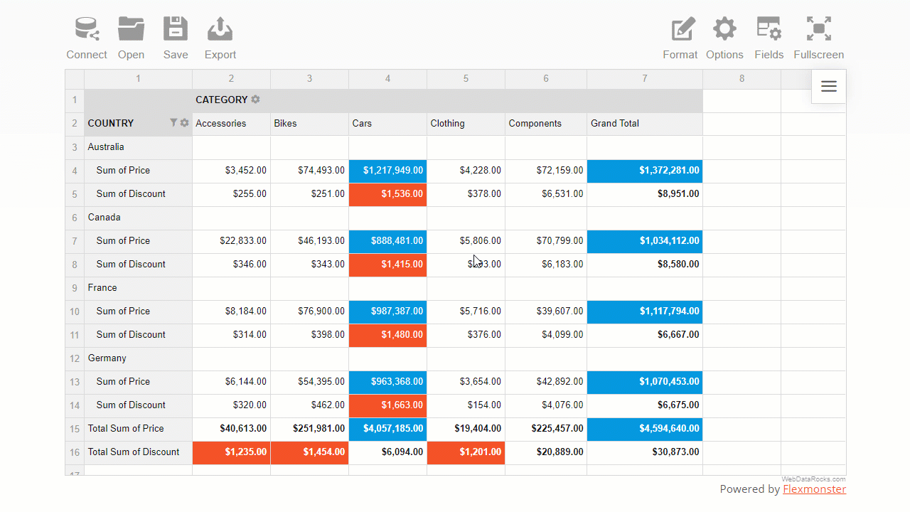
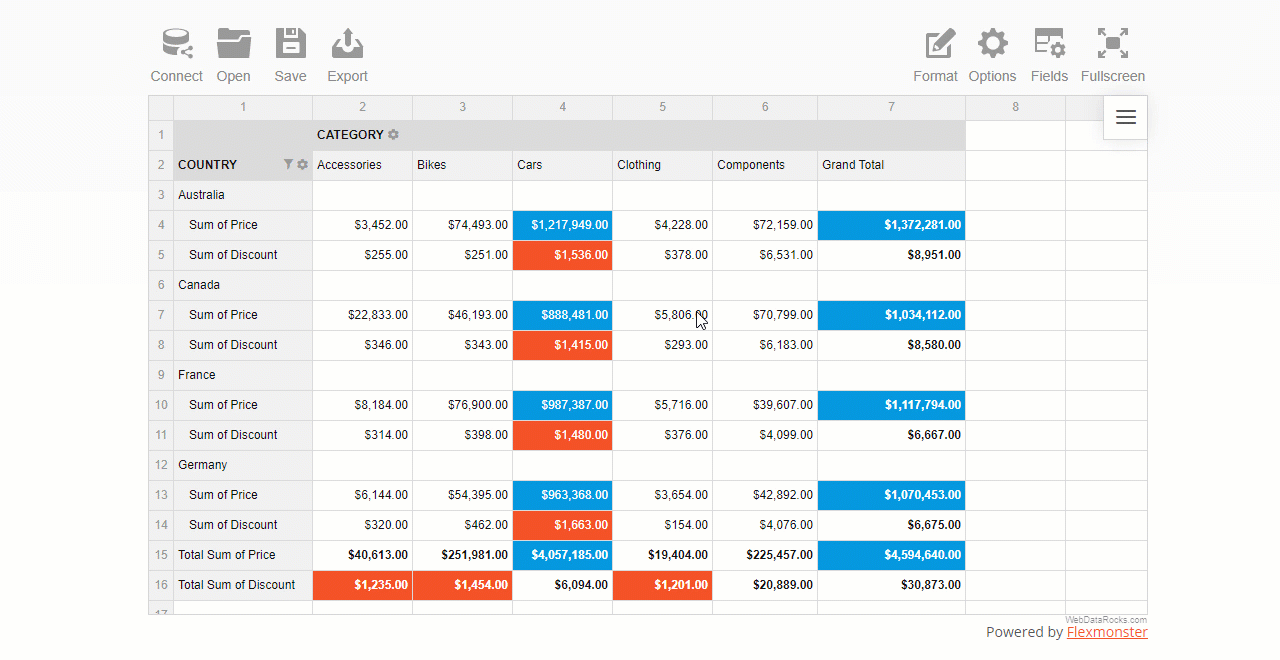
Conditional formatting is a particular formatting type by cells’ values.
The name itself suggests that formatting is based on conditions, i.e., user-defined rules that describe how values have to be formatted. This rule is a logical statement, also known as a boolean expression). The rules are always applied to the pivot table measures.
With conditional formatting, you can change the color of the cell’s background and text and manage the report’s typography: font color, family, and size.
This feature helps you highlight information that is crucial to see first. It also allows you to make trends in data more noticeable.
A comfy color picker lets you choose the color that suits your reporting goals best:
You can also set a custom hex color value for text or background.
For example, here is how you can color pivot grid cells green based on the values of the “Revenue” measure:
"conditions": [
        {
            "formula": "#value > 600",
            "measure": "Revenue",
            "format": {
                "backgroundColor": "#8BC34A",
                "color": "#FFFFFF",
                "fontFamily": "Arial",
                "fontSize": "12px"
            }
        }
    ]
Now you made sure how flexible WebDataRocks Pivot is when it comes to prettifying your data. Not only can you analyze your data fast but also prettify your report neatly and make it speak.
Documentation
More reporting tips & tricks
To improve your reporting skills, learn how to filter pivot table data, and set a data slice.
Ready to share results? Not sure how to do it best? We’ve got you covered here as well!
Move on to a detailed tutorial on how to save and export a pivot grid report.
Learn about the pivot table essentials with the detailed UI guide.
If, by any chance, there is an option that you haven’t found in WebDataRocks, we recommend testing Flexmonster Pivot Table & Charts – an even more powerful pivot table component. It offers extra number formatting options: negative numbers formatting, centered alignment of values, and more.

Today, every business, regardless of its size, deals with massive amounts of data. In fact, one can safely say that data is essential to the survival and progress of organizations. An Experian report says that over 90% of business executives believe that data plays a key role in forming business strategies.
However, data is only beneficial if you can make sense of and derive crucial insights out of it. Business executives have been trying to find ways to transform data and statistics into valuable intel that can be used to make decisions.
In recent years, tools like Power BI and Tableau have emerged as business solutions that allow users to convert data into neat visualizations. Modern data visualization tools are well-suited in dealing with huge chunks of data, organizing them, and transforming them into something meaningful.
Simply put, data visualization is the procedure of converting data into meaningful visual forms. But why are businesses so keen to do it? In this article, we will discuss how data visualization services can transform the way you do business.
One of the primary strengths of machine learning is the ability to process unstructured, raw data. However, plain text sometimes makes it difficult to portray or understand the results derived from data processing.
For instance, you have a tool that assesses social media traffic to determine your brand’s public perception. Now, the findings of that tool can either be in the form of a 150-page report or just a few well-designed visuals.
If you want a room full of customers, buyers, or potential investors to know that your business is growing, you will want the message to go across smoothly and clearly. The best way to do it would be to present the data in the form of visually-pleasing, simple bar charts, or line graphs. On the flip side, no investor or customer has the time to flip through hundreds of pages of dry numbers and text to see whether it is worth investing in your business or not. The key is to show the message, which is only possible through data visualization.
Data visualization is not restricted to trend charts and graphs, which have been around for decades. In fact, the ability to visualize and operate data sets helps businesses find new connections that they were previously unaware of.
You can identify which business conditions can influence other conditions, and which ones are unrelated. Many of these connections are only noticed upon ‘seeing’ your data.
Say, you are using a regular Excel table with a column each for revenue, expenses, and the sources of those numbers. Such a way of representing data will make it hard for you to derive insights.
On the other hand, depicting the same data through trend lines and charts will enable you to spot, for instance, your most and least profitable months, quarters, and years.
One thing that every business owner will agree upon is that the business world is one of relentless competition. In industries fueled by competition, time is perhaps the single-most-important factor determining business growth.
Let’s say that you and your competitors have a close eye on the industry trends. The business that will dominate the next quarter is the one which can make the correct decision, quickest. Agree?
Data visualization enables you to make better sense of data, such as future predictions and fast trends, in a timely manner. The resulting quicker and more informed decision-making will help your business gain the upper hand over its rivals.
With data visualization, you can contextualize apparently dissimilar bits of information. Looking at the bigger picture allows executives to identify vulnerable areas and act accordingly before those vulnerabilities start materializing.
At the same time, effective visualization will also pinpoint hidden growth opportunities that you can capitalize upon.
It is no secret that a picture is easier to remember than text. It is believed that people remember around 10 to 12 % of what they hear, but over 30% of something they see.
This means that no matter how well-explained your written report is, it will always make a lesser impact on people’s memories than a well-illustrated piece of data.
Organizational resistance is perhaps the biggest hurdle to implementing data analysis in business decision-making. Even though executives understand the importance of data science, they find it too inconvenient to utilize it regularly.
Data visualization can go a long way towards eliminating this hurdle by presenting data in interactive and perceptible formats (instead of in plain text).
It is observed that data-centric organizations generally fare better than organizations that trust their gut instincts for the bulk of their decisions. By prioritizing data visualization and its resulting insights, you can improve your company’s overall performance considerably. This is not to say that intuition does not play a role in decision-making, but that role might not be as substantial as many organizations believe.
In his book, 21 Lessons for the 21st Century, Yuval Noah Harari dedicates an entire chapter to the importance of data and why ‘people who own data, own the future.’ In the Fourth Industrial Revolution, the most significant players competed not for oil or gold but for information.
Therefore, businesses must know how to collect, observe, and visualize data adequately. If not, no matter how good your organization might be today, it will not be able to move with the times, and, before you know it, it will cease to exist.
Narwal is a US data visualization company that helps transform businesses by visualizing their data more efficiently. You can contact them today to get a free-of-cost consulting session.

The financial industry is famous for being traditional in many aspects, but they are slowly introducing new technologies to their processes. These trends utilize financial technology (fintech) and affect customer service, risk management, and real-time assessments for years to come. The best part about fintech is the use of artificial intelligence (AI) and blockchain, which are still in their early stages. The potential for their use is promising.
Blockchain is a tech trend that has impacted the financial industry the most in recent years.
Blockchain is the technology behind cryptocurrency, but it has many more applications besides that. It has become so popular because it makes transactions secure, transparent, and decentralized. But because transactions are decentralized, they no longer need a third party like a bank to participate in the transaction. Regardless, the banking sector can adopt this tech trend to make their systems more efficient and secure. For example, things like smart contracts that can fulfill themselves automatically when certain conditions are met will change the way we exchange money. Blockchain can also reduce the costs of operation for many financial companies.
One of the primary applications of AI and Machine Learning in the financial industry is the improvement of customer service through the use of chatbots. They automatically respond to simple queries any customer can have. Some robots can act as financial advisors in some cases. Similar trends in automation can be seen in all sectors. Robots are helping assembly lines create products for customers. This tech trend of using AI is also used to improve the security system in financial institutions. AI is used to predict attacks and prevent fraud. AI algorithms are already used to train models that can detect suspicious activities in bank accounts, make risk management analysis, user behavior, and so on. It is also behind big data analytics, voice interfaces, and robotic process automation.
Big data has changed how industries see and manage information. In the financial sector, data is used in everyday transactions, credit card buys, atm withdrawals, loans, and much more. With big data analytics, transaction information isn’t going to waste anymore. Financial institutions can have powerful insights through the use of data that help them make important decisions like whether or not to invest. These insights can save millions of dollars to many companies through the use of real-time risk analysis and fraud detection and prevention. It can also help improve their company performance and increase departments’ productivity.
Voice interfaces are changing a lot of aspects of our daily lives. Voice assistants, like Amazon’s Alexa and Apple’s Siri, are advanced technology that we see as standard nowadays. These are changes that are also being utilized to improve the financial industry. Companies and institutions like banks are reworking their platforms to adopt voice recognition software. Checking your bank account can be as simple as to say, “Alexa, what’s my bank account balance?” Chatbots are part of this tech trend. They can interact with these virtual assistants to give accurate answers in seconds. And, banks aren’t the only ones implementing this tech as chatbots can also provide quick financial advice like mentioned before.
These tech trends have already made changes in the financial industry. Blockchain, AI, voice interfaces, and big data make it possible to improve aspects like performance and lower costs. The application of these technologies will save the financial industry millions of dollars, and investing in them could determine their future standing.
Last time, you learned how to arrange fields on the grid and filter data records in a table.
In this tutorial, you will learn how to save your pivot table reports fast and conveniently.
We continue exploring the functionality of WebDataRocks Pivot – a reporting tool that integrates seamlessly with the most popular front-end frameworks. You can add it to your product and provide end-users with data visualization and analytics capabilities.
In the previous part of the “Reporting tips & tricks” series, you learned about the purposes of the pivot table’s data slice.
This time, you will learn how to make your reporting more advanced by creating filters in the pivot table.
In WebDataRocks Pivot, you can filter your data interactively or with a simple code configuration.
If you’d like to learn by doing without reading the explanations, jump straight to the section with live demos that show how to filter pivot table data in different ways.
The tutorial is divided into two main parts:
But first, let’s have a quick theoretical introduction.
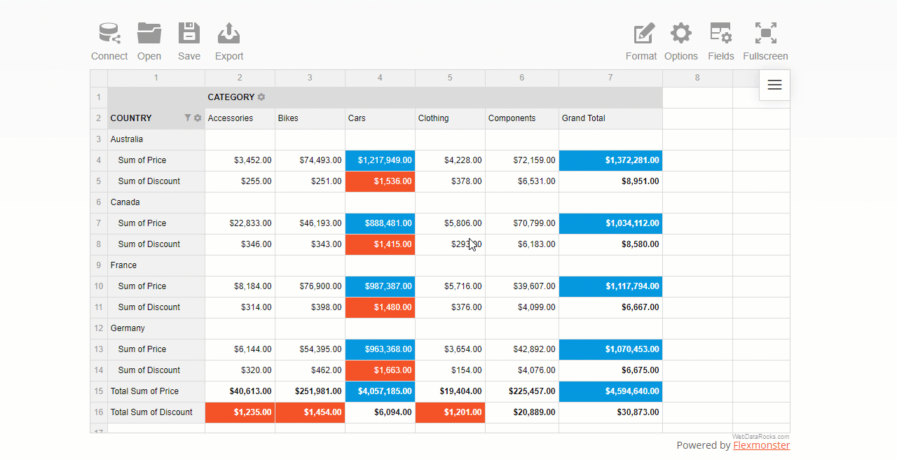
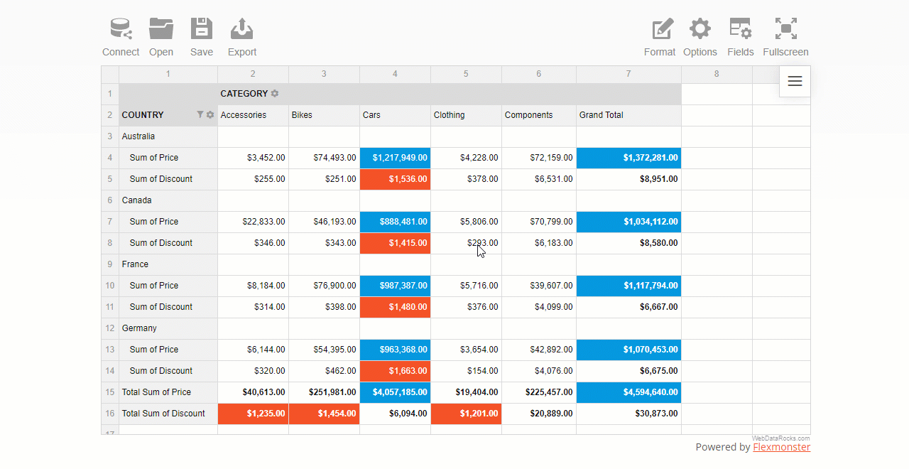
With filtering, you can perform a more in-depth analysis. To filter the data means to show a part of the data that meets a certain criterion. In other words, filtering is used to show specific information that’s relevant to a question a data analyst is asking.
Once the data is filtered, it’s narrowed to a smaller portion and doesn’t distract with unnecessary details.
WebDataRocks Pivot provides three main types of filters to end-users.
You can filter data by:
These two types filter data in specific rows or columns. Another filter type that stands aside is a report filter. It filters the entire report to show specific data records. In WebDataRocks Pivot, you can place a report filter above the grid’s header by dragging and dropping a field from the Field List.
The pivot table is designed to let you filter data on the fly.
Let us guide you through the filtering via the UI process.
After you configured the report, open the field values (members) list by clicking the field’s caption.
Check or uncheck the boxes near the field’s members that you want to include or exclude from the resulting data subset.
If the list of members is too large, using the search box comes in handy.
A value (number) filter filters records in a row or column field based on aggregated values.
There are two types of number filters you can use:
where X is the number of records to show on the grid.
This is pretty much similar to Excel’s filters by values you got used to.
To use a filter by value, click the field’s caption on the grid, select the number of data records, and the criteria – the highest or lowest measure’s values to display.
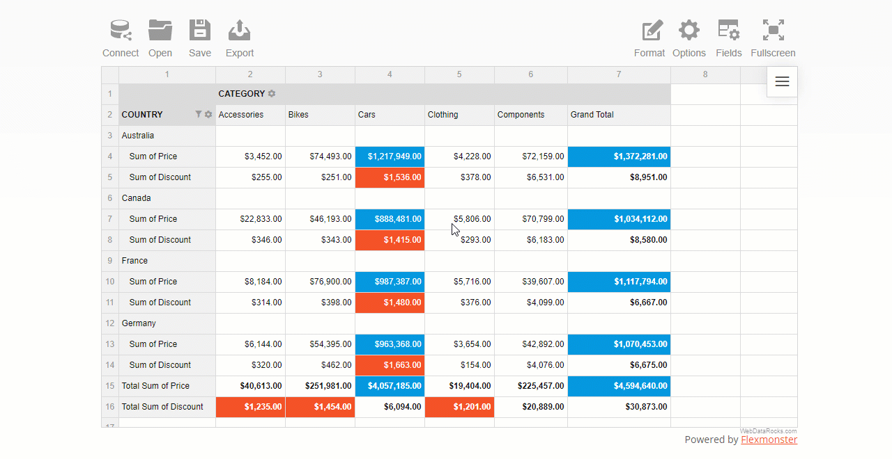
A report filter is applied to the entire report to show values for specific items.
First, open the Field List and choose the field to filter by. Next, open the list of members by clicking the field’s caption and filter data by members or values.
The area above the grid’s header is called the report filtering area:
You can also apply multiple filters to the hierarchy. For example, here’s how you can combine a filter by value and by member:
As you see, configuring filtering in a report is as easy as several clicks.
Now let’s get some coding practice and do the same but using JavaScript.
In the chosen hierarchy, add the filter object and specify an array of members. The negation property controls whether to include these members to the subset of fields shown on the grid or not.
Here’s a tiny code snippet that shows how to exclude two specific members from the Country hierarchy that is placed into rows:
"rows": [{
    "uniqueName": "Country",
    "filter": {
        "members": [
            "Country.United Kingdom",
            "Country.United States"
        ],
        "negation": true
    }
}]
In the filter’s object of a specific hierarchy, define the filter type, the number of records to show, and a measure to filter by:
"columns": [{
    "uniqueName": "Category",
    "filter": {
        "type": "top",
        "quantity": 2,
        "measure": "Discount"
    }
}]
Setting a report filter is similar to the above approach. The only difference is that doesn’t relate to any specific row or columns – the changes are applied to the entire grid. You can choose here any hierarchy you want to filter the data by.
Here’s how you can filter data records by a specific business type:
"reportFilters": [{
    "uniqueName": "Business Type",
    "filter": {
        "members": [
            "Business Type.Warehouse"
        ]
    }
}]
The best way to learn is by practice.
These demos will help you to understand how to add filters to the pivot table component. Feel free to experiment with code.
We hope you enjoyed this tutorial.
We would be happy to hear your thoughts on your progress with pivot table reporting. If any questions arise, contact our team on Forum.
To keep updated with new blog posts, you are welcome to follow WebDataRocks on Twitter.
This article is a part of the introduction to the web pivot table terminology. We do our best to show how to solve real-life use cases with our reporting tool.
Find more useful tips & tricks in the following blog posts and documentation:

R Shiny is a package for building interactive web apps with R.
The distinguishing feature of R Shiny is that you can build analytical apps with minimum lines of code and simple syntax, and put them on the web in a short time.
Great news for the data science and analytics community!
Now you can use our pivot table component in R Shiny projects.
We are extremely grateful to our active community for contributions. Thankfully to Mohamed El Fodil Ihaddaden, now our users can perform data analysis with WebDataRocks in R Shiny apps.
R Shiny comes with a great collection of interactive widgets. We believe WebDataRocks perfectly complements it. With the pivot table and simple syntax of R, you can build a dashboard that assists in connecting data scientists with decision-makers.
The role of WebDataRocks lies in aggregating and presenting your data in a neat tabular report. By handling all the data-related calculations, it acts as an engine for your dashboard. So, once it’s added to the dashboard, end-users can:
And more! To dive into the world of WebDataRocks features, peek into our UI guide.
Let’s apply our knowledge in practice and create a single-file R Shiny app with basic reporting functionality.
Create a new directory (e.g., reporting_app) and the app.R file that contains a user-interface definition and a server script. Run the R Studio and make this folder your working directory.
Next, install the pivtalibrary – a wrapper for R:
remotes::install_github("feddelegrand7/pivta")
Then, load the package to the app:
library(pivta)
Next, render the pivot table using pivta() function and passing the path to a data source and the report configuration as inputs.
pivta(dsource = "https://cdn.webdatarocks.com/data/data.csv", report = "https://cdn.webdatarocks.com/reports/report.json")
Here is how the full code of the app looks like:
library(shiny)
library(pivta)

ui <- fluidPage(

  # App title ----
  titlePanel("Reporting app"),
  pivtaOutput(outputId = "pivot_table")
)

server <- function(input, output) {

  output$pivot_table <- renderPivta({
    pivta(dsource = "https://cdn.webdatarocks.com/data/data.csv", report = "https://cdn.webdatarocks.com/reports/report.json")
  })
}

shinyApp(ui = ui, server = server)
Despite being simple, it creates an app with powerful pivoting features.
Now you have an interactive dashboard in your R Shiny app. You can extend the app's look and feel by tailoring the UI, add more interactive elements and graphs to your dashboard, or even implement more complex server-side logic.
Be open to experiments. Make your analysis more interactive, comprehensive, and powerful with WebDataRocks for R.

Find the R wrapper for WebDataRocks Pivot Table on GitHub.

If you’ve been following our release updates, then you definitely know we released integration with amCharts.
We feel this new shiny feature needs to be covered in more detail.
If you feel this way, too, make yourself comfortable and let’s figure out what this integration can bring to your reporting and data visualization processes.
If you’re new to the pivot table as an instrument for reporting, this article is a great place to get to know its core capabilities and astructure of a pivot table report. After reading, you can get straight to designing new reports with more confidence and professionalism.

Software production involves many stages, such as software design, software development, and many more. Software distribution is also an essential part of that process. It is like a logical continuation of development that determines where and how your end-user will get the product.
There are lots of platforms and stores offering themselves as a placement for your software. To decide whether to use this or another platform as a tool of distribution, you should certainly know who is your target audience and which platforms it uses most.
If you’re a JavaScript developer, you should research how JS libraries are usually distributed. You should adjust to customers and do everything so they can get your library in a way they usually get such software for their projects.
So, as a person interested in spreading the library, you should take two steps:
To help you with the first step, we gathered the most popular ways of JavaScript modules distribution.
Let’s start!
CDN aims to provide the quick transfer of resources needed for loading the webpage’s content: stylesheets, images, and javascript files. CDNs are becoming increasingly popular, and a significant part of web traffic is served through them.
Taking into account the availability of CDNs and the ease of use, we’re not surprised by their widespread acclaim.
Having your JS module accessible via CDN will not burden you, but bring many benefits to the users of your library.
You can start using CDNs with learning more about such CDN providers as Cloudflare, Amazon CloudFront, and Akamai. They are widely known for their reliability and quality of service.
How CDN may come in handy for the end-users:
First of all, GitHub is a perfect solution for open-source projects. Using GitHub as a repository gives you a community for the project. Thus, besides an additional platform for software distribution, you also get a bunch of people gathered around your library.
These people are an active network that can report bugs, fix them through pull requests, suggest new awesome features, and so on. It sounds like a good boost to your library’s development, isn’t it?
But even if your JavaScript software is commercial, GitHub is worth using. It can be an excellent option for promoting the library.
Does your library have any integrations with other libraries, frameworks, and technologies?
It’s a good idea to add different examples of such integrations to your repository. Thanks to these examples, people may discover your software when googling some related subjects.
Just a point to remember: GitHub is popular enough to be on the top of Google’s results, so you shouldn’t underestimate its power.
How having your library available through the GitHub may come in handy for the end-users:
The public npm registry is a database containing different JavaScript packages used for different developing purposes. When you use npm or yarn, the package you download is fetched right from that registry.
Since npm and its analogs are quite popular in web development, publishing your JS library on the npm registry might bring the lion’s share of users to the library.
How having your library available through the npm registry may come in handy for the end-users:
The NuGet Gallery maintains more than 200 000 unique packages for .NET developing. Like the npm registry for npm, it is the storage the NuGet package manager uses when downloading a library for your needs. Thus, if you think your library can be useful for .NET developers, you should certainly create a NuGet package for it.
How having your library available through the NuGet gallery may come in handy for the end-users:
Though we mentioned lots of software delivery options, the good old download link shouldn’t be forgotten. The download link, together with all the mentioned platforms, is an ultimate set for software delivery.
In this article, we described the most popular ways of software distribution, and we hope they will help you to spread your JavaScript library. So, go ahead and share your software with the world!
? To find more coding tutorials you can go to gitconnected.com.