5 Tips on How to Visualize Data for Insightful Solutions

The human brain processes visual cues faster than written ones. According to Visme (2022), 90% of the information communicated to our brain is visual. This is why utilizing visual aids in problem-solving helps people to find solutions faster. Visual problem-solving refers to the process of finding solutions to problems with the use of visual aids like flowcharts, diagrams, maps, infographics, etc. In simple terms, you solve problems using visual aids. This method helps people understand the situation better as visual tools showcase how elements relate to each other more clearly.
The significance of visual data representation lies in its ability to make people see and understand data easier and better. With visual elements, complex data becomes easier to grasp so that everyone can understand them no matter their level of expertise. Visual data representation also helps businesses to gather insight from vast amounts of data. It simplifies data representation and allows it to be used efficiently by entrepreneurs.
The Role of Visual Data Representation in Problem-Solving
1. Communicating Complex Information
Visual data representation can transform complex ideas into simple information, making them easier to communicate to other people. It can bridge gaps in the communication process, especially when working with people from different backgrounds and levels of expertise. Visual data representation makes it faster to disseminate concepts, findings, and solutions to others, enabling efficient collaboration within teams.
2. Enhancing Understanding and Analysis
Visual data representation makes individuals understand and analyze complicated problems more easily. Visual tools to convey data and abstract ideas can make complex concepts easier to grasp, particularly when handling and analyzing essential aspects and relationships within a problem. It aids in breaking down difficult problems transforming them into smaller components that are easier to manage and understand.
3. Enabling Informed Decision-Making
Visual data representation enables informed decision-making. Visualization tools help people evaluate and compare different concepts or solutions, allowing for more informed decision-making. Its decomposition of complex problems into manageable components allows for a more structured problem-solving process. Furthermore, it reduces the probability of having cognitive biases that may affect choices.
Types of Visual Data Representation
1. Graphs and Charts
a. Line Graphs
A line graph is a chart that displays a line joining several points or a line that shows the relationship between two points. It is commonly used to display data or information that changes over time. It consists of the horizontal “x-axis” and vertex “y-axis”.
b. Bar Charts
A bar chart is a graph that displays categorical data using horizontal or vertical bars with heights or lengths in proportion to the values they represent. It is commonly used to present categorical and discrete or continuous variables grouped in class intervals.
c. Pie Charts
A pie chart is a circular graph that is divided into slices or sectors to present numerical proportions. The length or size of each slice or section is proportional to the data it is meant to represent.

2. Infographics
a. Visual Storytelling Through Data
An infographic is a visual image used to represent information, data, or knowledge. It tells a story visually through data, enabling a more compelling way to make people learn and understand information. An infographic with good visual storytelling includes great content, typography, colors, symbols, grids, hierarchies, icons, white space, and more. You can create and enhance your infographics by using a background remover to efficiently remove unnecessary backgrounds from the visual elements in your infographic so people can focus more on the visual storytelling and not get distracted.
b. Combining Text and Graphics for Clarity
Infographics provide clarity by combining text and graphics. It helps in summarizing complex situations, managing information, heightening engagement, and increasing comprehension. By having graphics and text together, infographics give a clearer view of the data or information presented so different individuals can easily understand them.

3. Heatmaps and Treemaps
a. Identifying Patterns in Data Density
A heatmap is a 2D data visualization tool that represents data using colors to show density or magnitude. Heatmaps are commonly used in marketing, website analytics, and consumer behavior. For example, heatmaps are used to display the behavior of users on a website through pattern recognition. Particular colors are used to show the website’s frequent and infrequent clicks.
b. Hierarchical Representation of Information
A treemap is another data visualization tool used to showcase the hierarchical representation of information. It includes nested rectangles which represent categories within the area in a “tree”. Individuals can compare and display the hierarchy, quantity, and pattern based on their space on the chart.

5 Tips on How to Visualize Data to Facilitate Problem-Solving

1. Identify Trends and Patterns
a. Recognizing Correlations in Data
You can visualize data by recognizing their correlations. Once you know their relationship, you get to group them, identify patterns and trends, or display their correlation visually to enable faster communication and more efficient problem-solving.
b. Uncovering Anomalies and Outliers
Anomaly and outlier detection is another power of data visualization. You get to uncover anomalies and outliers that pertain to data that are significantly different from other data. By detecting these, you get to know what area you should focus on during problem-solving.
2. Simplify Complex Information
a. Condensing Large Datasets
Data visualization tools like charts allow you to break down or condense large datasets into smaller and easy-to-understand formats. You categorize data or divide them into groups instead of just seeing them as a whole. By simplifying large amounts of data, it is easier to get insights and show findings you won’t get just by looking at the raw datasets.
b. Enhancing Data Accessibility for Stakeholders
By making complex data easier to understand, you enhance their accessibility for stakeholders. Your stakeholders, whatever their profession or level of expertise, can easily grasp the information you want to deliver because you have made the data accessible enough for them to understand quickly. This allows for more effective communication between you and your stakeholders.
3. Support Hypothesis Testing
a. Visual Confirmation or Refutation of Hypotheses
Data visualization tools enhance hypotheses by confirming, refuting, challenging, or expanding the ideas based on the existing data. Visualization can showcase if the hypotheses are affected by the division of shapes, data outliers, and particular subgroups.
b. Iterative Problem-Solving Processes
You can discover contradictory or unexpected findings to your hypotheses during your iterative problem-solving process through data visualization tools. You test your hypothesis repeatedly until you achieve your desired result. With visualization, you can continually improve your hypothesis.
4. Tools and Software for Visual Problem-Solving
a. ClickUp
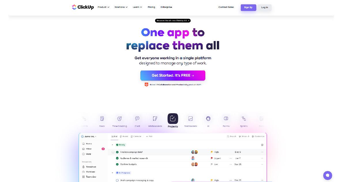
ClickUp is a visual problem-solving software that ensures the efficiency of your team’s collaboration. It makes sure that the members of your team are on the same page all the time. A live collaboration tool lets you create or edit documents with your team. It also includes virtual whiteboards to aid you in your problem-solving processes. The whiteboard feature helps your team brainstorm or generate ideas to solve problems you want to address. Mind maps are also available on the site, which lets you identify significant relations, gather useful insights, and execute creative approaches through mapping the connections between datasets and concepts.
b. Hive
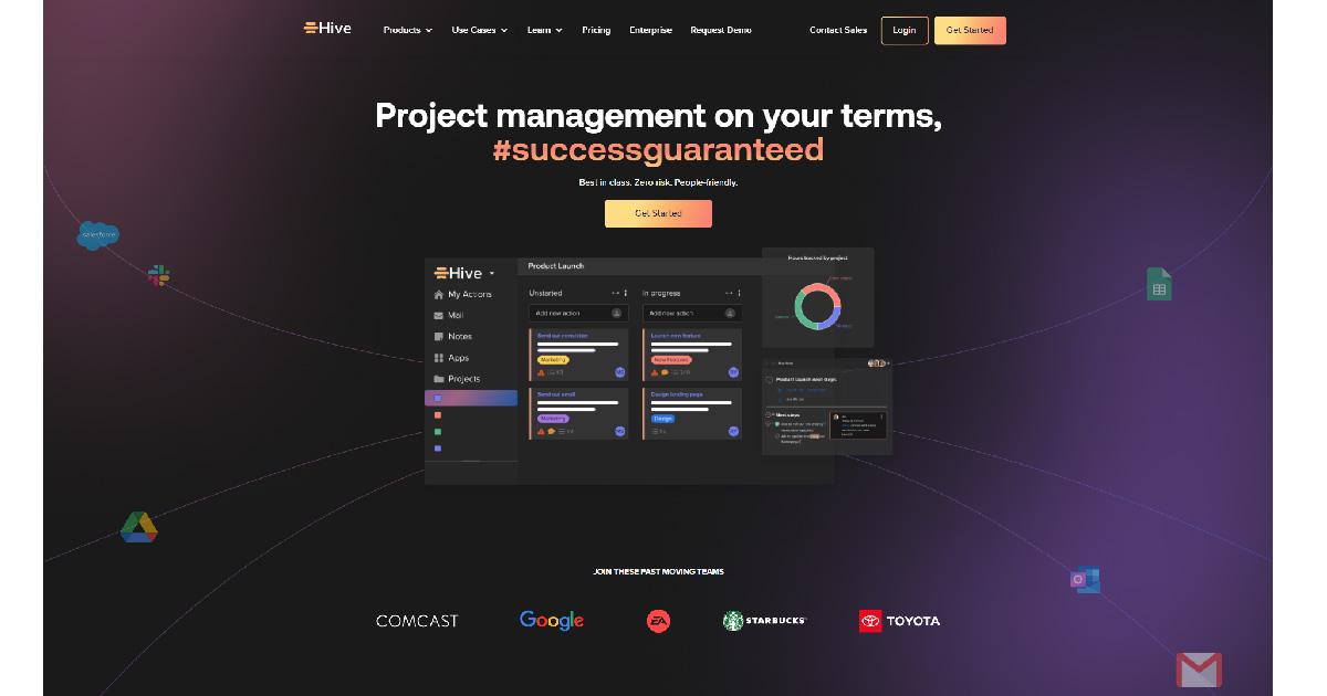
Hive is a data visualization tool that provides insightful solutions to your problem-solving processes. With Hive, you can get your team to face difficult challenges and improve their problem-solving abilities. It’s an engaging visual problem-solving platform that makes you see what your team members are doing. Its collaborative work management feature allows you to work with your team to address and solve issues efficiently. It has a user-friendly interface, project hierarchy, Gantt view, and Kanban view, which help you better manage your timelines and progress.
c. Tableau
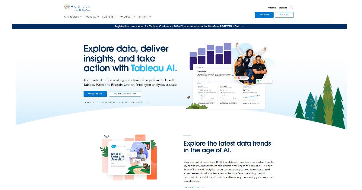
Tableau is one of the most popular tools for visual problem-solving big companies use. With the platform, you can make several types of maps, graphs, and charts and connect to various sources of data. It efficiently produces visualizations from small-scale to large-scale datasets commonly used for artificial intelligence and machine learning. Tableau is known for its high-quality performance, user-friendly interface, and great data visualization tools.
d. Trello
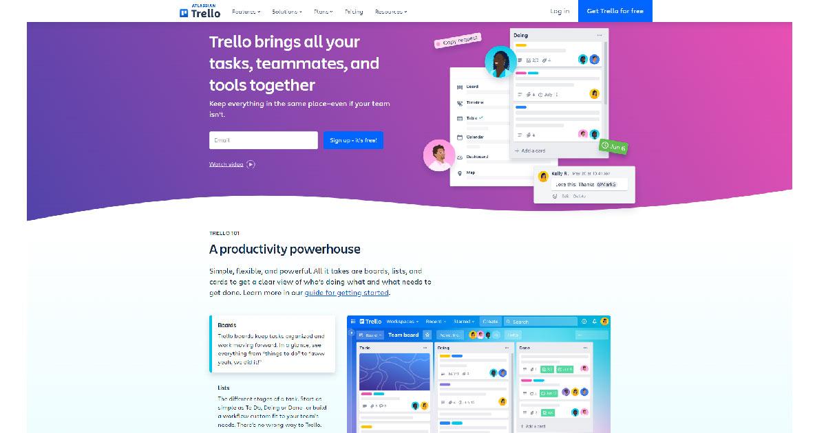
Trello is a visual problem-solving platform that effortlessly streamlines your work processes by organizing tasks using the drag-and-drop feature. Its collaboration and communication tools let you prioritize tasks and responsibilities efficiently. It has a map that exhibits an overview of your projects so you can see tasks, progress, and dependencies visually. Trello ensures you can solve issues through its effective task-management tools
e. Asana
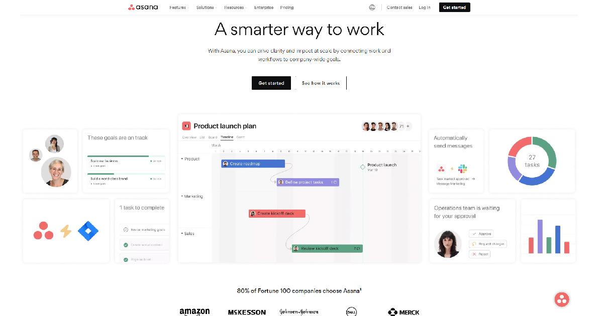
Last on the list is Asana. It is another well-known visual problem-solving platform that improves your decision-making efficiency. It can be used for several small projects and for teams without complicated workflows. It has a customizable workflow feature aids your team in their unique needs by automating repetitive tasks. It has Kanban boards, Gantt charts, and other data visualization tools used to enhance your problem-solving processes. Lastly, it can be integrated with popular tools like Google Drive, Microsoft, Zoom, etc.
5. Integration with Business Intelligence Systems
a. Leveraging Data for Strategic Decision-Making
Data visualization tools help you leverage data to have strategic decision-making. Visualized data integration allows you to access the data you need making it easier for you to make informed decisions for your business, fueling your business’ competitive intelligence.
b. Real-Time Analytics and Reporting
Real-time analytics and reporting involve gathering live data and sending it to users as it happens. You relay information based on the latest happenings so you or your managers can decide quickly based on the visualized real-time data you reported.
Practical Applications of Visual Problem-Solving
1. Business and Financial Analysis
a. Visualizing Key Performance Indicators (KPIs)
You can use visual problem-solving in a practical setting by using it for your business and financial analysis. You can apply it by visualizing your Key Performance Indicators or KPIs. To do it, you can simply compare a base value to a target value. You can also use charts and graphs to efficiently present the quantitative nature of your KPIs so you can bring out insightful observations from your team. It simplifies evaluating your project or campaign by clearly seeing the KPIs in place.
b. Forecasting and Trend Analysis
Another way to apply visual problem-solving is to forecast and analyze trends. Using visual tools like line and bar graphs, you see trends over time and draw forecasts from them. You see and build a pattern recognition over time, allowing you to create assumptions that you can use in your next problem-solving sessions. With visual tools, you get the idea of what may happen in the future based on your previous reliable visual data.
2. Scientific Research and Exploration
a. Visualizing Experimental Data
Data visualization plays a significant role in scientific research and exploration. It is applied by visualizing experiments to make them easier for stakeholders to understand. Using graphs, charts and other tools allows stakeholders to efficiently determine issues, identify new trends, and gain insightful information from hard-to-grasp experimental or novel data.
b. Communicating Research Findings Effectively
With visual aids, you also get to communicate your research findings effectively. You can use line graphs to see the changes in trends over time. You can use pie charts to show the percentage of an item from a whole and draw conclusions from them. Visual aids make it easier for you to convey the results of your research to other people.
Best Practices for Visual Problem-Solving
1. Choosing Appropriate Visualization Techniques
To maximize the potential of visual problem-solving, you need to pick the appropriate visualization techniques for your team. You have to ensure that the strategy you employ will help you and make your job easier rather than burden you. By choosing the appropriate data visualization techniques, you can efficiently solve even complex problems with your team. You ensure that your team members are knowledgeable of the strategy so you can reap its full potential.
Consider tools like WebDataRocks, which seamlessly integrate with various charting libraries. This flexibility empowers you to choose the perfect chart type for your data and audience, maximizing the impact of your visualizations.
2. Ensuring Data Accuracy and Integrity
Whatever industry you are in, you must ensure your data’s accuracy and integrity. You have to make sure that all data you present visually are facts and are based on research. You must have evidence to prove and back them up when questions arise. You must double-check all the data present and be 100% sure that they are accurate. This will allow you to provide real information to your team or stakeholders and prevent you from having problems in the future.
3. Encouraging Iterative Exploration and Analysis
You improve by repeating or doing the same thing daily. The same is true for visual problem-solving. You should employ iterative exploration and analysis to ensure that you are constantly improving your decision-making. By exploring and analyzing things continually, you allow continuous adjustment to your project or business process based on the results and feedback you get.
Conclusion
All in all, data visualization truly helps in the decision-making and problem-solving process. It simplifies data and makes them easier to understand for stakeholders. It also enables more engagement from your team and allows them to gain new insights based on the data they see visually. Visual tools and platforms enhance your and your team’s decision-making abilities, providing you with more insightful solutions to solve problems and challenges.
Thank you for the article to Vy, she a content writer for Removal.AI– an AI tool used to remove bg from images for social media, eCommerce, web, app development, and marketing automation. She loves to share her insights about tech, AI, and marketing.
What else to read?
- Data visualization with WebDataRocks & Chart.js: create a dashboard in 5 min
- Navigating the Future of Big Data and Analytics: Trends and Best Practices for 2024
- Tutorial: How to create a dashboard with WebDataRocks and AnyChart
- Top data visualization blogs to follow in 2023
- Pivot Tables: The Ultimate Guide

This is a hyper-competitive era for mobile app development as startups and well-established enterprises are looking to transform their business digitally. Building human-centric custom mobile apps provides them with the ability to offer their services more creatively and conveniently.
Consequently, companies that want to enhance their digital focus with a data-driven app strategy hire a reliable mobile app development company. Their expertise enables the digital transformation of complex and conventional businesses to achieve quantifiable success and ROI.
Do you have a growth-accelerating app idea that you want to convert into a full-functioning mobile application? Read this blog to learn the comprehensive guide on mobile app development, including its process, trends, costs, etc.
What Does it Mean by Mobile App Development?
A mobile application or app is software built to run on a smartphone or tablet. The process of making this software for a mobile app, web app, online app, iPhone app, smartphone app, or hand-held device is called mobile app development.
Based on the nature of the application, this software can be preinstalled on the device (utility app), downloaded from the App Store/Play Store, or accessed via a mobile web browser.
Quality of the app development process and speed-to-market are critical for business success when the competition is at an all-time high. Therefore, the Agile development methodology is widely accepted for mobile app development due to its wide range of benefits, such as pragmatic and comprehensive processes, efficiency, improved quality, adaptability, flexibility, etc.
Mobile App Development: A Market Overview
The number of mobile applications is increasing with every passing year. With 1.8 million apps available on the App Store and 3.7 million Android apps on the Google Play Store, mobile apps are becoming a lucrative business opportunity.
In terms of revenue, Apple iOS is winning the race with $83 billion in revenue generated in 2022 and is expected to generate $125 billion by the end of 2027. Hence, if you are an entrepreneur or own a startup, you can look for a business opportunity in the mobile app market. Moreover, an enterprise can also build an app to expand its revenue stream or benefit from an increased audience.
When we talk about the monetization strategy, premium apps, in-app purchases, and subscriptions are turning out to be some of the most revenue-generating streams. It is forecasted that $233 billion of app spending can be seen by the end of 2026 based on the given monetization methods. Therefore, you must carefully consider your strategy to generate incremental value from your mobile apps.
The number of subscriptions for smartphone mobile networks is increasing rapidly. It is expected to reach 7.7 billion by 2028 when countries like China, India, and the United States are at the top. This states why businesses focus on mobile app development to leverage an extended customer base. Given the stats, it is no wonder mobile apps have such a profound impact on businesses as well as our daily lives.
Top Mobile App Categories Popular in the Market
It is possible that some of you have already come up with a basic idea or concept. Those who are starting from scratch may have no idea where to begin. Competitive analysis is one of the crucial parts of building a successful mobile app. You can take inspiration from the various apps available in the market to find out the features integrated, technology used, monetization methods, etc.
Get inspired by the best mobile app ideas given below:
| App Category | Essential Features and Popular App Examples |
| eLearning App for the EdTech Industry |
|
| On-demand Grocery Delivery App |
|
| eCommerce Mobile App |
|
| On-demand Food Delivery App |
|
| Courier Delivery App |
|
| Healthcare and Fitness App |
|
| Mental Health and Wellness App |
|
| Social Media App |
|
| Cab/Taxi Booking App |
|
| Online Video Streaming App |
|
| Digital Wallet App |
|
Types of Mobile App Development
The types of mobile app development can be typically divided into 3 categories:
- Native App Development: Generally divided into iOS and Android App Development, where the app is built for both mobile platforms separately using their Native app development technologies.
- Hybrid/Cross-platform App Development: Here, the app is built using cross-platform app development frameworks like React Native, Flutter, Ionic, etc. Hybrid apps are also developed using web technologies like HTML, CSS, and JavaScript.
- Web App Development: Web applications are accessed using mobile web browsers. These types of applications are famous, too, because they ensure that the application developed for the web offers a fast and responsive experience to mobile users.
Step-by-Step Guide to Mobile App Development
Remember that mobile app development is an iterative process, meaning you can move from one or two steps back and forth to generate a quality result.
Here are the steps to build a mobile app:
| Planning | This is the first phase of the app development, which includes requirement gathering. |
|
| Designing | In this step, building the UI/UX design of the app is included. |
|
| Development | This is the actual building part of the app development process, including coding. |
|
| Testing | Here, QA engineers will be checking the quality and performance of the application. |
|
| Deployment | After the app is developed and tested, it will be deployed on the App Store/ Play Store or the client-server as per their request. |
|
Refine the Mobile App Idea With MVP Development
Do you have an app idea but don’t know whether it will succeed in the market? What if you can launch it in the market with less budget to gauge the response from potential audience or target users?
Minimum Viable Product (MVP) development is an approach to building a software product or, in this case, a mobile app with essential features that represent your core idea or functionalities. This is a launch-ready version of the app; consider it as the first step towards ensuring the success of a mobile app.
Once you get a positive response from the audience and gain enough traction, you can start with the scaling of the application. It minimizes the risk and expenditure before the full-fledged mobile application development.
Tech Stack Used in Mobile App Development
Here are the frameworks, platforms, and technologies used in building mobile applications.
| Android App Development | Swift, Java |
| iOS App Development | Objective-C, Swift |
| Hybrid App Development Framework | React Native, Flutter, Ionic |
| App SDK | Xcode, Android Studio |
| UI Frameworks | UIKit (iOS), Android XML Layouts (Android) |
| Server-side Languages | Node.js, Python, Ruby, Java, etc. |
| Databases | MongoDB, MySQL, PostgreSQL |
| Payment Gateway Integration | Stripe, PayPal, Braintree, and Square |
| Cloud Services | Amazon AWS, Microsoft Azure, Google Cloud |
| Notifications and Messages | Firebase Cloud Messaging (FCM), Apple Push Notification Service (APNs), In-App Messaging (real-time chat), Firebase Realtime, Socket.io |
| GPS Tracking | Core Location (iOS), Google Location Services (Android), Google Maps API |
Top Mobile App Development Service Providers
Here are the top companies providing mobile app development services:
- Successive Digital
It is a CMMI-3 certified next-gen digital solutions provider with over a decade of experience. With their domain expertise on various industry verticals, cloud consulting services, and commitment to delivering value-driven solutions, you can build scalable mobile apps.
- Clutch Ratings: 4.9 (77 Reviews)
- Hourly Rate: $25 – $49 / hr
- Number of Employees: 1,000 – 9,999
- Founded: 2012
- Naked Development
It is one of the most creative app development agencies you can find to hand over your app development project. You can get end-to-end app development solutions from them, including planning, designing, development, testing, and maintenance.
- Clutch Ratings: 4.9 (28 Reviews)
- Hourly Rate: $100 – $149 / hr
- Number of Employees: 10 – 49
- Founded: 2018
- Mercury Development
One of the oldest companies on our list is Mercury Development, making it a reliable source for app development services. From startups to enterprises, it provides its services catering to the needs of a wide variety of business sizes.
- Clutch Ratings: 5.0 (25 Reviews)
- Hourly Rate: $50 – $99 / hr
- Number of Employees: 50 – 249
- Founded: 1999
- CodigoDelSur
It is one of the best-known mobile app development companies with more than 15 years of experience. Moreover, this company has won many awards and accreditations for their exceptional services.
- Clutch Ratings: 4.8 (40 Reviews)
- Hourly Rate: $50 – $99 / hr
- Number of Employees: 50 – 249
- Founded: 2007
- Utility
This specialized company has a team of experienced and skilled professionals crafting custom mobile and web applications. They have experience working with various industry sectors, creating successful applications catering to users’ needs.
- Clutch Ratings: 4.8 (25 reviews)
- Hourly Rate: $100 – $149 / hr
- Number of Employees: 50 – 249
- Founded: 2013
What is the Total Cost of Building a Mobile App?
When you select an app idea and decide to build it, your next concern must be how much mobile app development costs. The total cost of developing a mobile app depends on its complexity— a simple app with basic functionality can cost you anywhere from 30,000 to $60,000. When you increase the complexity, the cost can range anywhere between $60,000 and $150,000. However, an advanced mobile app with a high level of complexity, features, API integration, and ample storage can cost you as much as $300,000 or more.
Other factors influence the mobile app development cost, such as app category, platform selection, app design, app security, testing cost, selected features and functionality, the cost of hiring mobile app developers, and more. Therefore, it is challenging to find out the exact cost of mobile app development. To give you an idea, the average cost of building a mobile app can range from $40,000 to $300,000 (or more as per the complexity).
How to Generate Revenue With Mobile Apps
As a business owner, you must be looking to make it a source of income. Fortunately, there are many methods to generate revenue through your mobile app, and you can select any one of them or use a combination of two or more methods.
- Freemium: This model allows your users to access and utilize your application for free while keeping the selected features paid.
- Subscription Model: You can set the price of the paid subscription tiers with various features and functionalities for your user.
- In-app Purchases: In this type of model, you offer certain services or content to users for a set amount of price. This is one of the widely used revenue models combined with other ones.
- Advertisements: This is a simple trick of monetizing your application by approving ads in your application. However, your application must already be popular and have a set customer base to ensure this revenue stream works for your business.
- Affiliate Marketing: You can offer some affiliate links inside your application via advertisements to earn money. The benefit of this model is that you can negotiate with the brand you are affiliated with on how much commission you want.
- Collaboration With Brands: This model requires you to have marketing skills, as you have to be careful with brand positioning. You can build an app in collaboration with some brands or collaborate with them if you find your application niche.
Conclusion
There’s a lot to unpack regarding mobile app development, including budget, goals, timeline, technical skills, and app complexity. Moreover, it is essential to partner with a reliable and experienced company that you can trust to get custom mobile app development services. Ensure the company you hire has a proven track record of delivering best-in-class mobile apps for a wide range of industry verticals. Moreover, make sure to judge them based on competitive pricing, quality assurance, and maintenance services that can fulfill all your mobile app development needs.
What else to read?
- Best Mobile App Development Tools for iOS & Android
- Mobile App Frameworks That Define Business Success in 2021
- What is the difference between React.js and React Native?
- Tutorial: How to create a dashboard with WebDataRocks and AnyChart
- Top data visualization blogs to follow in 2023

Data is one of the core components of every business. Data helps to improve the efficiency in problem solving, decision making, generating an ability to function proactively, and focus on sustainability. It is the backbone of customer service, marketing, sales, accounting, etc. Earlier, businesses managed with just static data from spreadsheets and other documents to analyze their performance and suggest relevant improvements. With the innovative technologies like AI, analytics etc, businesses can now transform the static data and use them to optimize customer experiences.
(more…)Are you trying to figure out how to make a profitable mobile application? It entails many difficulties and factors to be considered, such as determining the budget, particular project specifications, features and functionalities, and more. Nonetheless, picking the right combination of powerful tools and technologies is essential to developing an app.
Your mobile app’s budget, performance, and maintenance will all be significantly impacted by the tech stack your mobile app development company decides to incorporate within. This emphasizes choosing the right mix of technologies for efficient app development that gives your company a competitive edge.
There are several factors to consider when choosing the best tech stack. Therefore, you should read this guide to choose the appropriate tech stack for creating your project.
Mobile App Development Tech Stack: 4 Main Pillars
A tech stack, a set of tools and technologies, is decided and arranged as per the development needs of software or an application. These development platforms are strategically used to create well-oriented and feature-rich mobile apps. It can include tools for data storage, security management, user interface design tools, and various other frameworks.
This tech stack is bifurcated into four central pillars to make the mobile app development process seamless, as given below:
In the back-end development of mobile applications, the decision of technologies depends on the smooth functioning of server-side code and the database. The work of backend developers is to store and manage data, respond to user requests, and ensure frictionless communication between the server and client side. The back-end tech stack supports them in controlling these tasks effectively.
| Back-end Development Programming Languages | Python, Ruby, Golang, PHP, or Java |
| Back-end Frameworks | Django, Ruby on Rails, or Laravel |
| Database Management System | MySQL, PostgreSQL, or SQLite |
The front end is at the forefront of any application or software. This is an interface where your users can interact with a digital product. The tech stack chosen to develop the front end of the application manages the user interface and the client-side code running on the device. Developing a mobile app layout includes elements such as buttons, animations, user flow, and links.
| Front-end Development Programming Languages | HTML, CSS, JavaScript |
| Front-end Frameworks | React, Vue.js, and Angular |
Your choice of mobile app development tech stack depends significantly on the platform you choose to deploy the app (such as iOS or Android). Here, all libraries and interfaces are pictured as part of the mobile app design and development. Depending on the mobile app platform, specific technologies are selected.
| iOS Platform | Development Tools: Apple Xcode and AppCode, iOS SDK |
| Programming Languages: Objective-С, Swift | |
| UI Frameworks: SwiftUI, UIKit | |
| Android Platform | Development Tools: Android Studio, Android SDK |
| Programming Languages: Java Kotlin | |
| UI Frameworks: Android UI, Jetpack Compose |
The hosting environment ensures the server-side code runs smoothly on the application as the input-output function depends on it. The fundamental purpose of a hosting platform is to
- store data,
- hosting APIs,
- scale applications,
- implement robust security measures,
- and enhance reliability by minimizing downtime.
Numerous hosting platforms such as Linux, Apache, and Amazon Web Services (AWS) are popular choices in mobile app development. However, cloud hosting services have been the most in demand recently due to their many benefits.
How Do I Choose the Best Tech Stack for Creating Mobile Apps?
The robust tech stack you position will influence how effectively you are able to build the app. However, it requires meticulous planning, a clear vision, and familiarity with the features to ensure you have chosen the right tech stack.
The choice of technology stack is also driven by the varying features and levels of complexity of various application categories.
For instance, an app for on-demand meal delivery will provide push alerts, real-time tracking, and smart search and suggestion features. Therefore, you should pick technologies that facilitate easy integration with external parties.
| PHP, Jenkins, LAMP Stack, HHVM, Cassandra, React Native, and GraphQL | |
| Airbnb | JavaScript, React, Java, MySQL, Amazon S3, Amazon EC2, Ruby, Rails, Google Analytics, Braintree, and Twilio |
| Uber | Python, JQuery, Node.js, React, Java Golang, Kafka, Swift, Objective-CMySQL, EC2, and Hadoop |
| Objective-C, Swift, Java, KotlinReact NativeAFNetworking and Facebook SDK | |
| Objective-C, Java, JavaScript, React, ScalaAWS, GCP, and Microsoft Azure |
Note: Remember that these are the primary tech stacks used in developing these apps. An application uses a vast set of technologies for app development. Moreover, technological trends keep changing with time, and thus, companies adopt new tools and frameworks.
The type of platform on which you choose to deliver your application has the most influence on the tech mobile app development stack. As mentioned above, iOS and Android applications will have platform-specific technologies.
In contrast, if you choose to develop a hybrid app, you can use cross-platform frameworks (such as React Native, Ionic, Xamarin, and Flutter).
The next factor you need to consider while selecting a suitable tech stack is the features and functionality you decide to integrate into your mobile app. This is because some technologies are better fit to create or embed features like games, augmented reality, or machine learning.
Make sure to define your budget and resources (time, expertise, and development team) in the initial stage of development. With a fixed budget, you can ensure your team utilizes the tech stack fully within that cost.
For example, native app development can be costly and requires more effort. Whereas hybrid or cross-platform app development can be done with open-source frameworks, ensuring a faster and more cost-effective process.
You must consider whether your application can be scaled with the tool or framework you choose to integrate. Go for the technologies that support a stable system architecture with an increasing user base and traffic. Here, you can select your server, hosting service providers, databases, and programming languages wisely. Ensure they are not getting outdated soon and facilitate app scalability.
Conclusion: Get Experts Help
As mentioned in this article, technologies are growing at an unprecedented rate; thus, it requires the mobile app development company you hire to be updated with the latest tech trends. In conclusion, different types of project requirements, such as budget, app types, technical expertise, and, most importantly, platform choice, affect your choice of tech stack.
Therefore, as you initiate your project with your partnered app development team, begin with a thorough analysis of the app idea and discovery phase. With this, not only will you be able to decide on a robust technology stack but also ensure your mobile app developers are on the same page.
With the holidays fast approaching, our team has been brainstorming ideas for meaningful gifts for our colleagues. This year, our workplace is hosting a “Secret Santa” gift exchange, and finding the perfect presents has proven to be quite the challenge. While exploring Kaggle, we came across an intriguing dataset called Customer Shopping (Latest Trends) and thought—what if the data could help?
That’s when we turned to Vue 3 and WebDataRocks—free tools that make it easy to build interactive dashboards and uncover hidden insights. With this JavaScript framework and pivot table library, we’ll explore how various factors, such as gender and season, influence shopping habits. Let’s visualize and analyze the data together—and who knows, maybe we will even find some gift inspiration along the way 🎄
However, before diving into coding, let’s take a look at the result we are aiming for:

Data visualization with Vue 3 and WebDataRocks + Christmas tree animation made with HTML, CSS, and JavaScript
To add a touch of holiday magic, we created an animated Christmas tree to bring festive cheer to the project. Crafting the animation involved a fair amount of CSS, as well as some JavaScript to make the tree interactive. The result is a fun and engaging feature that reacts to user interaction. We’ll dive into a code review later, but for now, we hope it adds a bit of holiday spirit to your day!🎄
Now, get ready to begin the development process. Remember that you can always refer to the source code in the GitHub repository.
But beforehand, check out a quick explanation why Vue + WebDataRocks is a great technology stack.
Why To Choose Vue 3 as a Framework?
Vue 3 is a robust, lightweight framework with a component-based architecture that makes managing and reusing code easy. Its impressive speed comes from the Virtual DOM and optimized reactivity system, which ensures only the necessary updates are made, resulting in faster performance. Additionally, Vue 3 keeps your application’s bundle size small, making it one of the most efficient front-end frameworks available.
Moreover, Vue 3 has well-structured documentation that you can easily refer to whenever needed, making the learning process smoother.
Why To Choose WebDataRocks for Data Visualization?
WebDataRocks is a feature-rich JavaScript pivot table library that perfectly balances functionality, performance, and ease of use. Moreover, WebDataRocks can seamlessly embed into Vue, thus it fits the bill perfectly. In general, this pivot table component supports integration with various frameworks, making it an ideal choice for creating dynamic and interactive data visualization for different applications.
One of the best aspects of this tool is that, despite being free, it offers a robust set of features for data analysis and is highly customizable. While WebDataRocks does have a data size limitation of 1 MB, it remains a powerful and dependable solution for smaller projects and lightweight datasets.
Set Up Vue and WebDataRocks Project
First, to work with any JavaScript framework, you need to have Node.js installed along with your preferred package manager. In this case, we will be using npm.
To create a Vue project and get and include WebDataRocks in it, follow this guide from the official WebDataRocks documentation.
Note that you will be prompted to choose configurations for your project during the creation process. Check the official Vue documentation for more explanation. For simplicity, select No for all configurations.
To ensure the setup works correctly, run this command:
npm run dev
It starts a development server. Open the provided URL in your browser to view the app.
With the project set up, we are ready to dive into coding!
Visualizing Dataset with Vue and WebDataRocks
To get started, let’s import some styles to enhance the pivot table’s appearance.
WebDataRocks comes with various predefined themes, and our team has agreed on the teal one for a clean and vibrant look.
Thus, below you can see how the <template> section of our App.vue currently looks:
<template>
  <header>
<link rel="stylesheet" type="text/css" href="theme/teal/webdatarocks.min.css" />

    <div class="main">
      <div class="wrapper">
        <div class="pivot-container">
          <div class="logo">📊 Vue 3 + WebDataRocks</div>
          <Pivot toolbar /> //toolbar property set to ‘true’
        </div>
      </div>
    </div>
  </header>
</template>
Next, we will define a Report Object as the foundation for building our pivot table. Place it under the <script> tag in your App.vue file.
However, before configuring the Report Object, download the Customer Shopping (Latest Trends) dataset from Kaggle and save it in your project’s src/assets folder. Then, link your CSV file to the dataSource parameter to make the data available for the pivot table.
const reportCsv = {
  dataSource: {
    filename: 'src/assets/shopping_trends.csv',
  },

};
To customize how the data is displayed, configure the Slice Object, which allows you to define rows, columns, and measures, giving you full control over the pivot table structure. For more details on its parameters, refer to the official WebDataRocks documentation.
Thus, our Report Object looks the following way:
const reportCsv = {
  dataSource: {
    filename: 'src/assets/shopping_trends.csv',
  },
  slice: {
    rows: [
      { uniqueName: 'Category' },
      { uniqueName: 'Item Purchased' },
      { uniqueName: 'Gender' },
    ],
    columns: [
      { uniqueName: 'Season' },
    ],
    measures: [
      {
        uniqueName: 'Purchase Amount (USD)',
        aggregation: 'sum',
      },
    ],
  },
  options: {
    grid: {
      showTotals: 'off',
      layout: 'classic',
    },
  },
};
The next step is to pass it to the Pivot component using the report property like this:
<Pivot v-bind:report="reportCsv" toolbar />And that’s it for setting up the WebDataRocks Pivot Table!
To make the website look more visually appealing, we added the following styles under the <styles scoped> section in App.vue:
.pivot-container {
  min-width: 1000px;
  display: flex;
  flex-direction: column;
}
For now, the result looks like this:
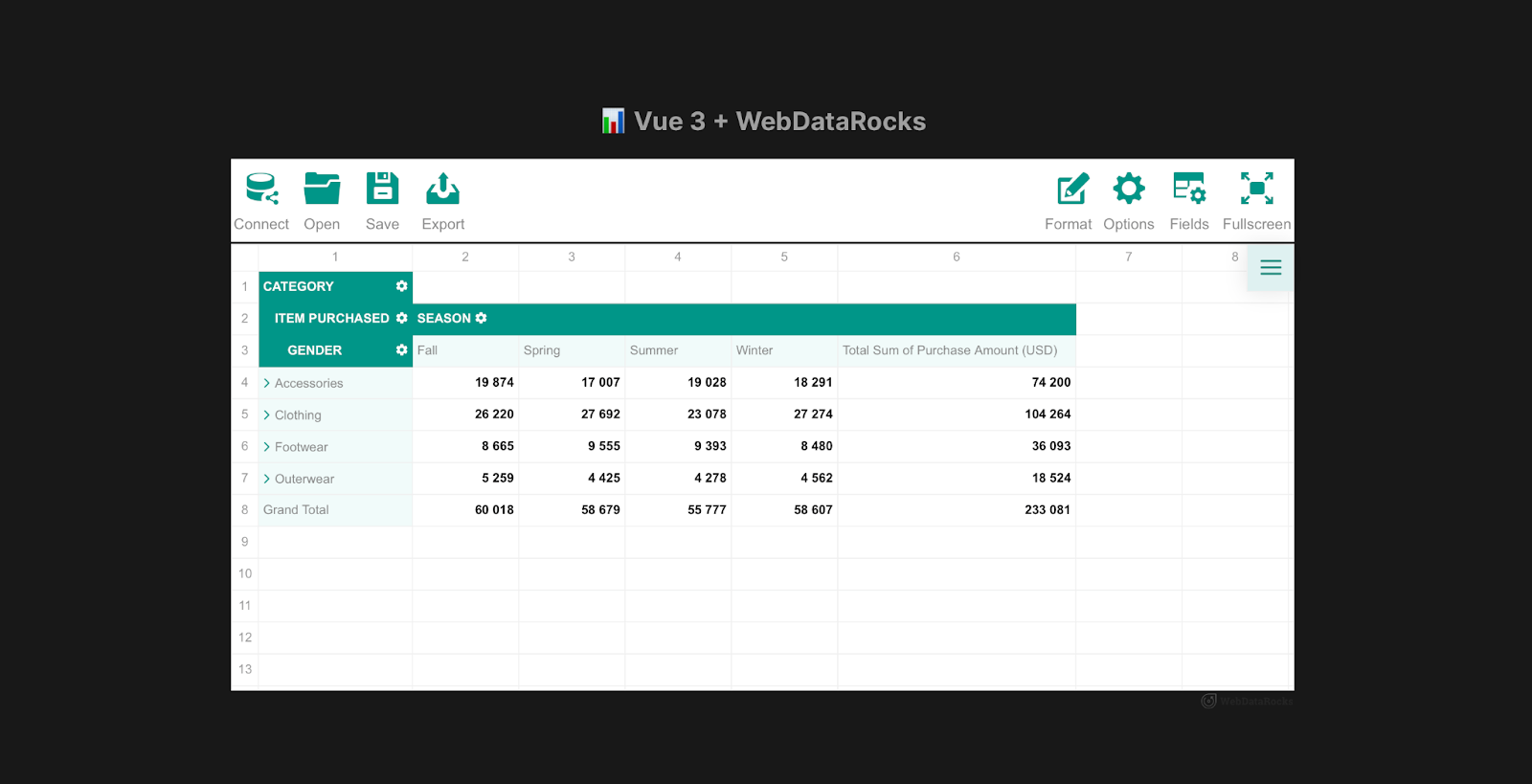
WebDataRocks Pivot Table component
With the pivot table ready, let’s move on to the next exciting part—creating the Christmas Tree and animating it! 🎄✨
How To Create the Animated Christmas Tree with HTML, CSS and JavaScript
Let’s create a new component named ChristmasTree.vue, where we’ll set up the tree structure, styles, and behavior. Then in the <template> section define the HTML structure:
<template>
<!--
The :class="{ clicked: isClicked }" dynamically applies a CSS class when clicking the tree.

The @click and @mouseleave directives bind methods to handle interactions.
-->
  <div
    id="christmas-tree"
    class="christmas-tree"
    :class="{ clicked: isClicked }"
    @click="toggleTreeState"
    @mouseleave="resetTreeState"
  >
    <div class="tree">
      <div class="tree-details"></div>
    </div>
    <div class="lights">
      <div class="row-one"></div>
      <div class="row-two"></div>
    </div>
    <div class="balls"></div>
    <div class="star"></div>
    <div class="shadow"></div>
  </div>
</template>
It’s time to apply CSS to style and animate the Christmas tree. While setting up HTML structure, we have used descriptive names for the section’s classes and ids to keep the code organized and understandable. Since there are many CSS styles involved and space in the blog is limited, you can view the complete code in the ChristmasTree.vue file on my GitHub Repository. Please, don’t just copy the styles but read through them. You know, if there’s an animation property, it’s there for a reason! 😊
We hope you completed the previous step successfully! Now, it’s time to add some interactivity to our Christmas tree using Vue.js. We will start by defining a data property to manage the state. Then, we can include methods to handle toggling and resetting the tree’s state. Last but not least, we’ll use event listeners to create dynamic behavior when the tree is clicked or the mouse leaves the tree area.
Thus, the code should look the following way:
<script>
export default {
  data() {
    return {
      isClicked: false,
    };
  },
  methods: {
    toggleTreeState() {
      this.isClicked = !this.isClicked;
    },
    resetTreeState() {
      this.isClicked = false;
    },
  },
  mounted() {
    const treeElement = document.getElementById('christmas-tree');

    if (treeElement) {
      treeElement.addEventListener('mouseleave', () => {
        this.isClicked = false;
      });

      treeElement.addEventListener('click', () => {
        this.isClicked = true;
      });
    }
  },
};
</script>
Congratulations, the ChristmasTree.vue is ready! 🎄✨ To actually display the component on the webpage, you need to add it to the App.vue:
import ChristmasTree from './components/ChristmasTree.vue';
…
<template>
  <header>
    <!-- Link to the WebDataRocks theme -->
<link rel="stylesheet" type="text/css" href="theme/teal/webdatarocks.min.css" />

    <div class="main">
      <div class="wrapper">
        <div class="pivot-container">
          <!-- Logo and Pivot Table -->
          <div class="logo">📊 Vue 3 + WebDataRocks</div>
          <Pivot v-bind:report="reportCsv" toolbar />
        </div>
        <!-- Christmas Tree Component -->
        <ChristmasTree id="ch-tree" />
      </div>
    </div>
  </header>
</template>
As you may have guessed, we will apply additional styles to the ChristmasTree component since there is its own id. The goal is to position the WebDataRocks Pivot Table and the ChristmasTree side by side. Check out these updated styles:
<style scoped>
#ch-tree {
  margin-top: 13.5rem;
}
.pivot-container {
  min-width: 1000px;
  display: flex;
  flex-direction: column;
}
:root {
  --color-primary: #00796b;
  --color-secondary: #004d40;
  --color-text: #ffffff;
  --color-background: #e0f2f1;
  --color-border: #004d40;
}

header {
  background: var(--color-primary);
  color: var(--color-text);
  padding: 1rem;
  border-bottom: 3px solid var(--color-secondary);
}

.logo {
  font-size: 1.5rem;
  text-align: center;
  font-weight: bold;
  margin-bottom: 1rem;
}
nav a {
  color: var(--color-text);
  text-decoration: none;
  padding: 0.5rem 1rem;
  transition: all 0.3s ease;
}

nav a:hover {
  background: var(--color-secondary);
  border-radius: 4px;
}

nav a.router-link-exact-active {
  font-weight: bold;
  text-decoration: underline;
}

.wrapper {
  display: flex;
  flex-direction: column;
  justify-content: space-between;
  align-items: center;
  height: fit-content;
  gap: 10rem;
}
@media (min-width: 1024px) {
  header {
    display: flex;
    align-items: center;
    justify-content: space-between;
  }

  .wrapper {
    display: flex;
    flex-direction: row;
    justify-content: space-between;
    align-items: center;
  }

  nav {
    margin-top: 0;
  }
}
</style>
Let’s check what do we have so far:
To add the finishing touch with a border, create a separate style.css file and add the following styles:
body {
  border: 3em solid seashell;
  border-top: 5em solid seashell;
  border-bottom: 5em solid seashell;
  height: fit-content;
}
Next, head over to your index.html file and link this CSS file by adding the following line in the <head> section:
<link rel="stylesheet" href="style.css" />
And there you have it! Save your code, run your project, and enjoy the result!
Final Words
And that’s it! You’ve built a festive data visualization dashboard with Vue 3 and WebDataRocks Pivot Grid, complete with an interactive Christmas tree animation! 🎄✨
Our hope this project taught you some new skills and brought you a bit of holiday cheer. Feel free to customize the dashboard further with extra features to make it uniquely yours.
Oh and have you found any gift ideas? Share your thoughts in the comments!
Happy coding, and enjoy the holidays! 🎁
Flexmonster, with love.
React Native has long been a popular choice for building cross-platform mobile applications, allowing developers to write code once and deploy it on both iOS and Android. With the release of React Native 0.76, the framework introduces significant improvements to its New Architecture by default, paving the way for even more robust and efficient development. These updates aim to streamline cross-platform development, offering developers enhanced performance, better tooling, and a more seamless integration of native modules.
New Architecture Now Default

New architecture in React Native 0.76. Taken from Dev.to
Starting with React Native 0.76, the New Architecture is now enabled by default in all projects and is officially ready for production use!
The New Architecture introduces full support for modern React features such as Suspense, Transitions, automatic batching, and useLayoutEffect (although it is still recommended to use the useEffect hook because useLayoutEffect can hurt the performance).
It also includes revamped Native Module and Native Component systems, enabling developers to write type-safe code with direct access to native interfaces, eliminating the need for a bridge.
The previous architecture, which relied on an asynchronous bridge, faced several challenges, including delayed updates, performance bottlenecks, synchronization issues, and limitations in handling layouts efficiently. To address these issues, the New Architecture introduces four key improvements:
- The New Native Module System
- The New Renderer
- The Event Loop
- Removing the Bridge
According to the official documentation: “The New Module system allows the React Native Renderer to have synchronous access to the native layer, which allows it to handle events, schedule updates, and read layout both asynchronously and synchronously. The new Native Modules are also lazily loaded by default, giving apps a significant performance gain.”
New Native Modules unlock powerful new capabilities since they are entirely built on C++:
- Synchronous Communication
- Type Safety
- Cross-Platform Support
- Lazy Loading
- Performance Optimizations
In the old system, handling responses from native functions required callbacks and return values had to be serializable:
// ❌ Old architecture example
nativeModule.getValue(value => {
// ❌ Cannot reference a native object
  nativeModule.doSomething(value);
});
The New Architecture simplifies this process:
// ✅ New architecture example
const value = nativeModule.getValue();
// ✅ Values can reference native objects directly
nativeModule.doSomething(value);
You can explore the New Architecture and its benefits in detail in the New Architecture is here blog post in the official React Native documentation.
New Dev Tools

A picture from the official React Native documentation
It has always been hard to debug React Native Apps due to overlapping tools like Flipper and Hermes. But now, the new DevTools combines all the debugging tools into one seamless stack, with zero setup required— ready to go by default with zero configuration. You can open it from the in-app Dev Menu or use `j` to debug directly in the CLI server, which now supports multiple emulators and devices.
One of the most interesting UX improvements is a new “Paused in Debugger” overlay that makes it crystal clear when your app is paused at a breakpoint. Plus, warnings in LogBox are now summarized and hidden when DevTools is attached.
For more information, check out updated debugging docs.
15x Metro Resolution
The latest update to Metro Resolver (v0.80.11) brings significant performance improvements, notably optimizing module loading. This update has made Metro’s resolver—responsible for finding modules from import paths — about 15 times faster. As a result, Metro’s overall performance has improved, with warm builds running around 4 times faster. These enhancements make a noticeable difference, especially in reducing build times and improving development efficiency.
Do you want to be the first to test the grid with your data?
New Style Props: boxShadow and filter
boxShadow
The boxShadow property allows you to add a shadow to an element with customizable settings for its position, color, size, and blurriness. This gives you full control over the appearance of shadows. For a complete breakdown of each argument and its options, check out the MDN documentation. You will also find a fiddle there to try out yourself.
Below are a few examples of the shadow you can take from the React Native documentation:

Examples of boxShadow from the official React Native documentation
filter
The filter property applies graphical effects to an element, such as color modifications (brightness, saturation, and hue) or non-color adjustments like blurs and shadows. This property offers a wide range of filters for creative control over your visuals. For an in-depth guide to each filter function, visit the MDN documentation, which provides a fiddle for hands-on testing. Below is an example, taken from the official React Native Documentation, of a hot dog image with various filters applied:

Examples of filter from the official React Native documentation
Android App Bundle Recuded by ~3.8MB
React Native 0.76 introduces an update that enhances both app size and startup performance on Android by consolidating multiple native libraries into a single library, libreactnative.so. This change reduces the app size by approximately 3.8MB and cuts startup time by 15ms. The smaller APKs improve download and installation times, which is especially beneficial for users in emerging markets. However, developers will need to make some adjustments to ensure compatibility with the new structure. Refer to the official React Native documentation for the details.
Expo SDK 52 Update
Expo SDK 52 (beta) supports React Native 0.76, making it easier to leverage these new features within the Expo ecosystem.
Summary
React Native 0.76 combines years of development into a game-changing update that enhances performance and developer experience. With the new architecture now the default, React Native has become more efficient, providing faster build times and smoother app performance. The update introduces faster debugging with streamlined DevTools, making it easier than ever to diagnose issues. New styling capabilities, including `boxShadow` and `filter` properties, offer developers more flexibility in creating visually dynamic applications. Additionally, Android apps now benefit from a smaller size and improved startup times, thanks to the consolidation of native libraries.
To understand how React Native differs from React and why this update is significant, check out this detailed comparison: What is the difference between React and React Native .
Overall, React Native 0.76 sets the stage for building more efficient, performant, and polished applications, making it a significant step forward for the framework.
Looking for a one-stop solution for simple, yet effective, online data analysis? Here’s where WebDataRocks comes in. A JavaScript pivot table library that can be easily added to your website or application and then be able to produce interactive reports in real-time on any device you prefer (PC, tablet, mobile, etc.).
Whether you’re a developer building a web reporting application or a business analyst needing to extract insights from datasets, WebDataRocks can help. It’s easy to use and packed with features to turn your complex data into clear reports.
All you get with WDR:
- Easy web reporting, even for beginners: no coding required! WebDataRocks seamlessly integrates with your website or application, allowing you to create interactive reports in just a few minutes. Want to see it in action? Check out our pivot table demo.
- Real-time access, anywhere: Drill down into your data and uncover hidden trends on any device, be it your desktop, tablet, or mobile. Make data-driven decisions anytime, anywhere.
- Effective/Intuitive data exploration: Slice and dice your data easily using familiar pivot table functionality. Group, filter, and sort to uncover patterns and optimize processes.
- Dashboard Capabilities: WebDataRocks allows you to create dashboards that become central hubs for data exploration and analysis within your web applications. By incorporating these dashboard capabilities, you can transform your web applications from data repositories into powerful business intelligence tools. Explore our dashboard demos to see how it works.
How to start with WebDataRocks: Your Simple 4-Step Guide

STEP 1. Get Web Reporting Tool for Free
Get started WebDataRocks and gain access to a high-powered, feature-rich tool for free. It’s the best option for new projects or startups to make serious data analysis for their own business with no risks and obligations. You can actually get to your reporting in 5 minutes after download. No pitfalls!
STEP 2. Embed Web Reporting Tool into your Application
Simply embed a script into your webpage—no programming expertise is needed! We designed WebDataRocks to minimize development costs associated with complex integrations.
Our pivot table tools also offer easy integration with popular frameworks. Whether you’re using Angular, React, or Vue, you can use ready-made wrappers to simplify the integration process.
STEP 3. Run Your Data in Ready-to-Use UI
Load your dataset and now you have a powerful analytics tool with a well-designed interface. We developed WebDataRocks with a user-friendly interface, so you have a ready-to-use tool straight away.
STEP 4. Start Reporting, Now!
WebDataRocks is a web reporting tool with enterprise features for real business. Powered by features like filtering, sorting, grouping, conditional and number formatting, calculated values, grand totals, subtotals, etc.
Do you want to be the first to test the grid with your data?
Take control and manage your data the way your project demands. Explore our Quick Start Tutorial to get started quickly.
What’s the point
Data is the key to every business. If you have data you can boost your business insight and drive growth.
But let’s face it, data analysis can feel like an endless battle against clunky spreadsheets. We’ve all been there – staring at rows and columns, wrestling with formulas, desperately trying to extract meaning from a mountain of information. Whether it’s identifying trends, uncovering patterns, or summarizing data, having a reliable tool is essential.
When it comes to data analysis and reporting, Excel is often the first tool that comes to mind for many. While Excel has been a go-to for many years, it has its limitations. Created for everyone and everything, it’s packed with many specific features that can be hard to understand. Limited to desktop use, it lacks the flexibility for web-based reporting and seamless integration within applications. Furthermore, as data volumes explode, Excel performance can suffer, leading to sluggish calculations and frustrating delays. Collaboration and customization, crucial for modern business, are also Excel’s Achilles heel.
While cloud-based alternatives like Google Sheets offer increased accessibility and collaboration features, they often lack the depth and complexity required for advanced data analysis. This is where WebDataRocks shines—it provides – providing an efficient tool for turning data into actionable insights.
Built by Developers for Everyone
With over 15 years of experience developing solutions like Flexmonster Pivot Table & Charts Component, our team is passionate about simplifying data analysis for everyone. We provide developers with tools that are easy to integrate into applications, offering extensive customization options and the ability to create interactive dashboard-like visualizations of your data with other components, thanks to integration with popular charting libraries.

End users benefit from intuitive tools that make complex data exploration a breeze, featuring user-friendly filtering, sorting, and grouping functionalities. WebDataRocks is a solution built by developers who understand the everyday challenges of data analysis, designed to make data visualization faster, simpler, and more collaborative.
Flexmonster, with love.

Selecting the suitable pivot table component for your project can be challenging and time-consuming for many developers. With so many options available—pivot table libraries, data grids with pivot functionality, and all-in-one reporting bundles—it’s easy to feel overwhelmed. To help you navigate this part of web reporting, I’ve conducted some research and reviewed the top components currently on the market.
Research focus
In my evaluation, I focused on several key criteria that are crucial for developers:
Documentation and support: having comprehensive, up-to-date documentation is crucial for developers. It helps them quickly integrate and customize a component.
Framework: compatibility with widely used frameworks like React, Angular, Next.js, and Vue is a significant factor, especially given their popularity as reported in the latest Stack Overflow Developer Survey.
Performance and scalability: data is growing exponentially (over 120 zettabytes of data were created in 2023, compared to just 12.5 zettabytes in 2014), so it’s critical to choose a pivot table component that can handle large datasets efficiently.
Update frequency: a component that is actively maintained and supported by its developers is more likely to be reliable and receive timely bug fixes and new features.
Customization: the ability to customize the pivot table to meet specific project requirements is crucial for ensuring a seamless user experience. Also, as a developer, you should keep in mind that every project grows, and customization options that aren’t necessary today may become handy in the future.
So, let’s explore the list. As we go through each component, I’ll point out the core advantages and disadvantages that I find important to highlight based on the criteria I mentioned above. While I may not discuss every single detail, I’ll provide a thorough overview of each component.
DHTMLX
DHTMLX Pivot Table is a JavaScript component for data analysis and visualization. It is a part of a front-end toolkit designed to create user interfaces for enterprise web applications.
Customization: the pivot table provides extensive customization options, allowing developers to tailor its appearance and functionality to specific requirements.
Integration: it integrates with popular JavaScript frameworks, such as React, Angular, Vue, and TypeScript.
Functionality: includes standard features such as two display modes (flat and tree), sorting, filtering, exporting, conditional formatting, and read-only mode.
Performance: recently, DHTMLX rolled out an update that significantly enhances performance when handling massive datasets. The pivot table can now generate and render datasets with up to 1 million rows. While this update is good, for many other pivot libraries on this list, managing such large datasets has been a standard feature for some time.
Also, one potential drawback is that there is no roadmap page. This might be a concern for users who rely on consistent updates and new features.
Licensing: the cost depends on what you need. You can buy just the pivot table or the whole DHTMLX toolkit. Price from 299$.
DHTMLX Pivot is still a good choice for developers who want to change things a bit. But if you have a lot of data, you might consider other options.

WebDataRocks
WebDataRocks is a free, JavaScript-based pivot table library designed to create interactive reports in web applications. It offers a wide range of features for data analysis and visualization with simple integration, making it a go-to choice for developers looking for a cost-effective reporting tool. While it may not be as advanced as other commercial components in our list, it’s still a solid choice that covers more than just the basics of pivot tables.
Do you want to be the first to test the grid with your data?
Intuitive User Interface: the library’s user-friendly interface ensures a smooth and enjoyable experience for both developers and end-users.
Customizable and Extensible: offers extensive customization options that help the developer to adjust the component to project needs.
Chart: works with 3rd-party charting libraries, allowing you to create interactive, dashboard-like visualizations.
Overall, WebDataRocks is a good tool for anyone looking to create interactive and informative pivot tables within their web applications. Its combination of features, ease of use, and free availability make it a reliable choice for the development of small and mid-size projects.

Telerik
The Telerik Pivot Table, also known as the PivotGrid, is a powerful data visualization tool designed to help users organize, summarize, and analyze datasets. With its intuitive drag-and-drop interface, automatic calculations, and support for multi-dimensional data, this component simplifies the process of summarizing and visualizing data.
One of Telerik’s greatest strengths is its broad ecosystem of software components. If you’re building a product that needs additional features like charting, data grids, or forms, Telerik provides a cohesive suite of tools that integrate smoothly together.
Telerik’s extensive customization options and seamless integration with design tools like Figma make it an excellent choice for creating tailored, interactive reports.
Pricing starts at $1,099 per developer, with discounts and renewal offers available for long-term clients. The price point may be a consideration for teams working with limited budgets.
While it can be effective for basic data analysis, some users have reported performance issues, particularly when working with large datasets or complex calculations. So, it could be a great choice for those who prioritize style and appearance.

Syncfussion
The Syncfusion Pivot Table is a data visualization tool designed to organize and summarize large volumes of business data in a cross-table format. It offers a range of functionalities including data binding, filtering, sorting, and aggregation, making it easy to analyze complex datasets. Users can drill down or up to view detailed or abstract data, and the table supports various data sources.
Chart integration: the Pivot Table can be seamlessly integrated with various chart types, allowing you to visualize pivot data in a more interactive and insightful manner. It supports over 20 different chart types, including bar, line, pie, and more. This integration helps in creating comprehensive dashboards where users can switch between tabular and graphical data representations.
Responsive design: designed to be highly responsive, adapting to various screen sizes and resolutions.
Customizable themes: Syncfusion has several built-in themes, such as Fluent, Tailwind CSS, Bootstrap, Material, and Fabric. These themes can also be customized to match the application’s design with the help of the online Theme Studio tool.
User reviews are generally favorable, although some mention that implementing a pivot view yourself is time-consuming. Based on their frequent releases, it’s clear that they are continually updating the pivot grid.
Price from $ 395/per month for developer.
Flexmonster Pivot Table and Charts
Flexmonster Pivot Table is also a widely used and popular JavaScript library for visualizing business data among developers. It’s known for its set of functionalities and high performance with huge datasets and smooth integration with various development stacks, which makes it a reliable tool for businesses looking to analyze and visualize data.
Performance: one of the biggest strengths of Flexmonster is how well it handles massive amounts of data. Whether you’re working with MongoDB, ElasticSearch, OLAP cubes, SQL databases, or even files up to 1GB, it’s developed to render millions of rows smoothly. I’ve seen demos that show how it works with massive data sets without freezing or lagging, which is pretty impressive.
Functionality: from basic aggregation to advanced filtering and sorting, you have the tools to uncover valuable insights from your data. The drill-up-and-down functionality provides a dynamic perspective, allowing you to explore data on various levels.
Frameworks: has a quick-start guide for smooth integration with frameworks like React, Angular, and Vue.
Charts: Flexmonster offers built-in charts and can be integrated with popular charting libraries such as Highcharts, amCharts, Google Chart, and others, making it easy to build interactive dashboards.
Customization: extensive API for deep customizations, allowing you to fully adjust the pivot table to the project needs.
Flexmonster pivot table gets regular bi-weekly updates, which shows the team is dedicated to keeping it up-to-date. They offer excellent documentation and have an active YouTube channel with detailed video tutorials, making it easy for developers to integrate and customize the component.
While Flexmonster Pivot is undoubtedly a powerful tool, the pricing might be a consideration for smaller businesses. Pricing starts from 799$ but in my opinion, if you’re looking for a powerful pivot table solution, it’s worth the investment.
DevExtreme Pivot Table
The DevExtreme Pivot Table is also a well-known tool designed for multidimensional data analysis. It’s a component of the DevExtreme suite, which offers a wide range of UI components.
Performance: handle large datasets directly in the browser, eliminating the need for server-side processing and enhancing performance.
Integrations: the pivot grid also seamlessly integrates with OLAP services like Microsoft SQL Server Analysis Services and works smoothly alongside other DevExtreme data visualization components.
While the DevExtreme team might be more consistent in updating Pivot Table compared to other tools on our list, they still roll out updates periodically. Recent improvements include a new rendering engine that replaces the older Bootstrap-based system, as well as accent-insensitive operations for data-aware controls.
DevExtreme also provides good support resources, including documentation, interactive demos, code examples, webinars, and a helpful and really joyful YouTube channel.
Pricing starts from 899$.

AG-Grid
AG-Grid is a data grid solution designed to manage and analyze datasets. The commercial version of AG-Grid offers powerful pivoting features that let you manage your data by moving rows and columns around. You can set up these features using the grid’s API or the user interface, with options like the Side Bar and Pivot Panel. AG-Grid supports various calculations like sums, averages, and counts, giving you many ways to analyze your data.
Documentation: AG-Grid also has a well-structured documentation section that’s easy to follow and understand.
Chart Integration: AG-Grid integrates Sparklines, Integrated Charts, and AG Charts Enterprise so users can easily include charts in the projects.
While AG-Grid is a widely used solution with solid functionality, it is still primarily a data grid rather than a full-featured pivot table component. If you need exclusively powerful pivot functionality, you may want to explore other options on our list.
Pricing: AG-Grid is free under the MIT license for non-commercial use (without pivoting features). The commercial version starts at $999.
Conclusion
Every pivot table solution offers its own unique advantages, and the right choice depends on your project and its needs. So whether you’re prioritizing performance, customization, integration, or cost, this overview should help you make a more informed decision and choose the best tool for your web reporting project.

Do you have a one-in-a-million idea for your eCommerce business? With that in mind, you are looking to commence your entrepreneurial journey with a feature-rich online store. However, eCommerce app development calls for attention to various factors, including choosing the right app development company, the features and functionalities of the eCommerce store, and the technologies required to build and integrate the right set of features effectively.
(more…)
Every month, CodePen organizes a challenge for individuals to showcase their creative abilities through mini-projects. If you haven’t checked out the previous challenge yet, don’t miss this fantastic opportunity! Take a look at our past pens, such as one focused on “How to Use Pivot Tables to Create Web Reports in Different Styles” and another where we delved into creating stunning “Bubble Text.”
With the new month on the horizon, a fresh CodePen challenge has been unveiled! This time, the challenge revolved around Filters.
What is Filtering and its Function in Front-End?
Let’s start with what filters are and why they’re important.
Filtering allows users to narrow down a large dataset to find specific information quickly and efficiently. In front-end development, filtering techniques are implemented using JavaScript and CSS to manipulate data displayed on a web page without requiring additional requests to the server. This approach offers several advantages:
- Enhanced User Experience: Front-end filtering provides a smoother and more responsive user experience by instantly updating the displayed data based on user interaction. This is because filtering happens on the user’s device, eliminating the need to wait for server responses.
- Reduced Server Load: By handling filtering on the front end, you can significantly reduce the load on your server, especially when dealing with large datasets. Only the filtered data needs to be rendered and visualized in the browser, minimizing the amount of data transferred between the server and the client.
It’s important to consider a few factors when implementing front-end filtering:
- Data Size: Front-end filtering might not be suitable for very large datasets. Complex filtering operations on massive amounts of data can lead to performance issues in the browser.
- Security: When dealing with sensitive data, it’s crucial to perform the filtering on the back-end server. This ensures that sensitive information is not exposed or manipulated on the client-side (user’s browser).
If you’re looking to improve the way users interact with your data, consider incorporating front-end filtering techniques into your next project!
Let’s now dive into our challenge. Throughout the month, each week presented a new opportunity for participants to experiment with front-end filtering, employing various methods, including CSS, JavaScript, and SVG.
Below, we proudly present our results! Consistently, WebDataRocks is our foundational tool, and CodePen tasks are our inspiration.
Week 1. CSS filter
In this CodePen example, a blur effect is applied to specific cells in the WebDataRocks Pivot Table through CSS, toggling this effect based on user interaction. Here’s a breakdown of how it operates:
Adding a Blur Effect with CSS
This is how to create a blurred element using CSS. We’ll achieve this with a class and a special filter property.
- The ‘hidden’ Class: We’ll define a CSS class named hidden that applies the blur effect.
- The ‘filter: blur()’ Property: The property is responsible for creating the blur effect. The value following blur() determines the intensity of the blur. In our case, it’s set to 2.5px, which creates a moderate blur effect.
#wdr-pivot-view #wdr-grid-view div.hidden {

  filter: blur(2.5px);

}
JavaScript implementation.
The JavaScript snippet establishes an event handler for the “cellclick” event on the pivot table. Upon clicking a cell, this handler records the row and column indexes of that cell into the visibleNumber object. The pivot.customizeCell() function is then employed to tailor the cell’s display within the pivot table. Specifically, within the customizeCell routine, it:
- Verifies if the cell is of type “value,” indicating it holds numeric data.
- Confirms that the cell isn’t designed for drill-through actions (cells that can be expanded to reveal more data).
- Determines whether the cell represents a grand total for a column (the aggregate of all rows in a column).
- Conceals cells in grand total columns that don’t correspond to the indexes of the selected cell.
const visibleNumber = {
  rowIndex: undefined,
  columnIndex: undefined
}

pivot.on("cellclick", (cell) => {
  visibleNumber.rowIndex = cell.rowIndex;
  visibleNumber.columnIndex = cell.columnIndex;
  pivot.refresh();
});

pivot.customizeCell((cellStyle, cellData) => {
  if (cellData.type == "value" &&
    !cellData.isDrillThrough &&
    cellData.isGrandTotalColumn &&
    !(cellData.rowIndex == visibleNumber.rowIndex &&
      cellData.columnIndex == visibleNumber.columnIndex)) {
    cellStyle.addClass("hidden");
  }
});
Here’s what happens:
- Upon a user’s click on a cell within the pivot table, the event listener seizes the row and column indexes of the selected cell and marks it as visible.
- Subsequently, the customizeCell function sweeps through all cells present in the pivot table.
- If a cell meets the condition of being a grand total column and does not align with the row and column indexes of the clicked cell, it is assigned the “hidden” class. This class triggers a blur effect on these specific cells.
In short, clicking a cell in a pivot table lets you explore your data in more detail by temporally removing the blur effect on specific cells within the WebDataRocks pivot table through their interactions.
Week 2. JavaScript filter
In this scenario, the JavaScript function is tailored to enhance the WebDataRocks Toolbar by specifically eliminating the “Connect” tab. Let’s delve into its functionality:
- customizeToolbar Function: This function is invoked to customize the Toolbar, requiring the Toolbar object as a parameter that signifies the pivot table’s Toolbar.
- Retrieve Existing Tabs: The getTabs() method of the Toolbar object obtains an array containing all current tabs within the Toolbar.
- Tab Filtering Process: The filter() method is applied to the array of tabs retrieved through getTabs(). Within the filter function, each tab undergoes a check to determine if its id does not match “wdr-tab-connect”. Tabs failing this check are included in the filtered array, thus eliminating the “Connect” tab from the Toolbar.
- Provide Filtered Tabs: Following the filtration process, the function yields the updated array of tabs excluding the “Connect” tab.
- Integration with WebDataRocks: This function can be assigned to the beforetoolbarcreated property within the WebDataRocks configuration object to achieve seamless integration with the WebDataRocks pivot table.
Example:
var pivot = new WebDataRocks({
    container: "#wdr-component",
    toolbar: true,
    width: "100%",
    height: 350,
    width: 850,
    beforetoolbarcreated: customizeToolbar,
    report: {...}});
Week 3: SVG Filters on Hold
We explored using SVG filters with WebDataRocks but didn’t quite decided on he purpose and the implementation code this week. If you have any ideas on how to make this work, we’d love to hear them!
Week 4. Filter Fest!
The last week was all about combining different filter effects! We created a special demo to showcase the variety of filtering options available in WebDataRocks.
We understand how powerful filters can be for data analysis which is why we ensured WebDataRocks supports three key filter types:
- Filtering by member names: Want to focus on specific data points? This filter type allows you to display the values of specific members within your data.
- Filtering by values (Top/Bottom X): Identify trends or outliers with this filter. Use it to keep only records that fall within a specified range, such as those with values higher or lower than a certain number.
- A report filter: Take control of your entire report’s data with this filter. Apply it to control what data is displayed across your entire web report.
For more details on filtering in the pivot table, check out our comprehensive documentation and our article ‘Reporting tips & tricks: filtering explained’.
Wrapping Up
That’s a look back at our filter explorations this month! Feel free to check out the demos, experiment with the code, and build something creative!