
Top pivot table components for web reporting: guide for developers
In this article
We’ll review top pivot table components based on key criteria like documentation, performance, scalability, and customization. This guide will help you find the best fit for your project, whether you prioritize functionality, integration, or cost.
Selecting the suitable pivot table component for your project can be challenging and time-consuming for many developers. With so many options available—pivot table libraries, data grids with pivot functionality, and all-in-one reporting bundles—it’s easy to feel overwhelmed. To help you navigate this part of web reporting, I’ve conducted some research and reviewed the top components currently on the market.
Research focus
In my evaluation, I focused on several key criteria that are crucial for developers:
Documentation and support: having comprehensive, up-to-date documentation is crucial for developers. It helps them quickly integrate and customize a component.
Framework: compatibility with widely used frameworks like React, Angular, Next.js, and Vue is a significant factor, especially given their popularity as reported in the latest Stack Overflow Developer Survey.
Performance and scalability: data is growing exponentially (over 120 zettabytes of data were created in 2023, compared to just 12.5 zettabytes in 2014), so it’s critical to choose a pivot table component that can handle large datasets efficiently.
Update frequency: a component that is actively maintained and supported by its developers is more likely to be reliable and receive timely bug fixes and new features.
Customization: the ability to customize the pivot table to meet specific project requirements is crucial for ensuring a seamless user experience. Also, as a developer, you should keep in mind that every project grows, and customization options that aren’t necessary today may become handy in the future.
So, let’s explore the list. As we go through each component, I’ll point out the core advantages and disadvantages that I find important to highlight based on the criteria I mentioned above. While I may not discuss every single detail, I’ll provide a thorough overview of each component.
DHTMLX
DHTMLX Pivot Table is a JavaScript component for data analysis and visualization. It is a part of a front-end toolkit designed to create user interfaces for enterprise web applications.
Customization: the pivot table provides extensive customization options, allowing developers to tailor its appearance and functionality to specific requirements.
Integration: it integrates with popular JavaScript frameworks, such as React, Angular, Vue, and TypeScript.
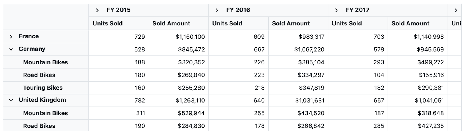
Functionality: includes standard features such as two display modes (flat and tree), sorting, filtering, exporting, conditional formatting, and read-only mode.
Performance: recently, DHTMLX rolled out an update that significantly enhances performance when handling massive datasets. The pivot table can now generate and render datasets with up to 1 million rows. While this update is good, for many other pivot libraries on this list, managing such large datasets has been a standard feature for some time.
Also, one potential drawback is that there is no roadmap page. This might be a concern for users who rely on consistent updates and new features.
Licensing: the cost depends on what you need. You can buy just the pivot table or the whole DHTMLX toolkit. Price from 299$.
DHTMLX Pivot is still a good choice for developers who want to change things a bit. But if you have a lot of data, you might consider other options.

WebDataRocks
WebDataRocks is a free, JavaScript-based pivot table library designed to create interactive reports in web applications. It offers a wide range of features for data analysis and visualization with simple integration, making it a go-to choice for developers looking for a cost-effective reporting tool. While it may not be as advanced as other commercial components in our list, it’s still a solid choice that covers more than just the basics of pivot tables.
Do you want to be the first to test the grid with your data?
Intuitive User Interface: the library’s user-friendly interface ensures a smooth and enjoyable experience for both developers and end-users.
Customizable and Extensible: offers extensive customization options that help the developer to adjust the component to project needs.
Chart: works with 3rd-party charting libraries, allowing you to create interactive, dashboard-like visualizations.
Overall, WebDataRocks is a good tool for anyone looking to create interactive and informative pivot tables within their web applications. Its combination of features, ease of use, and free availability make it a reliable choice for the development of small and mid-size projects.

Telerik
The Telerik Pivot Table, also known as the PivotGrid, is a powerful data visualization tool designed to help users organize, summarize, and analyze datasets. With its intuitive drag-and-drop interface, automatic calculations, and support for multi-dimensional data, this component simplifies the process of summarizing and visualizing data.
One of Telerik’s greatest strengths is its broad ecosystem of software components. If you’re building a product that needs additional features like charting, data grids, or forms, Telerik provides a cohesive suite of tools that integrate smoothly together.
Telerik’s extensive customization options and seamless integration with design tools like Figma make it an excellent choice for creating tailored, interactive reports.
Pricing starts at $1,099 per developer, with discounts and renewal offers available for long-term clients. The price point may be a consideration for teams working with limited budgets.
While it can be effective for basic data analysis, some users have reported performance issues, particularly when working with large datasets or complex calculations. So, it could be a great choice for those who prioritize style and appearance.

Syncfussion
The Syncfusion Pivot Table is a data visualization tool designed to organize and summarize large volumes of business data in a cross-table format. It offers a range of functionalities including data binding, filtering, sorting, and aggregation, making it easy to analyze complex datasets. Users can drill down or up to view detailed or abstract data, and the table supports various data sources.
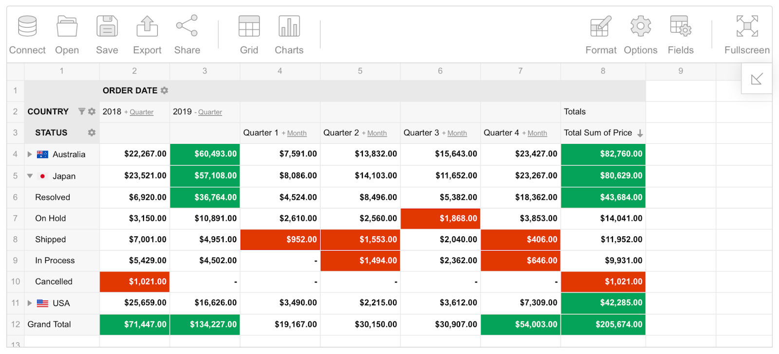
Chart integration: the Pivot Table can be seamlessly integrated with various chart types, allowing you to visualize pivot data in a more interactive and insightful manner. It supports over 20 different chart types, including bar, line, pie, and more. This integration helps in creating comprehensive dashboards where users can switch between tabular and graphical data representations.
Responsive design: designed to be highly responsive, adapting to various screen sizes and resolutions.
Customizable themes: Syncfusion has several built-in themes, such as Fluent, Tailwind CSS, Bootstrap, Material, and Fabric. These themes can also be customized to match the application’s design with the help of the online Theme Studio tool.
User reviews are generally favorable, although some mention that implementing a pivot view yourself is time-consuming. Based on their frequent releases, it’s clear that they are continually updating the pivot grid.
Price from $ 395/per month for developer.
Flexmonster Pivot Table and Charts
Flexmonster Pivot Table is also a widely used and popular JavaScript library for visualizing business data among developers. It’s known for its set of functionalities and high performance with huge datasets and smooth integration with various development stacks, which makes it a reliable tool for businesses looking to analyze and visualize data.
Performance: one of the biggest strengths of Flexmonster is how well it handles massive amounts of data. Whether you’re working with MongoDB, ElasticSearch, OLAP cubes, SQL databases, or even files up to 1GB, it’s developed to render millions of rows smoothly. I’ve seen demos that show how it works with massive data sets without freezing or lagging, which is pretty impressive.
Functionality: from basic aggregation to advanced filtering and sorting, you have the tools to uncover valuable insights from your data. The drill-up-and-down functionality provides a dynamic perspective, allowing you to explore data on various levels.
Frameworks: has a quick-start guide for smooth integration with frameworks like React, Angular, and Vue.
Charts: Flexmonster offers built-in charts and can be integrated with popular charting libraries such as Highcharts, amCharts, Google Chart, and others, making it easy to build interactive dashboards.
Customization: extensive API for deep customizations, allowing you to fully adjust the pivot table to the project needs.
Flexmonster pivot table gets regular bi-weekly updates, which shows the team is dedicated to keeping it up-to-date. They offer excellent documentation and have an active YouTube channel with detailed video tutorials, making it easy for developers to integrate and customize the component.
While Flexmonster Pivot is undoubtedly a powerful tool, the pricing might be a consideration for smaller businesses. Pricing starts from 799$ but in my opinion, if you’re looking for a powerful pivot table solution, it’s worth the investment.
DevExtreme Pivot Table
The DevExtreme Pivot Table is also a well-known tool designed for multidimensional data analysis. It’s a component of the DevExtreme suite, which offers a wide range of UI components.
Performance: handle large datasets directly in the browser, eliminating the need for server-side processing and enhancing performance.
Integrations: the pivot grid also seamlessly integrates with OLAP services like Microsoft SQL Server Analysis Services and works smoothly alongside other DevExtreme data visualization components.
While the DevExtreme team might be more consistent in updating Pivot Table compared to other tools on our list, they still roll out updates periodically. Recent improvements include a new rendering engine that replaces the older Bootstrap-based system, as well as accent-insensitive operations for data-aware controls.
DevExtreme also provides good support resources, including documentation, interactive demos, code examples, webinars, and a helpful and really joyful YouTube channel.
Pricing starts from 899$.

AG-Grid
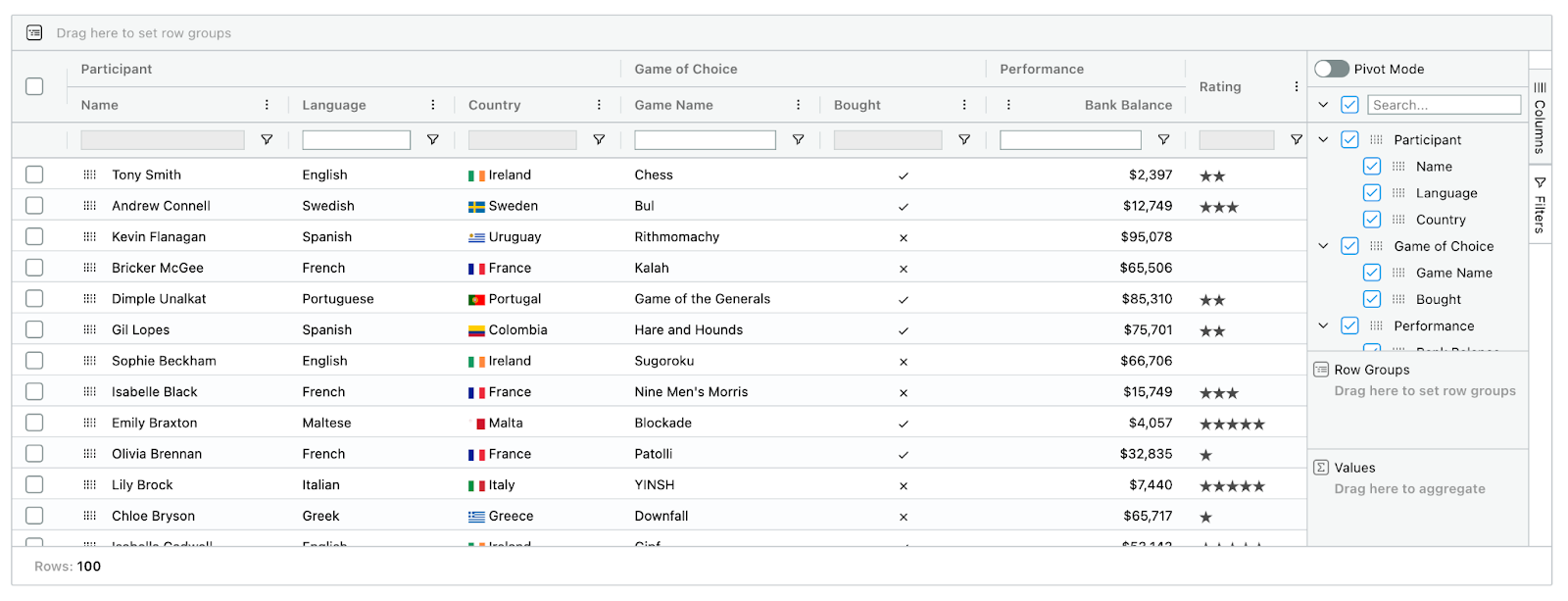
AG-Grid is a data grid solution designed to manage and analyze datasets. The commercial version of AG-Grid offers powerful pivoting features that let you manage your data by moving rows and columns around. You can set up these features using the grid’s API or the user interface, with options like the Side Bar and Pivot Panel. AG-Grid supports various calculations like sums, averages, and counts, giving you many ways to analyze your data.
Documentation: AG-Grid also has a well-structured documentation section that’s easy to follow and understand.
Chart Integration: AG-Grid integrates Sparklines, Integrated Charts, and AG Charts Enterprise so users can easily include charts in the projects.
While AG-Grid is a widely used solution with solid functionality, it is still primarily a data grid rather than a full-featured pivot table component. If you need exclusively powerful pivot functionality, you may want to explore other options on our list.
Pricing: AG-Grid is free under the MIT license for non-commercial use (without pivoting features). The commercial version starts at $999.
Conclusion
Every pivot table solution offers its own unique advantages, and the right choice depends on your project and its needs. So whether you’re prioritizing performance, customization, integration, or cost, this overview should help you make a more informed decision and choose the best tool for your web reporting project.


